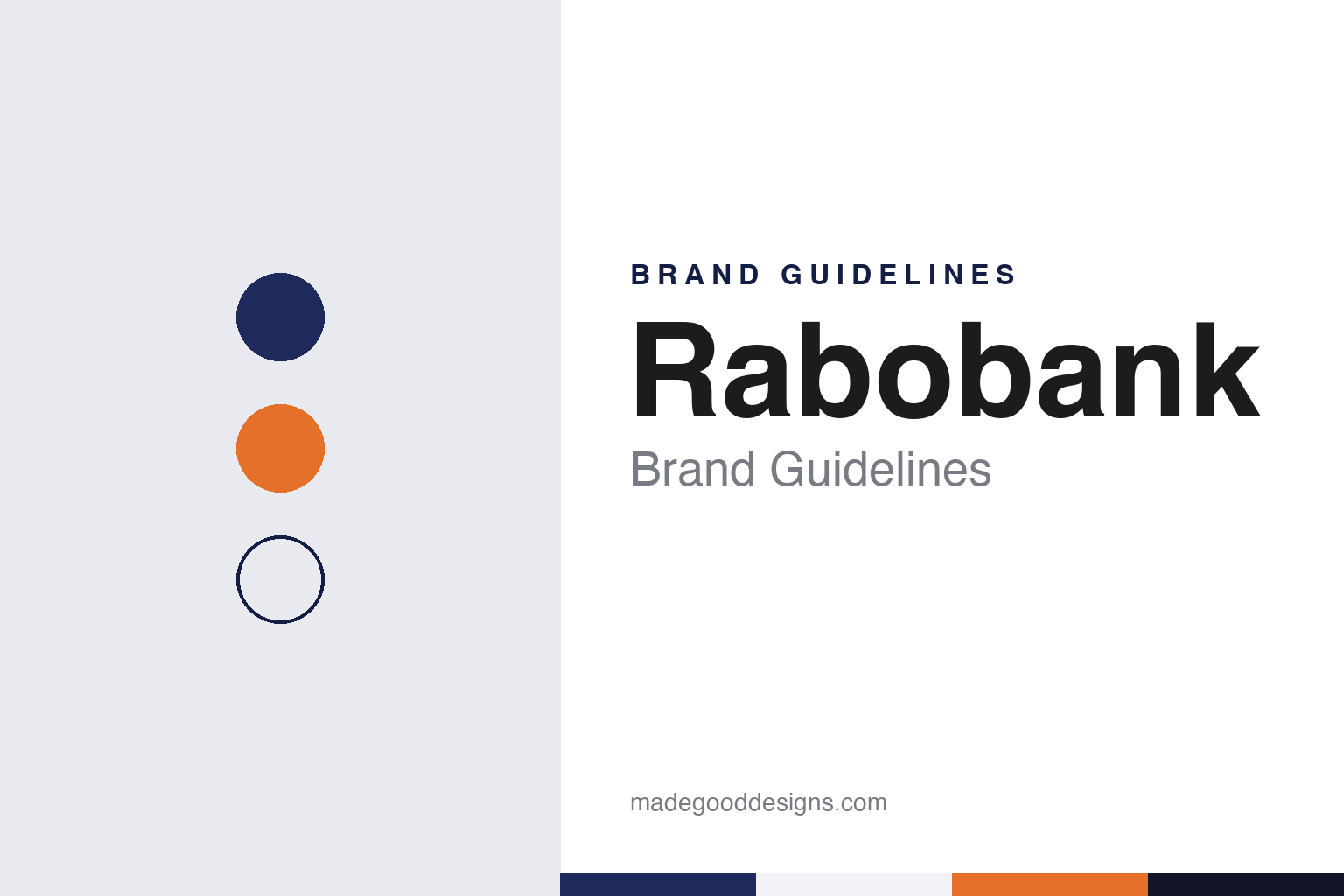
Rabobank Brand Guidelines
Two farmers’ banks of 1898, a 1972 merger and a cooperative name.
Aa
Two constants: a Rabobank navy and orange palette and a cooperative sans register. Abstract homage — not a Rabobank product or mark; no logo, card or branch sign is reproduced.
Farmers’ banks
Raiffeisen’s model and two central banks of 1898.
Rabobank grew out of the cooperative credit movement started in Germany by Friedrich Wilhelm Raiffeisen, who in 1864 turned a charitable foundation into a farmers’ bank that collected rural savings and lent to farmers, English Wikipedia says. The model spread to the Netherlands at the end of the nineteenth century. Dutch Wikipedia says farmers and growers began setting up credit cooperatives on the Raiffeisen system from 1895, and English Wikipedia names the priest Gerlacus van den Elsen as a founder of several local farmers’ banks in the south of the country.
In 1898 the local banks formed two central organisations: the Coöperatieve Centrale Raiffeisen-Bank in Utrecht, started by six local banks, and the Coöperatieve Centrale Boerenleenbank in Eindhoven, started by 22. English Wikipedia says the two existed side by side for about three-quarters of a century, partly because of legal disagreements but mainly because of culture: the Eindhoven bank had a Catholic character and the Utrecht bank a Protestant background, in a country then divided into separate religious and social “pillars”. Many villages had two local banks as a result, one for each community. The Boerenleenbank was highly centralised, while the Raiffeisen-Bank favoured local autonomy.
English Wikipedia says the two organisations were cooperating on a limited scale by 1940. The sources used for this guide do not say how Rabobank’s predecessors operated during the occupation of 1940–1945. English Wikipedia lists three forces that drew the two closer: more branches and local competition, fading religious differences, and a rising demand for capital from Dutch industry.
Colour
A 1972 merger and a short name.
The two central banks merged in 1972 to form the Coöperatieve Centrale Raiffeisen-Boerenleenbank. Dutch Wikipedia says the new bank traded as Rabobank because the full name was too long and hard to remember; the short name is built from the first letters of Raiffeisen and Boerenleenbank, and since 1980 the bank has been called only Rabobank. English Wikipedia adds that Amsterdam was chosen as the statutory seat because it was neutral ground for the two founding organisations; the head office today is in Utrecht.
The cooperative structure remains the core of the bank. For most of its history the local banks owned their central organisation, Rabobank Nederland, rather than the other way round. Dutch Wikipedia says membership was once required for business borrowers and closed to other customers, but at the centenary in 1998 the cooperatives were modernised so that every customer could join; a membership drive from 2001 lifted the number of members to about 1.9 million by the end of 2012. On 1 January 2016 the 106 local banks merged with Rabobank Nederland into a single bank, Coöperatieve Rabobank U.A., with one banking licence from De Nederlandsche Bank, while the local banks keep their own member councils and supervisory boards.
Abroad, the bank built its business on food and agriculture. English Wikipedia describes food and agribusiness as its main international focus and lists purchases in Australia, New Zealand and California, among them Primary Industry Bank of Australia in 1994 and Mid-State Bank & Trust in 2007. The American retail branches were sold to Mechanics Bank in 2019, and the bank kept its food and agriculture lending in North America under Rabo AgriFinance. Online savings banks followed in several countries; in Belgium Rabobank ran an internet bank from 2002 to 2021, Dutch Wikipedia says.
The record includes regulatory cases. On 29 October 2013 Rabobank reached agreements with Dutch, British, American and Japanese authorities over its past submissions for the Libor and Euribor interest-rate benchmarks, and in February 2018 it settled with the United States Department of Justice over internal controls at its Californian subsidiary, both Wikipedia editions say. In the Netherlands the Public Prosecution Service is prosecuting the bank over its client checks under the anti-money-laundering law. An ANP report of 31 March 2026 says Rabobank, unlike ING and ABN AMRO, did not accept a settlement, so the matter goes to court; that month the Amsterdam court issued an interim ruling on seized files, and the case itself had not been decided at that date.
Typography
Design and documentation.
Banks in the Netherlands, Belgium and Luxembourg tend to present themselves with restraint. The usual starting point is a clear sans-serif wordmark, often paired with a simple symbol, set in one or two strong colours. Green, orange, red and blue recur across the region, and many of the names are short: initials, contractions of older merger names, or a single coined word that is easy to say in more than one language.
The messages behind those marks often go back to how the banks are owned and what they say they stand for. Cooperative banks put their members and local roots up front, savings banks and state-owned banks point to their public role, and a growing number of banks lead with sustainability, publishing impact reports alongside their annual reports. Several of today’s names were formed by mergers, and their identities have had to carry two or more histories at once.
Language shapes the design work too. Dutch, French and English often sit side by side, and in Luxembourg Luxembourgish and German join them, so type has to stay readable across longer words, accents and switching between languages on the same page. Photography is usually kept to a minimum, with plain layouts, generous white space and simple icons doing most of the work on websites and in apps.
The pages people visit most are practical ones: everyday banking, savings, mortgages, business accounts and the mobile app. Behind them sit the formal documents, from annual and impact reports to investor pages, where the same colours and type carry a more sober tone. For a designer, the region shows how a bank can stay recognisable through colour and a short name while keeping its interface quiet and functional.
Aa
A friendly humanist sans — the register of a short, spoken name. (Specimen set in Source Sans 3, a sans STAND-IN; NOT the Rabobank logo.)
Rabobank
A cooperative told through a short name.
Rabobank’s identity leans on its cooperative story. Dutch Wikipedia says the bank tries to present itself as a bank that behaves differently from other banks, and that its advertising gives much attention to its cooperative character: local banks with their own member councils, supervisory boards and directors inside one shared cooperative. Part of the profit goes to social and cultural causes, which the bank calls a “cooperative dividend”, and members receive the magazine Rabo & Co, published three times a year since 2018.
Sponsorship carried the name further. Rabobank was main sponsor of a Dutch professional men’s cycling team until 31 December 2012, has supported the Netherlands Bach Society and the Van Gogh Museum in Amsterdam, and has been a partner of the Dutch Olympic committee NOC*NSF and TeamNL since 2017, Dutch Wikipedia says. Its digital record is long too: the bank has had a website since 1994 and has offered online banking on its site since 1997.
For a design guide, Rabobank shows how a merger of two rival networks can settle on one short, spoken name and build its message around ownership by members. Compare ABN AMRO, another Dutch bank named after the banks that merged to form it, and ING, another Dutch high-street bank. For this guide we use a deep navy, a warm orange and soft grey with a sans, an unofficial interpretation; no product or logo is reproduced.
Explore & save
Keep Rabobank’s identity on hand — save it to a board in the Made Good inspiration library.
Rabobank identity set
Pin the Rabobank navy and orange palette and the cooperative sans register to your own board.