ABN AMRO Brand Guidelines
An 1824 trading company, a 1991 merger and a green and yellow shield.
Aa
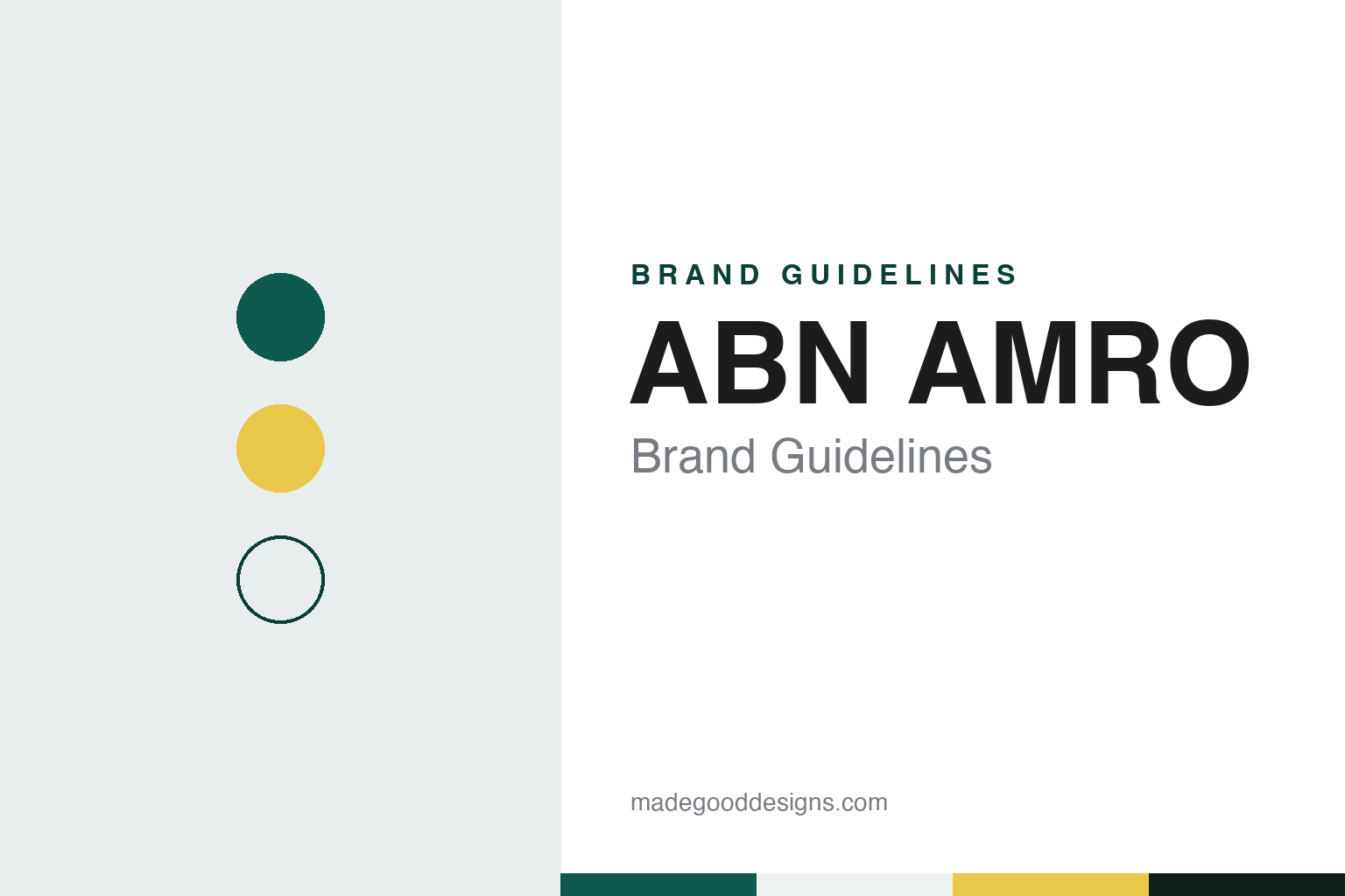
Two constants: an ABN AMRO green and yellow palette and a banking sans register. Abstract homage — not an ABN AMRO product or mark; no logo, shield or card is reproduced.
An 1824 trading company
From the Nederlandsche Handel-Maatschappij to a 1991 merger.
ABN AMRO traces its roots to 1824, when King William I founded the Nederlandsche Handel-Maatschappij (NHM), a trading company set up to revive trade with, and the financing of, the Dutch East Indies. English Wikipedia calls the NHM one of the primary ancestors of the bank, and an ANP profile published by NU.nl in May 2015 also places the bank’s roots in that year. Dutch Wikipedia notes that the NHM began as an import and export business and shifted over time from trade and shipping towards banking.
The modern name comes from two mergers in 1964. The NHM joined the Twentsche Bank to form Algemene Bank Nederland (ABN). In the same year the Amsterdamsche Bank, founded in 1871, merged with the Rotterdamsche Bank, founded in 1873, to form the Amsterdamsche en Rotterdamsche Bank, known as AMRO Bank. English Wikipedia gives 22 September 1991 as the date ABN and AMRO merged to form ABN AMRO, with its head office in Amsterdam.
The two banks brought a large overseas network with them. From the NHM side came branches in Asia and the Middle East; English Wikipedia records an NHM branch in Jeddah from 1926 and an agency in New York from 1941. The Hollandsche Bank-Unie added branches in South and Central America, and ABN had bought LaSalle National Bank of Chicago in 1979. In 2006 research was published on some 200 predecessors founded before 1888, which found that some of them had connections to slavery in the Americas, English Wikipedia says.
The sources used for this guide do not say how ABN AMRO’s predecessors operated during the occupation of the Netherlands in 1940–1945 or of the Dutch East Indies in 1942–1945.
Colour
Expansion, a 2007 break-up and state ownership.
After the merger the bank kept growing abroad. English Wikipedia lists purchases including Standard Federal Bank near Detroit in 1996, Banco Real in Brazil in 1998 and Antonveneta in Italy in 2006, and the ANP profile notes a listing on the New York Stock Exchange at the end of the 1990s and a new head office on Amsterdam’s Zuidas in 1999. The same profile says the bank did not manage to bring its high costs down, which kept its share price relatively low.
In 2007 an activist shareholder pushed for a break-up. A consortium of the Royal Bank of Scotland, Belgium’s Fortis and Spain’s Banco Santander, working through a joint company called RFS Holdings, acquired ABN AMRO on 17 October 2007 after Barclays withdrew a rival offer, English Wikipedia says. The parts were divided among the three buyers, with Fortis due to receive the Dutch and Belgian operations.
The financial crisis followed within a year. On 3 October 2008 the Dutch state bought the Dutch operations of Fortis, including its share of ABN AMRO; the ANP profile describes this as the nationalisation of the Dutch parts of ABN and Fortis. In February 2010 the state-owned assets were legally separated from those held by RBS, and on 1 July 2010 Fortis Bank Nederland and the Dutch ABN AMRO businesses were combined under the ABN AMRO name, with the Fortis name dropped. Under an agreement with the European Commission on state aid, the bank sold the Hollandsche Bank-Unie in 2010.
The state brought the bank back to the stock market in Amsterdam on 20 November 2015 and then sold shares in stages. Dutch Wikipedia says the state’s stake fell below half in September 2023, and English Wikipedia says it was cut to 20 percent in September 2025. In October 2026 the state announced a plan to reduce its stake further, to 10.5 percent, Dutch Wikipedia says; that reduction had not been completed at the time of writing.
In April 2021 the Dutch Public Prosecution Service concluded that the bank had fallen short of its legal role against money laundering in the Netherlands between 2014 and 2020, NPO Radio 1 reported on 19 April 2021, and the bank accepted a settlement offered by the prosecutors, Dutch Wikipedia says; an ANP report of March 2026 also notes that ABN AMRO chose a settlement. Recent purchases include the investment app BUX in 2023, the German private bank Hauck Aufhäuser Lampe, completed on 1 July 2025, and NIBC Bank, a subsidiary since 1 August 2026, according to Dutch Wikipedia.
Typography
Design and documentation.
Banks in the Netherlands, Belgium and Luxembourg tend to present themselves with restraint. The usual starting point is a clear sans-serif wordmark, often paired with a simple symbol, set in one or two strong colours. Green, orange, red and blue recur across the region, and many of the names are short: initials, contractions of older merger names, or a single coined word that is easy to say in more than one language.
The messages behind those marks often go back to how the banks are owned and what they say they stand for. Cooperative banks put their members and local roots up front, savings banks and state-owned banks point to their public role, and a growing number of banks lead with sustainability, publishing impact reports alongside their annual reports. Several of today’s names were formed by mergers, and their identities have had to carry two or more histories at once.
Language shapes the design work too. Dutch, French and English often sit side by side, and in Luxembourg Luxembourgish and German join them, so type has to stay readable across longer words, accents and switching between languages on the same page. Photography is usually kept to a minimum, with plain layouts, generous white space and simple icons doing most of the work on websites and in apps.
The pages people visit most are practical ones: everyday banking, savings, mortgages, business accounts and the mobile app. Behind them sit the formal documents, from annual and impact reports to investor pages, where the same colours and type carry a more sober tone. For a designer, the region shows how a bank can stay recognisable through colour and a short name while keeping its interface quiet and functional.
Aa
A clear banking sans — the register of a capitalised name. (Specimen set in IBM Plex Sans, a sans STAND-IN; NOT the ABN AMRO logo.)
ABN AMRO
A green and yellow shield by Landor.
The bank’s mark is documented more clearly than most. English Wikipedia says the green and yellow shield logo was designed by Landor Associates for ABN AMRO in 1991, the year of the merger, and has been used for the bank and all its subsidiaries. The name itself is written in capitals: it joins the initials of Algemene Bank Nederland with AMRO, formed from the first two letters of Amsterdam and Rotterdam. The letters of ABN are spoken separately and AMRO is said as a word, which is why some media write “ABN Amro”, though the bank itself uses only the capitalised form.
The shield also travelled on football shirts. ABN AMRO was the main sponsor of AFC Ajax from 1991 to 2008, and English Wikipedia notes that the sponsor logo ran vertically down the right side of the shirt front. In 2016 and 2017 the bank introduced new services, brand names and subsidiaries, among them the payment app Tikkie and the business lender New10, Dutch Wikipedia says. The bank’s former art collection has been managed since the end of 2007 by a dedicated foundation.
For a design guide, ABN AMRO shows how a merger mark can outlast the break-up, nationalisation and relisting of the company behind it. Compare ING, another Dutch bank with a long-standing symbol, and BNP Paribas Fortis, the Belgian bank that carries the Fortis name. For this guide we use a deep green, a warm yellow and near-black ink with a sans, an unofficial interpretation; no product or logo is reproduced.
Explore & save
Keep ABN AMRO’s identity on hand — save it to a board in the Made Good inspiration library.
ABN AMRO identity set
Pin the ABN AMRO green and yellow palette and the banking sans register to your own board.