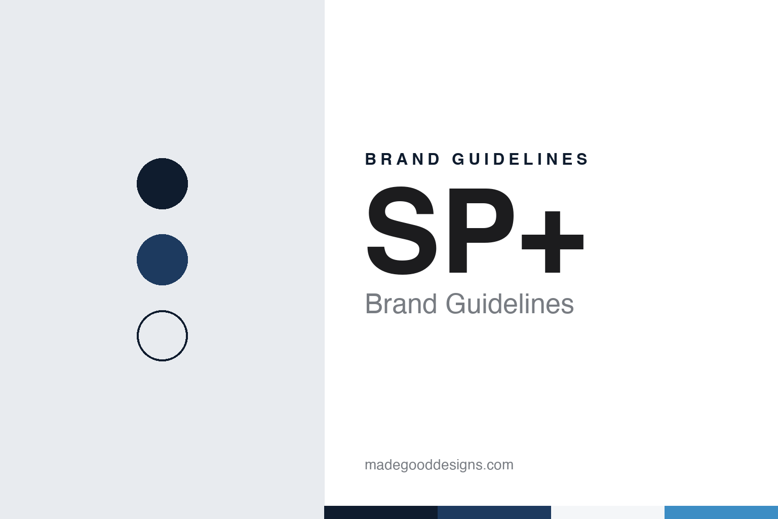
SP+ Brand Guidelines
A Chicago lot business of 1929 that grew into a parking network and a plus sign.
Aa
Two constants: a midnight, blue and white palette and a grotesque sans register. Abstract homage — not an SP+ sign or mark; no logo or signage is reproduced.
Standard Parking
A family lot business in Chicago.
SP+ traces its roots to Standard Parking, which began running parking lots in Chicago in 1929. The company’s own history page calls it a family owned and controlled business at the start, and English Wikipedia names David and Benjamin Warshauer as the family who ran it. Wikipedia says the business traded as Standard Parking Corporation from 1981 until 1995, when it was reorganised as a limited partnership, Standard Parking, L.P.
The first big step came in March 1998, when Standard Parking merged with APCOA, Inc. to form APCOA/Standard Parking, Inc., according to Wikipedia, which cites a New York Times report of January 1998 on the planned merger. In April 2003 the merged company took back the plain name Standard Parking Corporation, and in June 2004 it listed its shares on Nasdaq under the symbol STAN.
Acquisitions followed. In July 2009, Wikipedia says, Standard Parking bought the assets of Gameday Management Group, which planned traffic and parking for stadiums and large sporting events and ran a pre-paid service called Click and Park. In October 2012 it completed the purchase of Central Parking, a deal that Wikipedia, citing MarketWatch, says roughly doubled the size of the company.
Central Parking had its own long history. SP+ says it was incorporated in 1968, ran parking in the United States and Europe, and was both publicly and privately held over the years before it joined the group through the merger with Standard Parking.
Colour
A new name in 2013, then a family of brands.
In December 2013 Standard Parking Corporation rebranded as SP Plus Corporation, written SP+, and changed its Nasdaq ticker to SP, according to English Wikipedia, which cites the company’s announcement of a new brand identity. The corporate site still shows the name with a registered-trademark sign.
The services behind the name are wider than car parks. SP+ describes its work as parking management, ground transportation, luggage logistics and management, facility maintenance and event logistics, for aviation, commercial, hospitality and institutional clients. English Wikipedia puts the company at about 4,200 parking facility locations, with parking and shuttle bus operations at 75 airports. Its promise line, as the site presents it, is “Making Every Moment Matter for a World on the Go.”
Over time SP+ became a house of brands. The corporate site lists Sphere, a suite of technology tools; Bags, an airport baggage service with the line “making travel easier”; Parking.com, a booking and marketing platform for daily, monthly and event parking; and AeroParker, airport parking pre-booking software. It also lists Roker, a parking management platform, KMP Digitata, a digital agency in Greater Manchester, and USA Parking, a hotel valet and parking division that SP+ says serves more than 300 hotels. Standard Parking and Central Parking are presented as part of the same family.
The corporate site is published in English, Spanish and French, and SP+ says it has more than 20,000 team members across North America and Europe.
Typography
How parking brands present themselves.
Toll-road and parking operators sell access to something the customer can already see: a stretch of motorway, a tunnel, a multi-storey car park. Their visual identity therefore lives in two places at once. On the road it appears on gantries, toll plazas, barrier arms, ticket machines and the signs at a car-park entrance; online it appears on corporate websites, annual reports and investor presentations, where the same company explains its concessions to shareholders and lenders.
Network maps and road photography carry much of the corporate side. Operators publish maps of the routes or sites they run, usually as simple lines and dots over a pale base, together with photographs of interchanges, viaducts, tunnels and car parks, often taken from above. Concession pages and investor sections list each asset with its length or number of spaces, its concession dates and its ownership structure, and many groups give each road or site its own page or its own website under its own name.
Parking brands meet a shared visual language at the kerb. The blue and white “P” sign is the common shorthand for parking across much of the world, and operators place their own name and colours beside it on entrance signs, pay stations and barrier arms. Customer apps have become a second front door: their screenshots, as the companies publish them, typically show a map of nearby sites, a booking or payment screen and a digital ticket or account page.
Toll operators increasingly present themselves through electronic tolling, with transponder tags, licence-plate accounts and apps that show trips and statements, so their customer materials lean on clear numbers, simple icons and plain instructions. Across the category the tone is practical and reassuring rather than playful: a name that needs to be read at speed, a limited palette and a sans-serif that stays legible on a sign, a phone and a results page alike.
Aa
A grotesque sans for a plain, initial-led name. (Specimen set in Archivo, a sans STAND-IN; NOT the SP+ logo.)
SP+
Absorbed by Metropolis in 2024.
SP+ is no longer an independent company. On 5 October 2023 Metropolis Technologies, a Los Angeles company whose computer-vision system lets drivers pay for parking without a ticket or a checkout, agreed to buy it. The deal closed on 16 May 2024. Metropolis said in its announcement that day that it owned all of SP+, that the nearly 20,000-strong SP+ team had become part of Metropolis, and that SP+ shares would no longer trade on the Nasdaq Global Select Market; trading had been halted before the market opened. Metropolis described the combined business as the largest parking network and operator in North America, with more than 4,000 locations.
The Los Angeles Business Journal reported in June 2024 that Metropolis had been founded in 2017, that its co-founders included chief executive Alex Israel, and that it had bought the Chicago-based SP Plus in May 2024 after acquiring Premier Parking, an owner of more than 600 garages, in 2022. The paper said Metropolis expands both by deploying its own technology and by partnering with property owners to run their parking. Israel told the paper the purchase followed what he called a “growth buyout” model, in which the aim was to bring new business to SP+ locations and their owners, rather than a take-private built on cutting costs. Metropolis said the financing for the deal was led by Eldridge Industries, an existing investor, with new investors including credit funds affiliated with BDT & MSD Partners, Vista Credit Partners and Temasek, and with support from its earlier shareholders led by 3L.
The SP+ name has not vanished. The corporate site remains live under the SP Plus Corporation copyright, with a notice at the top that Metropolis has acquired the company, and its brands, from Parking.com to Bags, are still presented there. Metropolis said at the closing that it would continue as a founder-led and founder-controlled private company, so SP+ now sits inside that business rather than trading as a listed company of its own.
For a design guide, SP+ shows how a nearly century-old parking name can be shortened to initials and a symbol, then carried into a new owner’s technology business. Compare APCOA, a European car-park operator, and EasyPark, a parking app brand. For this guide we use a midnight blue, a signal blue, kerb grey and a cool white with a grotesque sans, an unofficial interpretation; no product or logo is reproduced.
Explore & save
Keep SP+’s identity on hand — save it to a board in the Made Good inspiration library.
SP+ identity set
Pin the midnight, blue and white palette and the grotesque sans register to your own board.