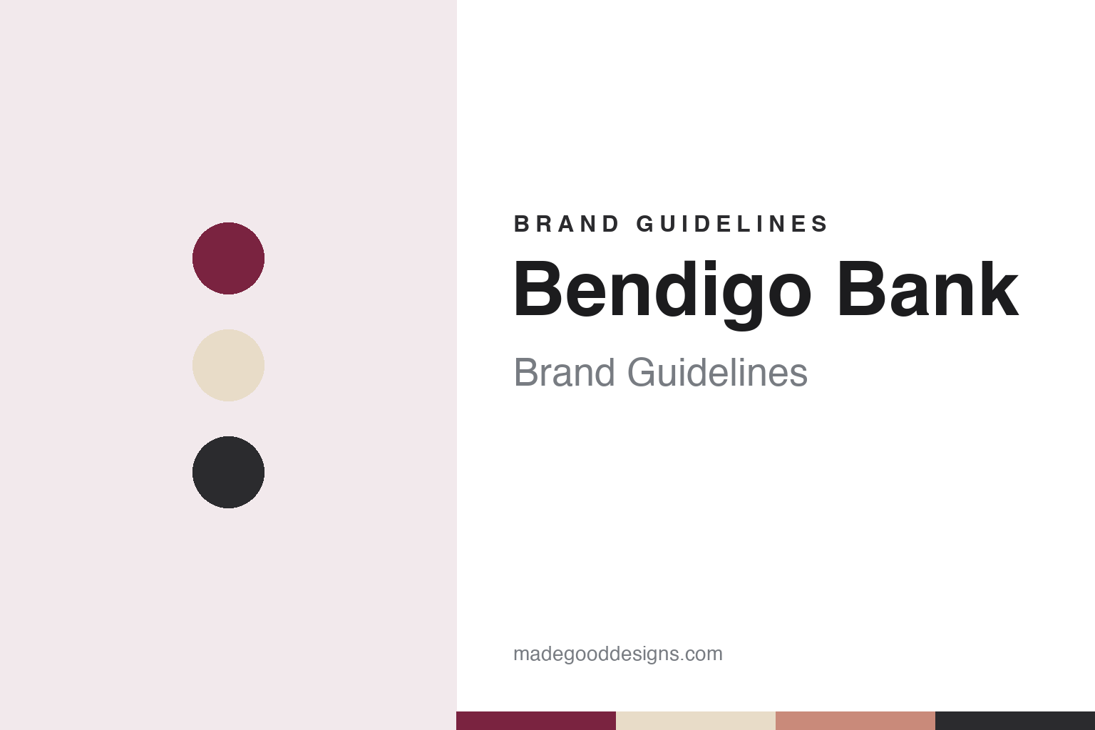
Bendigo Bank Brand Guidelines
An 1858 goldfields society and the Community Bank model.
Aa
Two constants: a claret, sand and charcoal palette and a friendly sans register. Abstract homage — not a Bendigo Bank product or mark; no logo, card or branch sign is reproduced.
Goldfields society
A building society for the Victorian gold rush.
Bendigo Bank began in 1858 as a fixed-term building society in the central Victorian town of Bendigo, set up to improve conditions on the goldfields during the gold rush, English Wikipedia says. In 1865 it was restructured as the Bendigo Mutual Permanent Land and Building Society, which was incorporated in Victoria eleven years later.
For more than a century it grew as a regional building society. In 1978 it merged with the Bendigo and Eaglehawk Star, a society founded in 1901, and it went on to take in the Sandhurst society in 1983 and the Sunraysia society in 1985, along with the Capital and Compass societies and a merger with Sandhurst Trustees. English Wikipedia credits the society with being the first financial institution in Australia to introduce both Visa credit and debit cards successfully, in 1982.
The society listed on the stock market in 1993 and converted to a bank in 1995, taking the name Bendigo Bank. In 1997 it bought the Australian arm of the Italian group Banca Monte dei Paschi di Siena and renamed it Cassa Commerciale Australia. With Elders it formed Elders Rural Bank, a joint venture for agribusiness and rural customers, in the late 1990s, and English Wikipedia also says the bank was the first financial institution to introduce the mortgage offset account, now a standard product in Australia.
In 2000 it absorbed the First Australian Building Society in Queensland, gaining a regional office in Ipswich, and in 2005 it built a regional headquarters in Melbourne’s Docklands.
Colour
The Community Bank model.
The idea most closely tied to the brand is the Community Bank. The programme began in 1998: the first branches opened in the western Victorian towns of Minyip and Rupanyup on 26 June that year, and the first metropolitan branch opened in the outer-eastern Melbourne suburb of Upwey on 19 October, according to English Wikipedia.
English Wikipedia describes the model as “profit-with-purpose”: after the running costs of a branch are paid, profits go back to the community that generated them. It frames the programme as a response to widespread closures of bank branches, mostly in rural areas, and says Bendigo has since extended it to city areas that already had banks. Before the 2007 merger, the bank counted about 220 community-owned Community Bank branches among its outlets, the same source says.
The bank’s own marketing leans on that idea. Its Community Bank page, headed “Switch and be the change,” tells customers that their home loans and everyday banking help pay for skate and sports parks and classrooms, and illustrates the point with a short film shot in Mount Gambier, South Australia, in which local groups thank customers outside a branch. The group lists the Community Enterprise Foundation among its subsidiaries alongside the programme.
English Wikipedia also records a 2014 policy under which the bank said it would not lend to companies whose core activity is the exploration, mining, manufacture or export of thermal coal or coal seam gas.
Typography
How Australian and New Zealand banks present themselves.
Australian and New Zealand banks tend to present themselves through one strong symbol and one strong colour. The Commonwealth Bank has a diamond, which it refreshed in October 2020 to make it, in its marketing chief’s words to Campaign Brief, “lighter, brighter and more dynamic”; Westpac has kept the W of the old Bank of New South Wales since taking its new name in 1982. Across the banks in this guide, symbols and wordmarks tend to appear in bold colours, yellow, red, blue and green among them.
Their websites and campaigns lean on plain-English copy and on people rather than products. The Commonwealth Bank’s 2020 “Can Lives Here” campaign featured real customers rather than actors, Campaign Brief reported, and Westpac’s 2026 “Double You” campaign was framed around practical help with everyday financial admin. Photography of customers, cities and landscapes fills the space between the pages on home loans, everyday accounts, business banking and the mobile apps.
Sport and community programmes are part of the identity too. The Commonwealth Bank’s name has been attached to Australian cricket since 1987 and to the national women’s football teams since 2021, according to Wikipedia, while Westpac has sponsored a rescue helicopter service since 1973. Banks also publish annual and sustainability reports each year, which set out their brands, strategies and regulatory matters in their own words.
The banks share a recent history as well. The Royal Commission into Misconduct in the Banking, Superannuation and Financial Services Industry, established in December 2017, examined the major lenders, and its final report was made public in February 2019. This guide sets out what can be checked about each bank — who founded it, who owns it and how its identity has changed — with the companies’ own claims marked as theirs.
Aa
A friendly, open sans for a regional bank. (Specimen set in Figtree, a sans STAND-IN; NOT the Bendigo Bank logo.)
Bendigo and Adelaide
A merger, a new name and a digital bank.
In 2007 Bendigo Bank turned down a merger or takeover proposal from Bank of Queensland and instead merged with Adelaide Bank; the takeover was completed on 30 November 2007, and shareholders voted to rename the company Bendigo and Adelaide Bank Limited from 31 March 2008, English Wikipedia says. A new head office in Bendigo was completed in December 2008, keeping the group’s headquarters in the regional city, with a major office in Adelaide.
Since then the group has folded older names into one. It agreed in 2011 to buy Bank of Cyprus Australia, renamed it Delphi Bank, and began absorbing the Delphi brand into Bendigo products in 2022; English Wikipedia says the Adelaide Bank brand itself was retired in favour of Bendigo Bank in December 2025. The group’s brand page now lists two main brands: Bendigo Bank, offering retail, business, agribusiness and third-party banking, and Up, which the group describes as Australia’s first cloud-hosted bank. From 2015 the bank also ran an agency branch in Nauru, ending that agreement on 8 August 2025.
In December 2025 Bendigo agreed to buy the retail lending and deposit business of RACQ Bank, the banking arm of the Queensland motoring club RACQ, subject to regulatory approval. In August 2026 The Motley Fool Australia reported that the purchase was expected to complete in the first half of the bank’s 2027 financial year; it was agreed in December 2025 and not completed at the time of writing. The same report noted a new multi-year programme to improve non-financial risk management. That followed December 2025, when The Motley Fool Australia reported that APRA had applied an operational risk capital charge and that AUSTRAC had opened an enforcement investigation into the bank’s anti-money-laundering and counter-terrorism financing compliance, with no decision yet on any action.
For a design guide, Bendigo Bank shows how a regional lender can build a national brand around local ownership. Compare Bank of Queensland, another regional bank with a branch model of its own, and Suncorp. For this guide we use a deep claret, a warm sand and a charcoal with a sans, an unofficial interpretation; no product or logo is reproduced.
Explore & save
Keep Bendigo Bank’s identity on hand — save it to a board in the Made Good inspiration library.
Bendigo Bank identity set
Pin the Bendigo Bank claret, sand and charcoal palette and the friendly sans register to your own board.