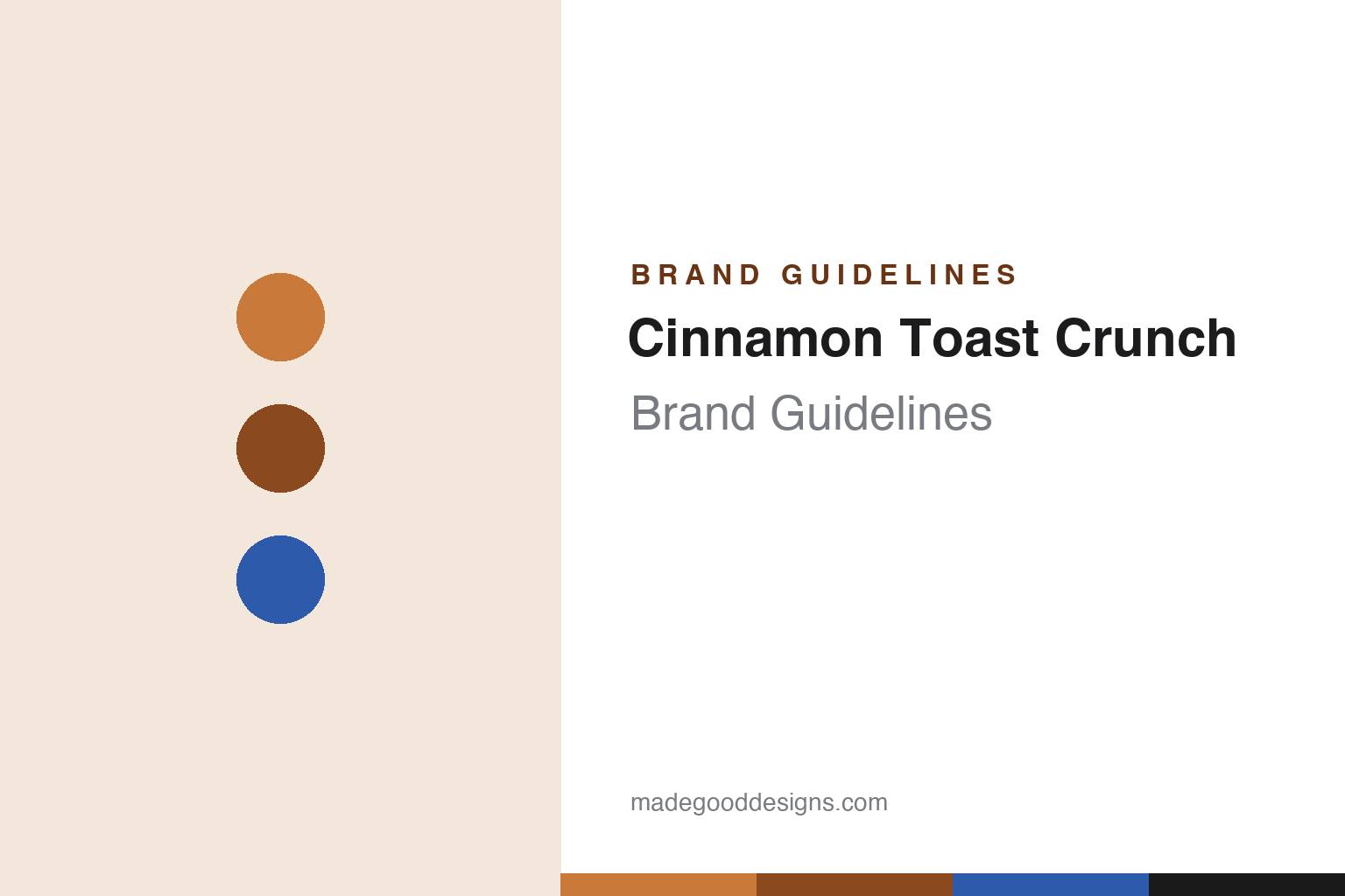
Cinnamon Toast Crunch Brand Guidelines
Cinnamon-swirl squares you can see, a lone baker turned self-eating mascot, and a taste made visible.
Aa
Two constants: a cinnamon palette and a bold, rounded display face. Abstract homage — not the Cinnamon Toast Crunch wordmark or squares.
The taste you can see
Cinnamon Toast Crunch made its flavour visible.
Cinnamon Toast Crunch is a lesson in making a flavour visible. Introduced on March 5, 1984 by General Mills, the cereal is small squares of wheat and rice coated in cinnamon and sugar — and its design signature is the cinnamon-colour swirl printed on every square, a visual cue that you can literally see the cinnamon-sugar coating. That idea powered the long-running slogan “The taste you can see” (from 1995): the swirl makes the promise of flavour tangible before you take a bite. It’s a small design decision with outsized brand power. (Honest caveats: no official brand hex or wordmark typeface is published, so colours and type here are approximate.)
The mascots have an interesting arc. Three animated bakers debuted in 1985 — Wendell, Bob and Quello — and in 1991 the two younger bakers were dropped, leaving Wendell as the sole face of the brand. Wendell ran solo until 2013, when he was replaced by the sentient, self-devouring cinnamon squares — officially the “Crazy Squares” (note: Crazy, not “Craze”), whose gleeful cannibalism (squares eating other squares) became a viral ad hallmark. In 2020 the US adopted flat 2D “Cinnamojis,” while the UK kept the Crazy Squares. (One thing not to conflate: “Cinnadust” is the branding for the cinnamon-sugar coating — “Blasted With Cinnadust,” 2019 — not the mascots’ name.)
The brand also lived through a very modern moment. On March 22, 2021, the musician-writer Jensen Karp tweeted that he’d found what looked like shrimp tails (and other debris) in a box; it went viral, and General Mills responded that the objects were “an accumulation of the cinnamon sugar that sometimes can occur when ingredients aren’t thoroughly blended.” The exchange became a textbook social-media brand-crisis moment. On ownership and naming: General Mills makes it in North America; internationally it’s produced via the Nestlé joint venture Cereal Partners Worldwide, and in the UK it’s sold as “Curiously Cinnamon” (formerly “Cinnamon Grahams”).
Colour
Cinnamon Toast Crunch lives in cinnamon. Click a swatch to copy the hex.
Cinnamon Toast Crunch’s palette is cinnamon — the warm brown-and-tan of cinnamon and sugar, from the golden square to the darker swirl, set against a box that trends blue for contrast. It’s an appetising, cosy, comfort-food scheme that evokes cinnamon toast straight from the oven, and it’s reinforced by the printed swirl on every square. The warm cinnamon tones make the flavour feel real and inviting; the blue box makes them pop on a shelf. The honest caveat: General Mills publishes no official public brand hex for Cinnamon Toast Crunch — the cinnamon colours here are approximations, not a confirmed spec.
The lesson is a palette (and a printed detail) that shows the flavour. Cinnamon Toast Crunch uses warm cinnamon colours and the visible swirl to make its taste believable at a glance — “the taste you can see.” For designers, it’s a reminder that colour and printed surface detail can communicate flavour and quality directly, before anyone tastes the product. The takeaways: use warm, appetising colours to evoke a specific flavour (cinnamon and sugar); add a visible product detail (the swirl) that makes the promise tangible; and treat specific hexes as approximate when no official spec is published.
Typography
The wordmark is a bold, rounded display face — warm and friendly.
Cinnamon Toast Crunch’s bold, rounded display wordmark is warm and friendly — chunky, approachable letters that read as fun and comforting, matching a cosy cinnamon-sugar treat. The rounded weight feels soft and indulgent (like the cereal), and it’s inviting rather than hyped, which suits a brand sold on the warm, familiar taste of cinnamon toast. The lettering has the same friendly energy as Wendell the baker and the grinning squares. (Because no official typeface is documented, the honest description is “a bold, rounded display face,” not a named font.) The type behaves like the brand: warm, bold and friendly — as comforting as cinnamon toast.
Aa
A bold, rounded display face — warm and friendly. (Specimen set in Paytone One, a bold rounded display in the spirit of the Cinnamon Toast Crunch wordmark; the real face is undocumented.)
Show, don’t tell
Cinnamon Toast Crunch made its promise visible.
Cinnamon Toast Crunch is a lesson in showing a benefit rather than just claiming it. Instead of merely saying the cereal tastes of cinnamon, the brand printed a cinnamon swirl on every square and built a slogan around it — “The taste you can see.” That single design move makes the flavour promise tangible and trustworthy: the proof is right there on the product. Combined with warm cinnamon colours and self-aware, funny mascots (the square-eating Crazy Squares), it gives the brand a distinctive, believable identity that turns a simple cinnamon-sugar cereal into something memorable.
For designers and brand-builders, Cinnamon Toast Crunch offers a clear takeaway: make the benefit visible in the product and the design. The lessons: show, don’t just tell — a visible detail (the swirl) makes a flavour claim credible; use warm, appetising colour to reinforce the promise; and give the brand a distinctive, self-aware personality (the Crazy Squares) so it stays memorable and shareable. It’s also a reminder to keep the facts precise — Cinnamon Toast Crunch launched in 1984 (wheat-and-rice squares); the mascots went from three bakers (Wendell, Bob, Quello) in 1985 to Wendell alone in 1991 to the “Crazy Squares” in 2013 and US “Cinnamojis” in 2020 (with “Cinnadust” being the coating’s branding, not the mascots); the 2021 Jensen Karp shrimp-tails episode is a notable social-media moment; and it’s a General Mills brand (Nestlé-made abroad, “Curiously Cinnamon” in the UK). Cinnamon Toast Crunch put the taste on the square — proof that showing beats telling.
Explore & save
Keep Cinnamon Toast Crunch’s identity on hand — save it to a board in the Made Good inspiration library.
Cinnamon Toast Crunch identity set
Pin the cinnamon palette and the bold-display spirit to your own board.


