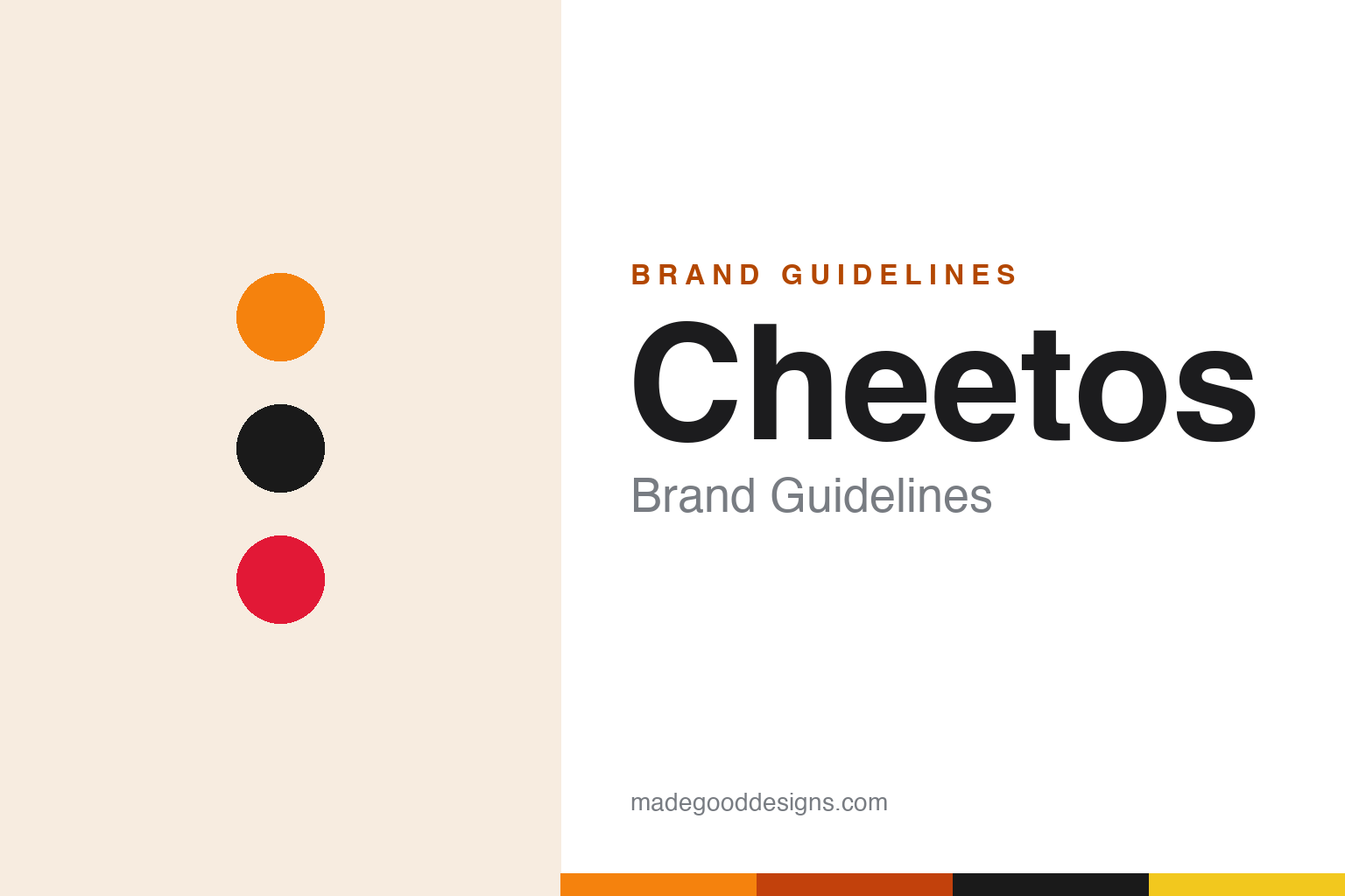
Cheetos Brand Guidelines
A hip cheetah, an unmistakable orange and dust so iconic it has its own name — Cheetle.
Aa
Two constants: a Cheetos-orange palette and a bold, cartoon display face. Abstract homage — not the Cheetos wordmark or Chester.
Dangerously cheesy
Cheetos built a brand on orange and a hip cheetah.
Cheetos is a lesson in owning a colour and a character. The cheese snack was invented in 1948 by Charles Elmer Doolin — the creator of Fritos — in the Frito Company’s R&D kitchen in Dallas. The original Crunchy Cheetos were the only form for 23 years until the airy Puffs arrived in 1971. But the brand’s personality really crystallised with its mascot: Chester Cheetah, who debuted in 1986 as a sly, smooth-voiced, sunglasses-wearing “hip kitty.” Chester gave Cheetos a cool, mischievous character that has carried the brand for decades. (Honest caveats: no official brand hex or wordmark typeface is published, so the orange and type here are approximate.)
A couple of details are worth getting right. Chester’s famous tagline history is often muddled: the original slogans (1986–1997) were “It’s not easy being cheesy” and “The cheese that goes crunch!”; the now-familiar “Dangerously Cheesy!” came later, from 1997 onward — so don’t date it to the ’80s. And Cheetos has one of the best pieces of brand vocabulary in snacking: “Cheetle,” the official Frito-Lay name for the orange cheese dust that coats your fingers — turning a (literal) mess into an ownable brand asset.
The one fact to handle carefully is Flamin’ Hot Cheetos. The popular story crediting janitor-turned-executive Richard Montañez with inventing them is disputed: a 2021 Los Angeles Times investigation found his account unsupported, and Frito-Lay has stated its records don’t credit him — company documents attribute Flamin’ Hot to a Texas-HQ team (led by Lynne Greenfeld) starting in 1989. The honest move is to present the invention as a Frito-Lay team effort, not to repeat the Montañez legend as fact. On ownership: Cheetos is a Frito-Lay brand, part of PepsiCo (which acquired Frito-Lay in 1965).
Colour
Cheetos lives in orange. Click a swatch to copy the hex.
Cheetos’ palette is dominated by one unmistakable colour: Cheetos orange, paired with black (Chester, the wordmark) and red accents. That bright, cheesy orange is the brand’s single greatest asset — it’s the colour of the snack, the dust (“Cheetle”), and the whole identity, and it’s so distinctive that it identifies Cheetos instantly. Black gives it edge and lets the orange pop; red adds energy. It’s a bold, fun, high-impact scheme built entirely around owning that one loud orange. The honest caveat: Frito-Lay publishes no official public brand hex for Cheetos — the orange here is an approximation, not a confirmed spec.
The lesson is owning a single, unmistakable colour. Cheetos orange is so distinctive it is the brand — even the finger dust (“Cheetle”) is part of the colour story. For designers, it’s a reminder that owning one bold, specific colour can make a brand instantly recognisable. The takeaways: own one distinctive, specific colour and use it everywhere (Cheetos orange); pair it with a high-contrast partner (black) so it pops; and treat specific hexes as approximate when no official spec is published.
Typography
The wordmark is a bold, cartoon display face — fun and mischievous.
Cheetos’ bold, cartoon-style display wordmark is fun and mischievous — chunky, playful letters with a comic-book energy that match Chester Cheetah’s hip, sly personality. It’s loud and cheerful rather than refined, promising fun and cheesy indulgence, and it sits perfectly against the signature orange. The lettering has the same cool, mischievous swagger as the mascot — a wordmark built for a snack that’s all about playful, messy fun. (Because no official typeface is documented, the honest description is “a bold, cartoon display face,” not a named font.) The type behaves like the brand: bold, playful and mischievous — as fun as Chester.
Aa
A bold, cartoon display face — fun and mischievous. (Specimen set in Luckiest Guy, a chunky cartoon display in the spirit of the Cheetos wordmark; the real face is undocumented.)
Own a colour, name the mess
Cheetos turned even its dust into a brand asset.
Cheetos is a lesson in turning every detail into a brand asset. It owns an unmistakable orange, a cool mischievous mascot in Chester Cheetah, and — brilliantly — it even gave a name to the orange dust on your fingers: “Cheetle.” That last move is pure branding genius: it takes the one “downside” of the product (messy fingers) and turns it into an ownable, playful part of the brand story. Combined with the bold orange and Chester’s personality, it shows how a brand can claim ownership of every part of the experience, even the crumbs.
For designers and brand-builders, Cheetos offers a clear takeaway: claim and name every distinctive part of your product experience. The lessons: own one unmistakable colour (Cheetos orange) and a character with real personality (Chester); turn even a product “flaw” into an ownable asset (naming the finger dust “Cheetle”); and keep the tone fun and mischievous throughout. It’s also a reminder to keep the facts precise — Cheetos was invented in 1948 by Charles Elmer Doolin; Chester debuted in 1986 (with “Dangerously Cheesy!” arriving from 1997, not the ’80s); “Cheetle” is the official term for the finger dust; the Flamin’ Hot invention is credited by Frito-Lay to a company team, not the disputed Richard Montañez story; and it’s a Frito-Lay/PepsiCo brand. Cheetos even named its own mess — proof that a brand can own every detail.
Explore & save
Keep Cheetos’s identity on hand — save it to a board in the Made Good inspiration library.
Cheetos identity set
Pin the Cheetos-orange palette and the cartoon-display spirit to your own board.