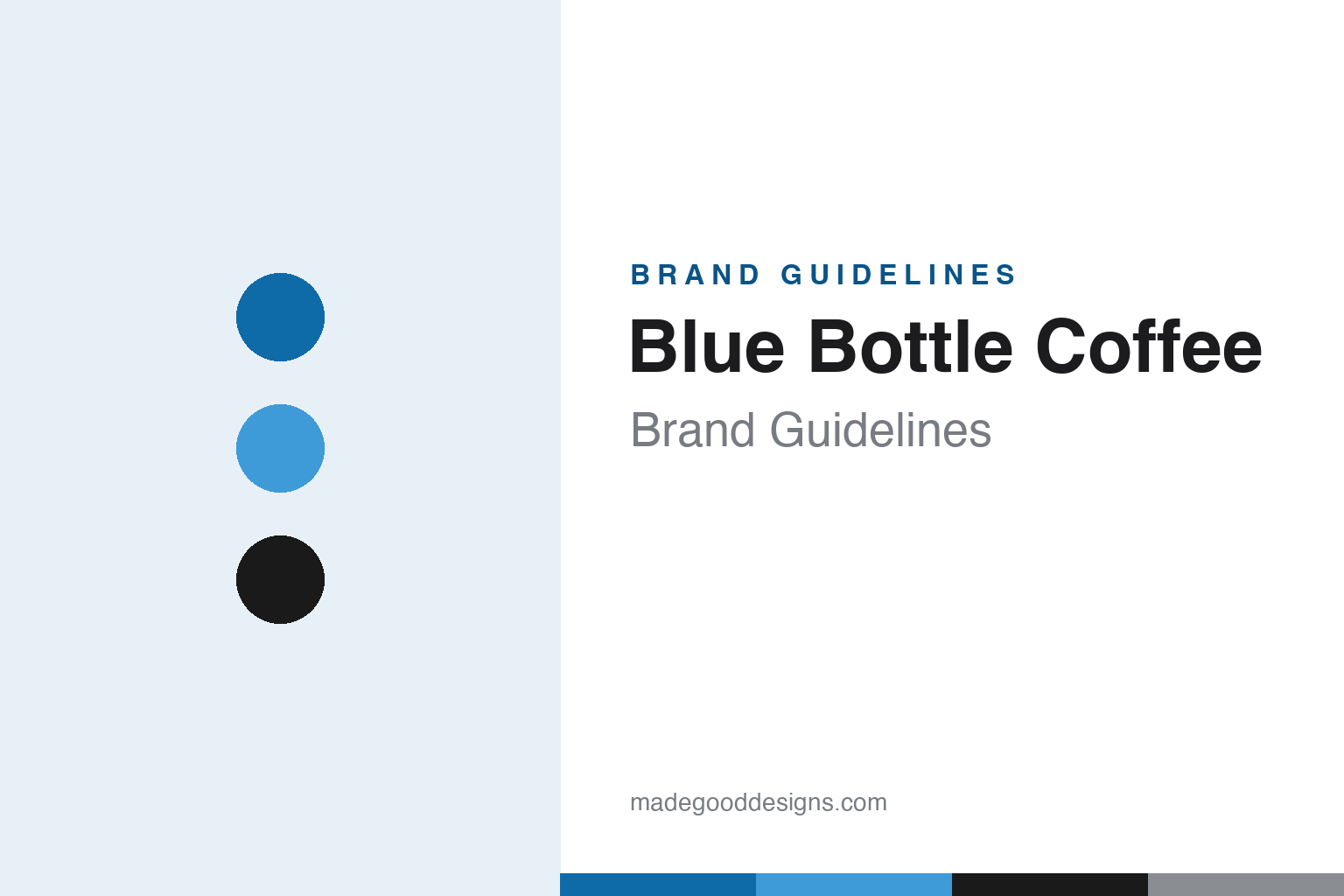
Blue Bottle Coffee Brand Guidelines
One little blue bottle, oceans of white space — the icon that defined third-wave coffee minimalism.
Aa
Two constants: one blue against white and a clean, geometric sans. Abstract homage — not the Blue Bottle wordmark or bottle icon.
One little bottle
Blue Bottle made minimalism the language of specialty coffee.
Blue Bottle Coffee is a lesson in the power of one simple icon and a lot of white space. The brand is built around a single, minimalist blue-bottle silhouette — a tiny, calm mark set against generous fields of white — which became the visual shorthand for the whole third-wave specialty coffee movement: precise, design-forward, quietly premium. Where older coffee brands piled on badges and warmth, Blue Bottle stripped everything back to a single bottle, and that restraint is the identity. (Honest caveats: the exact designer of the logo is not firmly documented — and the often-repeated “Pearlfisher packaging” credit could not be verified — so we don’t attribute it; no official brand hex or typeface is published either, so the blue and type here are approximate.)
The origin fits the aesthetic. Blue Bottle was founded in 2002 by W. James Freeman in Oakland, California (a common error is to say San Francisco — it was Oakland). Freeman was a struggling clarinet player who roasted tiny batches — famously about six pounds at a time — for same-day freshness and sold at farmers’ markets before opening cafés. The name is a piece of coffee history: it references “The Blue Bottle Coffee House,” one of Europe’s earliest cafés, in Vienna. The founding story — freshness obsession, small batches, a musician’s eye for craft — set up a brand that treats coffee as a design object.
On ownership, the current picture matters. Nestlé acquired a majority stake — about 68% — in September 2017 (for roughly $500 million); crucially, that was a majority stake, not a full buyout. And more recently, in 2026 Nestlé sold Blue Bottle’s global retail operations to Centurium Capital — so describing Blue Bottle as simply “Nestlé-owned” is now out of date. What’s stayed constant through the ownership changes is the design: one blue bottle, endless white space, and a minimalist confidence that reshaped how coffee brands look.
Colour
Blue Bottle lives in one blue on white. Click a swatch to copy the hex.
Blue Bottle’s palette is radically simple: one blue against white. A single calm, cool blue (the bottle) sits in generous white space, with ink-black type for contrast — no warm browns, no badges, no clutter. That restraint reads as clean, precise, modern and premium, and it deliberately distances the brand from the cosy, rustic look of traditional coffee. The white space is as much a brand asset as the blue: it signals confidence and craft, letting the single icon breathe. The honest caveat: Blue Bottle publishes no official public brand hex — the blue here is an approximation, not a confirmed spec.
The lesson is the confidence of restraint. Blue Bottle proves that one colour, one icon and a lot of white space can create a premium, instantly recognisable identity. For designers, it’s a reminder that minimalism — used with conviction — projects craft and quality more powerfully than decoration. The takeaways: commit to a single colour and icon and let white space do the work; use restraint to signal premium craft; and treat specific hexes as approximate when no official spec is published.
Typography
The wordmark is a clean, geometric sans — calm and precise.
Blue Bottle’s clean, geometric sans wordmark is calm and precise — restrained, evenly weighted letters that read as modern, considered and quietly premium, exactly matching the minimalist bottle and the white space around it. There’s no flourish and no warmth-signalling script; the type is understated on purpose, letting the single blue icon be the hero. It’s the typographic equivalent of a well-made pour-over: careful, unfussy and confident. (Because no official typeface is documented, the honest description is “a clean, geometric sans,” not a named font.) The type behaves like the brand: calm, precise and minimal — craft expressed through restraint.
Aa
A clean, geometric sans — calm and precise. (Specimen set in Jost, a geometric sans in the spirit of Blue Bottle’s minimalism; the real face is undocumented.)
Restraint as strategy
Blue Bottle showed that less can define a category.
Blue Bottle is a lesson in using minimalism to define a category. By reducing its identity to a single blue bottle floating in white space, the brand didn’t just look clean — it set the visual template for the entire third-wave coffee movement, signalling craft, precision and premium quality through what it left out. That restraint made Blue Bottle instantly recognisable and endlessly imitated, and it proved that a confident minimalist identity can feel more luxurious and more modern than any amount of ornament. The design says “we obsess over the details” without a word.
For designers and brand-builders, Blue Bottle offers a clear takeaway: disciplined minimalism is a powerful, ownable strategy. The lessons: reduce the identity to one strong icon and one colour, and protect the white space around them; use restraint to communicate craft and premium quality; and hold that discipline consistently so the simplicity reads as confidence, not emptiness. It’s also a reminder to keep the facts precise — Blue Bottle was founded in 2002 by James Freeman in Oakland (not San Francisco), named after Vienna’s historic Blue Bottle coffee house; Nestlé took a ~68% majority stake in 2017 (not a full buyout), and sold the retail operations to Centurium in 2026; and the exact logo designer isn’t firmly documented. Blue Bottle made less into a language — proof that restraint can define a whole category.
Explore & save
Keep Blue Bottle Coffee’s identity on hand — save it to a board in the Made Good inspiration library.
Blue Bottle identity set
Pin the one-blue palette and the minimalist spirit to your own board.


