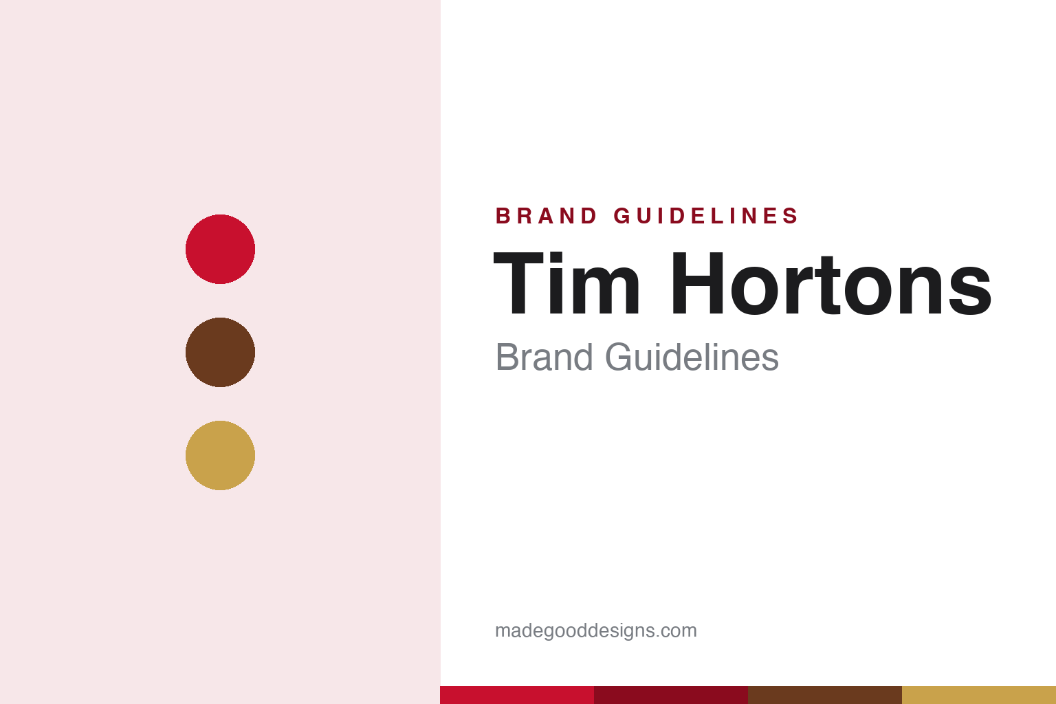
Tim Hortons Brand Guidelines
A red cursive wordmark, a dropped apostrophe and a hockey legend — Canada in a coffee cup.
Aa
Two constants: a red palette and a cursive script. Abstract homage — not the Tim Hortons wordmark.
The missing apostrophe
Tim Hortons dropped its apostrophe for a very Canadian reason.
Tim Hortons is a Canadian institution with a couple of brilliant brand details, and the sharpest is punctuation. The chain began as “Tim Horton’s” — a possessive, with an apostrophe — but the apostrophe was dropped (around 1993) because Quebec’s French-language sign law (Bill 101) discouraged English-style possessive apostrophes on signage; standardising on one bilingual-friendly wordmark was easier. So the legal name is “Tim Hortons,” with no apostrophe — a small design decision driven by Canadian language politics, and exactly the kind of detail a brand-guidelines piece should get right. (Honest caveats: no official brand hex or wordmark typeface is publicly documented, so the red and type here are approximate.)
The founding is pure Canadiana. Tim Hortons opened on May 17, 1964, in Hamilton, Ontario, founded by Tim Horton, the NHL defenceman (Toronto Maple Leafs and others). A careful correction: the 1964 co-founder was Jim Charade — Ron Joyce, the former policeman usually associated with the brand, joined a little later (a full partner by 1967) and built it into an empire, buying out the Horton family after Tim Horton died in a 1974 car crash. From there it grew into a national symbol, spawning its own vocabulary: “Timmies,” the “Double-Double” (two creams, two sugars), and the beloved annual “Roll Up the Rim to Win” promotion (launched 1986).
The visual identity is the red cursive wordmark — a casual, handwritten “Tim Hortons” in the brand’s signature red. Early logos (1964–85) used stacked ovals with “Donuts” and a brown-and-yellow ribbon; the pure red script emerged around 1987–90, and a 2018 refresh deepened the red while keeping the letterforms. On ownership, the fact people debate: Tim Hortons is owned by Restaurant Brands International (RBI), formed when Burger King acquired it in 2014 (backed by 3G Capital) — a deal that sparked ongoing “a Canadian icon, now foreign-controlled” debate.
Colour
Tim Hortons lives in red. Click a swatch to copy the hex.
Tim Hortons’ palette is dominated by its signature red, warmed by coffee-brown and (in heritage versions) gold and cream. The red is bold, friendly and unmistakably “Tims” — it carries the cursive wordmark and anchors the whole identity, from cups to storefronts to the “Roll Up the Rim” promotion. Warm brown ties it to coffee and doughnuts, while the overall feel is approachable and everyday rather than premium — exactly right for a mass-market Canadian institution. The honest caveat: Tim Hortons publishes no official public brand hex — the red here is an approximation sampled from packaging, not a confirmed spec.
The lesson is a single ownable colour for a national brand. Tim Hortons’ red is so consistent that Canadians recognise it instantly. For designers, it’s a reminder that a bold, consistent primary colour can carry a mass-market brand and become a cultural signal in itself. The takeaways: own one bold, friendly colour (Tims red) across every touchpoint; pair it with warm, everyday tones that match the product; and treat specific hexes as approximate when no official spec is published.
Typography
The wordmark is a red cursive script — casual and familiar.
Tim Hortons’ red cursive script wordmark is casual and familiar — a relaxed, handwritten-style “Tim Hortons” that reads as friendly, approachable and everyday, exactly matching a beloved mass-market coffee-and-doughnut chain. The script feel (not a rigid corporate sans) gives it warmth and personality, like a signature, and the bold red makes it pop on cups and signs. It’s type designed to feel like a familiar friend, not a premium boutique — which is precisely Tim Hortons’ place in Canadian life. (Because no official typeface is documented, the honest description is “a red cursive script,” not a named font.) The type behaves like the brand: casual, warm and familiar — Canada’s everyday coffee.
Aa
A red cursive script — casual and familiar. (Specimen set in Kaushan Script, a brush script in the spirit of the Tim Hortons wordmark; the real lettering is custom.)
A brand as national identity
Tim Hortons became shorthand for Canada itself.
Tim Hortons is a lesson in a brand becoming part of national identity. Through a bold red script, a hockey-legend founding, and a homegrown vocabulary — “Timmies,” the “Double-Double,” “Roll Up the Rim” — the chain wove itself so deeply into Canadian daily life that it functions as cultural shorthand for the country. Even its quirks are on-brand: dropping the apostrophe for Quebec’s language law is a very Canadian design decision. That cultural saturation is the brand’s superpower, and it’s exactly why the debate over its foreign (RBI/3G) ownership strikes such a nerve — people feel they own a piece of Tims.
For designers and brand-builders, Tim Hortons offers a clear takeaway: consistency and cultural fluency can turn a brand into an identity. The lessons: own a bold, consistent colour and a warm, human wordmark (the red script); build and celebrate a brand vocabulary and rituals (Double-Double, Roll Up the Rim) that customers adopt as their own; and understand that deep cultural belonging is both a huge asset and a responsibility. It’s also a reminder to keep the facts precise — the legal name is “Tim Hortons” (no apostrophe), dropped ~1993 over Quebec’s Bill 101; it was founded in 1964 in Hamilton by hockey player Tim Horton (1964 co-founder Jim Charade; Ron Joyce built the empire); Tim Horton died in 1974; and it’s owned by Restaurant Brands International after the 2014 Burger King merger. Tim Hortons became shorthand for Canada — proof that cultural belonging can be a brand’s greatest asset.
Explore & save
Keep Tim Hortons’s identity on hand — save it to a board in the Made Good inspiration library.
Tim Hortons identity set
Pin the Tims-red palette and the red-script spirit to your own board.


