Intel Brand Guidelines
A logo with a letter that fell below the line — and a jingle so famous the product inside became the brand.
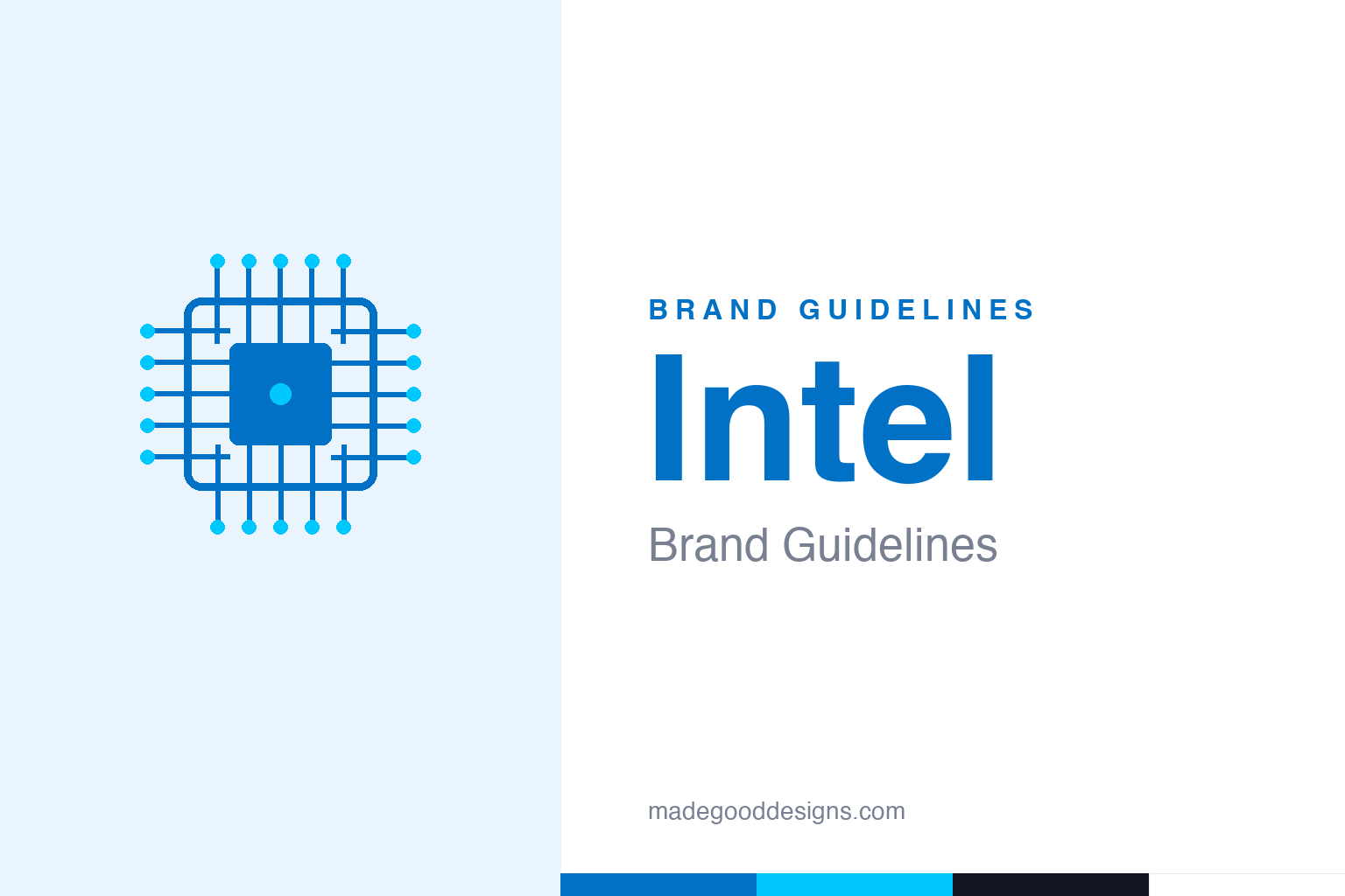
An abstract chip die with bond pads and a spark dot — the silicon, not the mark. Deliberately not the Intel wordmark, the dropped-e, or the swoosh.
The letter that dropped
Intel’s founding logo broke a small typographic rule on purpose.
From 1968, the Intel wordmark set the name in a rounded custom type with the lowercase ‘e’ dropped below the baseline — the mark’s signature quirk, used until the end of 2005. It’s often retold as a symbol of ‘thinking outside the norm,’ but that’s lore, not a documented rationale; what’s certain is that a single lowered letter gave a technology company a human, slightly playful signature. The founders’ names appear on it, and it carried Intel from an eight-person start-up to the company whose chips ran most of the world’s PCs.
Intel Inside
The most successful ingredient-branding campaign in history.
In 1991, marketing chief Dennis Carter launched ‘Intel Inside’ — a co-operative program that paid PC makers to display an Intel badge, turning an invisible component into a reason to buy. The famous five-note ‘bong’ followed in 1994 (composed by Walter Werzowa), not 1991 — a common conflation worth avoiding. Together the badge and the sound did something rare: they made consumers care which chip was inside a beige box. For years the swirl badge ran alongside the classic dropped-e wordmark, an ingredient mark and a corporate mark working in tandem.
Flattening the swoosh
Two rebrands, twelve years apart, reset the identity for the screen.
In 2006 (studio FutureBrand) Intel returned the ‘e’ to the baseline and wrapped the wordmark in a swirl/swoosh with the tagline ‘Leap Ahead.’ Then, in September 2020, the studio Red Peak stripped the swoosh away entirely: a flat, geometric wordmark with the classic dot on the ‘i’ recast as a small blue square — informally ‘the spark’ — plus a brighter palette and a new proprietary typeface. It’s a textbook modern-tech arc: from ornament (the swoosh) to essentialism (a flat wordmark and a dot), tuned for app icons and dark UI.
Moore’s Law, made visible
Intel’s identity has always been an argument about progress.
Intel was built on Moore’s Law — co-founder Gordon Moore’s 1965 observation that transistor counts roughly double at regular intervals — and the brand keeps restating that idea of relentless advancement. The 4004, the first commercial microprocessor, shipped in 1971 with about 2,300 transistors; today’s chips carry billions. Each identity update mirrors the same trajectory the company sells: smaller, cleaner, faster. That’s why an abstract chip die is the honest homage — the product itself, a lattice of traces converging on a core, is a better emblem of Intel than any wordmark. It also explains the brand’s restraint: when your product is invisible, buried inside someone else’s machine, the identity has to do the work of making that hidden thing feel valuable. ‘Intel Inside’ was a design solution to an economic problem, and the flat blue mark that followed carries the same job — to stand for engineering the buyer never sees. Few technology brands have had to argue so hard, for so long, that what matters most is the part you can’t look at.
The closing thought is simple, and it is the one Intel keeps proving: build on something real. An identity anchored in genuine substance — authentic heritage, a true point of view, a product worth believing in — will always outlast one built on styling alone. The symbol is the visible part, but its power comes from what stands behind it. Choose an idea with real substance, give it a distinctive and honest form, and commit to it fully, and you create a mark that means something — and, year after year, keeps meaning it.
Type: Intel One
A custom family, with an open-source developer face spun off.
The 2020 system introduced Intel One, a proprietary geometric sans, replacing earlier custom faces — Neo Sans Intel (2006) and Intel Clear (2014, Dalton Maag). (There’s no evidence Intel used Neue Haas Grotesk as its corporate face — a common misattribution.) Intel also released Intel One Mono, an open-source developer typeface. The specimen below is set in a clean geometric sans in that precise, engineered spirit.
Leap ahead
Geometric, even, forward-leaning — type that reads as engineering, not decoration. (Specimen set in Archivo, standing in for Intel One.)
Intel & Energy Blue
A trustworthy blue with a bright accent. Click a swatch to copy the hex.
The primary is Intel Blue #0071C5 (a darker #0068B5 also circulates), with a verified bright Energy Blue #00C7FD introduced in the 2020 palette. Note the 2020 blue is simply ‘Intel Blue,’ not ‘Classic Blue’ (which was Pantone’s 2020 colour of the year — a separate thing). Treat exact hexes as close reconstructions. Copy the working values below.
Explore & save
Keep the chip-die idea on hand — save it to a board in the Made Good inspiration library.
Intel identity set
Pin the silicon idea, the blue-and-energy-blue and the geometric type to your own board.