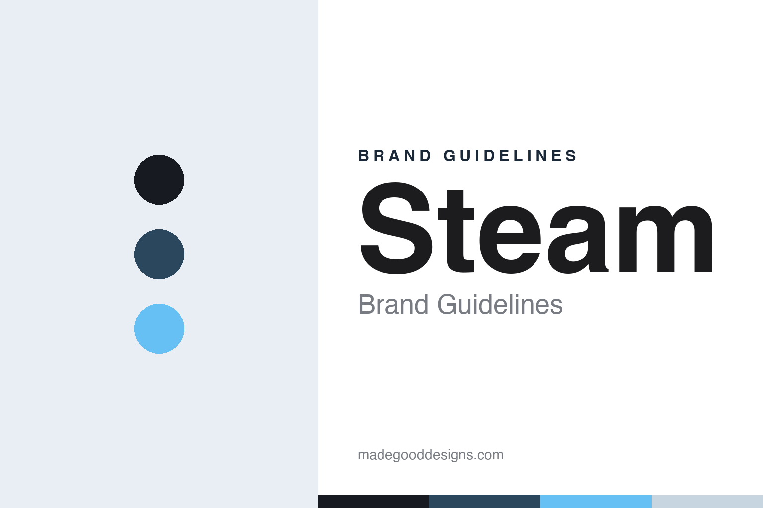
Steam Brand Guidelines
A circular piston, a deep-navy interface and a light-blue glow — the storefront that runs PC gaming.
Aa
Two constants: a deep-navy-and-blue palette and a clean, techy sans. Abstract homage — not the Steam piston emblem or wordmark.
A piston in a circle
Steam’s emblem puts a steam-engine pun at the centre of PC gaming.
Steam’s mark is a circular mechanical emblem — a piston-and-crank linkage, the kind that drives a steam engine, read as a visual pun on the name “Steam.” (An honest caveat: that steam-engine symbolism is the widely-shared enthusiast reading; Valve has published no official meaning, so treat it as “the common interpretation,” not a stated fact.) The “STEAM” wordmark is custom lettering, not a downloadable typeface. Over time the logo shifted from an olive-green, skeuomorphic 2003 look to the flat, deep-blue, geometric mark used today (the blue shift is widely dated to around 2014, refined flatter since).
The single most important distinction: Steam is not Valve. Steam is the store and platform; Valve Corporation is the company that makes it — and Valve has its own corporate logo, “Mr. Valve,” a man with a valve in his head (from the Half-Life intro), which is separate again from the lambda (λ), the symbol of the game Half-Life. Keep all three apart. Valve was founded on August 24, 1996 in Kirkland, Washington, by Gabe Newell and Mike Harrington (both ex-Microsoft); Half-Life shipped in 1998; and Steam launched in 2003, originally just a client to patch and update Valve’s own games (notably Counter-Strike) before it grew into the dominant PC storefront. On ownership, one clean fact: Valve is private, independent and has never gone public, with Gabe Newell as majority owner and the rest held internally.
Colour
Steam runs on deep navy and blue. Click a swatch to copy the hex.
Steam’s palette is deep navy blues with a light-blue accent — the dark, low-glare interface colours of the client itself, from near-black navy through steel blue to a bright sky-blue highlight, over off-white text. It’s a palette built for a screen you stare at for hours: dark backgrounds reduce eye strain and make game art (the store’s real content) pop, while the light-blue accent guides the eye to links and actions. The honest caveat: Valve publishes no confirmed public brand-colour kit, so the values here (navy around #171A21 and #1B2838, steel #2A475E, accent #66C0F4) are read from the interface and should be treated as approximate, not an official spec.
The lesson is a palette designed around the interface, not a logo. Steam’s dark navy and blue exist first to make a content-heavy app comfortable and legible, and the brand colour follows from that functional choice. For designers of software and platforms, it’s a reminder that your palette is a usability decision as much as a branding one: dark UI reduces fatigue and lets imagery lead, and a single bright accent does the wayfinding. The takeaways: choose colours that serve how the product is actually used; let one accent carry interactivity; and, as always, treat specific hexes as approximate when the brand keeps no public colour spec.
Typography
The wordmark is a clean, techy sans — the interface, in type.
Steam’s clean, custom wordmark matches the platform: modern, precise and unfussy, the typographic equivalent of a well-built interface. It doesn’t try to charm; it signals reliability and function, which is exactly right for software millions of people live inside. Worth noting for designers: the crisp UI type you see across the Steam client is Motiva Sans, Steam’s interface typeface — but that is the UI font, not the logotype, which is bespoke lettering. The distinction matters because the logo and the interface do different jobs: the wordmark identifies, the UI type communicates at length. (Because the logotype is custom, the honest description is “a clean, techy sans,” not a named font — spotter guesses are unverified.) Together they give Steam a coherent, engineered, trustworthy feel.
Aa
A clean, techy sans — engineered and legible. (Specimen set in Chakra Petch, a squared techy sans in the spirit of Steam’s look; the logotype is custom and the UI font is Motiva Sans.)
Function as the brand
Steam built its identity around utility — and won PC gaming.
Steam is a case study in identity built around function. The piston emblem, the deep-navy interface palette and the clean wordmark all express the same thing — a reliable, engineered piece of software that gets out of the way and lets games (and their art) take centre stage. That utility-first identity, plus assets like the lambda (from Half-Life), the seasonal sale culture and the Steam Deck, has made Steam the default home of PC gaming, run by a company — Valve — that stayed private and product-obsessed rather than chasing a corporate look. The brand’s restraint is the point: Steam doesn’t need a loud logo because the platform is the brand.
For designers, Steam offers several lessons. First, separate your marks and know what each is for — Steam (the platform), Valve (the company, “Mr. Valve”) and the lambda (the game) are three distinct identities, and conflating them is the classic mistake. Second, let function drive the aesthetics — a dark, comfortable palette and a clean wordmark serve the way people actually use the product. Third, distinguish logotype from interface type — the bespoke wordmark identifies, while Motiva Sans does the reading. And fourth, restraint can signal confidence — a utilitarian identity, consistently applied, can dominate a category. Steam turned a steam-engine pun and a dark-blue interface into the most recognisable storefront in gaming — proof that when the product is great, the branding can afford to simply work.
Explore & save
Keep Steam’s identity on hand — save it to a board in the Made Good inspiration library.
Steam identity set
Pin the deep-navy palette and the type spirit to your own board.


