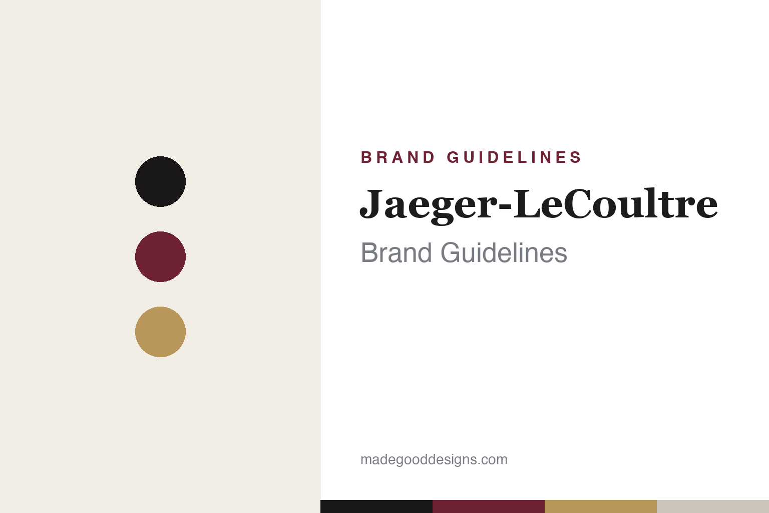
Jaeger-LeCoultre Brand Guidelines
An interlaced JL, a flip-case icon and a burgundy accent — the watchmaker’s watchmaker.
Aa
Two constants: a burgundy-and-gold palette and a high-contrast serif. Abstract homage — not the JL monogram or wordmark.
The watchmaker’s watchmaker
Jaeger-LeCoultre supplied the greats — and made an Art Deco icon of its own.
Jaeger-LeCoultre’s identity has two graphic elements: the “Jaeger-LeCoultre” wordmark — a high-contrast serif with a signature flourish, the “J” descender flowing into an underline that loops beneath the final “e” — and the interlaced “JL” monogram (two mirror-image letters). (Honest caveats: the wordmark is custom/proprietary, so don’t name a font; and the JL monogram in its fixed modern form dates to 1960, not the founding era.) But JLC’s deepest identity is a reputation: “the Watchmaker of Watchmakers,” earned by supplying movements and ébauches to the greats — its Calibre 920/2120 powered the Audemars Piguet Royal Oak, the Patek Philippe Nautilus and the Vacheron Constantin 222, and it supplied Cartier too (1,200+ calibres, 400+ patents).
The house traces to 1833, when Antoine LeCoultre founded LeCoultre & Cie in Le Sentier, in the Vallée de Joux. The “Jaeger-LeCoultre” name was formalised in 1937, after a collaboration begun in 1903 between Jacques-David LeCoultre and the Parisian (Alsatian-born) watchmaker Edmond Jaeger — so the partnership roots are ~1903 and the name is 1937. Its icons are extraordinary: the Reverso (1931), an Art Deco masterpiece whose case flips over in its cradle to protect the crystal — created after businessman César de Trey was challenged by British army officers playing polo in India, with designer René-Alfred Chauvot filing the swivel patent on 4 March 1931; the Atmos clock, which runs on tiny temperature and pressure changes (invented in 1928 by Jean-Léon Reutter and industrialised by JLC from 1935 — remarkable, but not literal perpetual motion); and the Calibre 101 (1929), the world’s smallest mechanical movement, still made. JLC is part of the Richemont group.
Colour
JLC pairs burgundy with gold. Click a swatch to copy the hex.
Jaeger-LeCoultre’s core is monochrome black-and-white, with the wordmark adapting to dial metals (silver, gold, grey), and a deep burgundy/oxblood that appears in its boutique interiors and packaging — a rich, refined accent that reads as heritage and quiet luxury. The honest caveat: JLC publishes no official brand hex, so any burgundy or gold value here is approximate and reconstructed. The restraint is deliberate: for a house revered by other watchmakers, the palette signals seriousness and craft, and the warm burgundy adds just enough character to feel distinguished without being loud. It’s the chromatic equivalent of understated excellence.
The lesson is a refined accent against a restrained base. JLC’s black-and-white core, warmed by a considered burgundy, reads as heritage luxury — one distinctive accent doing the work of a whole palette. For designers, it’s a reminder that in premium categories you can stay largely monochrome and still feel rich and ownable by choosing a single, characterful accent (a deep burgundy, a warm gold) and using it consistently across environments and packaging. The takeaways: anchor a luxury identity in a restrained base; add one refined accent for warmth and recognition; and present specific hexes as approximate when no official palette is published.
Typography
The wordmark is a flourished serif — craft made visible.
Jaeger-LeCoultre’s high-contrast serif wordmark, with its fine hairlines and signature looping flourish, is craft made visible — elegant, precise and a little artful, exactly right for the watchmaker other watchmakers admire. The flourish (the “J” flowing into an underline) gives it a distinctive, hand-crafted character without sacrificing legibility, while the high stroke-contrast reads as refinement and heritage. Paired with the interlaced JL monogram, it’s a mark that feels bespoke and considered — the typographic equivalent of a beautifully finished movement. (Because the face is custom, the honest description is “a high-contrast serif,” not a named font.) The type embodies JLC’s dual identity: technically masterful and quietly elegant.
Aa
A high-contrast serif with a flourish — elegant and crafted. (Specimen set in Playfair Display, a high-contrast serif in the spirit of the Jaeger-LeCoultre wordmark; the real face is custom.)
Substance as the brand
Jaeger-LeCoultre’s identity is backed by genuine technical mastery.
Jaeger-LeCoultre is a lesson in an identity backed by real substance. The refined wordmark, JL monogram and burgundy accent are elegant, but the brand’s deepest identity is its reputation: “the Watchmaker of Watchmakers,” a house that literally supplied the movements powering its most illustrious rivals, and that created genuine icons — the Reverso, the Atmos, the Calibre 101. That substance is what the understated identity points to: JLC doesn’t need a loud logo because its technical mastery speaks for itself, and its restraint signals confidence in that mastery.
For designers, JLC offers a clear takeaway: an understated identity is most powerful when it’s backed by genuine excellence. The lessons: restraint (a refined serif, a monochrome base, one burgundy accent) reads as confidence when the substance is real; a reputation or capability can be your deepest brand asset (“the watchmaker’s watchmaker” is worth more than any tagline); and iconic products (the flip-case Reverso, the near-perpetual Atmos) can anchor recognition better than a graphic mark. It’s also a reminder to keep the facts precise — the JL monogram is from 1960, the brand name from 1937 (the house from 1833), the Reverso’s polo origin came via de Trey and Chauvot, and the Atmos was invented by Reutter. Jaeger-LeCoultre turned real technical mastery into a quietly authoritative identity — proof that the strongest brands are backed by genuine substance.
Explore & save
Keep Jaeger-LeCoultre’s identity on hand — save it to a board in the Made Good inspiration library.
Jaeger-LeCoultre identity set
Pin the burgundy-and-gold palette and the type spirit to your own board.


