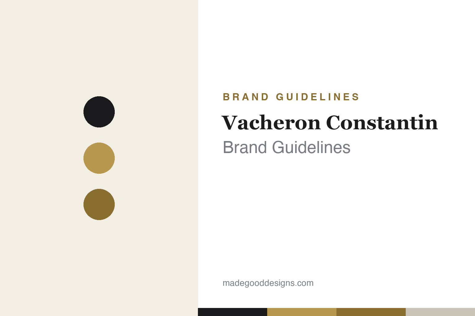
Vacheron Constantin Brand Guidelines
A Maltese cross from a movement part, and 1755 — the oldest watchmaker in continuous operation.
Aa
Two constants: a black-and-gold palette and an engraved serif. Abstract homage — not the Vacheron Constantin cross or wordmark.
A cross from a movement part
Vacheron Constantin’s symbol is a real watch component — and its date is the whole story.
Vacheron Constantin’s emblem is the Maltese cross — and, satisfyingly, it comes from a real movement component: a Maltese-cross-shaped part of the stopwork (the Geneva stop) mounted on the mainspring barrel to limit winding and keep the spring’s tension — and therefore the watch’s rate — constant. It was adopted as the company mark around 1877 (official emblem c.1880). So it’s a mechanism, not religious heraldry — describe the part, not the Knights of Malta. The “Vacheron Constantin” wordmark is a fine, engraved-style serif; the exact typeface is undocumented, so treat any font name as unverified.
The founding date is the identity. Vacheron Constantin was founded in 1755 (its founding contract dated 17 September 1755) by Jean-Marc Vacheron in Geneva, and it is the oldest watch manufacturer in continuous, uninterrupted operation — a careful claim (not “the oldest ever,” but the one that has never stopped). The “Constantin” came in 1819, when François Constantin partnered with the founder’s grandson; his letter of 5 July 1819 gave the house its motto: “Do better if possible, and that is always possible.” Its icons include the Maltese cross itself, the Overseas (sports/travel line), the Patrimony and Traditionnelle (classic dress watches), and Les Cabinotiers (bespoke grand complications) — including the record-setting Ref. 57260 (57 complications), once the most complicated watch ever (since surpassed by VC’s own 2024 Berkeley Grand Complication). Vacheron Constantin has been part of the Richemont group since 1996 and is one of the “Holy Trinity” of watchmaking with Patek Philippe and Audemars Piguet.
Colour
Vacheron Constantin lives in black and gold. Click a swatch to copy the hex.
The palette is classic haute horlogerie: black, white and gold, with no loud proprietary colour — restraint that lets 270 years of craftsmanship (and the gleam of the Maltese cross) speak. The honest caveat: Vacheron Constantin publishes no official brand hex, so the warm gold and ink values here are approximate. The point of the palette is timelessness and prestige: black and gold read as heritage and rarity, and the absence of a trendy signature colour signals a house whose confidence rests on being the oldest continuously operating watchmaker in the world. It’s a palette designed to look as at home in 1755 as today.
The lesson is a palette that expresses heritage and rarity. Vacheron Constantin’s restrained black-and-gold conveys 270 years of continuous history — colour used to signal timelessness rather than fashion. For designers, it’s a reminder that for the most heritage-rich brands, a classic, understated palette is a strength: it won’t date, and it lets the story (and the products) carry the prestige. The takeaways: choose a timeless palette when longevity is your core asset; let heritage, not colour trends, do the talking; and treat specific hexes as approximate when a house keeps no public colour spec.
Typography
The wordmark is an engraved serif — timeless and precise.
Vacheron Constantin’s engraved-style serif wordmark looks exactly as a 1755 Geneva house should: fine, precise and timeless, as if inscribed on a movement bridge. The delicate serif reads as heritage, craftsmanship and rarity, while its restraint keeps it from ever looking fashionable or dated — appropriate for the oldest continuously operating watchmaker in the world. Paired with the Maltese cross, it forms an identity that feels both mechanical (the cross is a real part) and refined (the engraved letters). (Because the exact face is undocumented, the honest description is “an engraved-style serif,” not a named font.) The typography behaves like the brand: precise, understated and confident in an unbroken 270-year history.
Aa
A fine, engraved-style serif — timeless and precise. (Specimen set in Marcellus, a refined inscriptional serif in the spirit of the Vacheron Constantin wordmark; the real face is custom.)
270 unbroken years
Vacheron Constantin’s identity is built on continuity itself.
Vacheron Constantin is a lesson in an identity built on continuity. Everything — the mechanical Maltese cross, the engraved serif, the black-and-gold restraint — points to one extraordinary fact: this is the oldest watch manufacturer in continuous, uninterrupted operation, founded in 1755 and never stopped since. That heritage, plus its status in the “Holy Trinity” and its record-setting grand complications (the 57-complication Ref. 57260 and beyond), is the brand’s deepest asset, and the understated identity is designed to let that history resonate. The Maltese cross is the perfect emblem for it: not a decorative symbol, but a genuine watch component, tying the brand’s image directly to the mechanics it has mastered for centuries.
For designers, Vacheron Constantin offers a distinctive takeaway: when heritage and continuity are your core assets, build an identity that expresses them and won’t date. The lessons: a timeless, restrained palette and a refined serif protect a heritage brand from looking fashionable or ephemeral; a symbol rooted in your actual craft (a real movement part, not an arbitrary mark) gives the identity authenticity and depth; and a precise, verifiable claim (“oldest in continuous operation,” not “oldest ever”) is more powerful — and more honest — than a vague superlative. Vacheron Constantin turned 270 unbroken years and a movement component into one of watchmaking’s most dignified identities — proof that continuity, expressed with restraint, can be the whole brand.
Explore & save
Keep Vacheron Constantin’s identity on hand — save it to a board in the Made Good inspiration library.
Vacheron Constantin identity set
Pin the black-and-gold palette and the type spirit to your own board.


