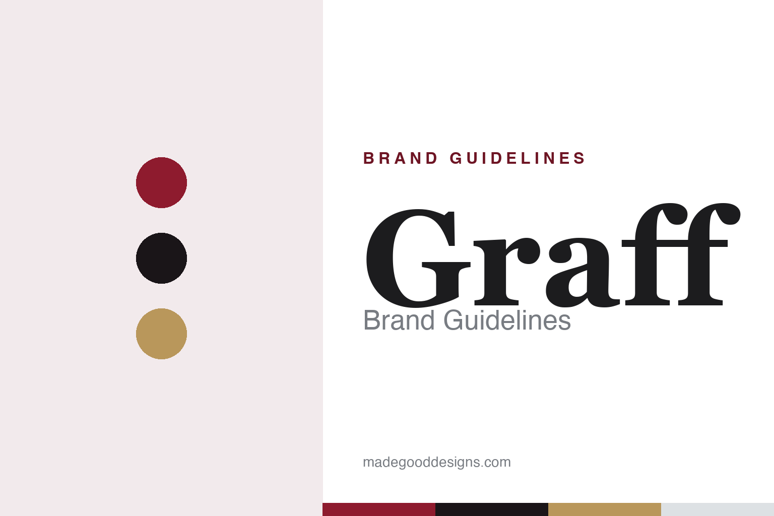
Graff Brand Guidelines
“The most fabulous jewels in the world” — a diamond house that owns the whole pipeline.
Aa
Two constants: a red-and-black palette and an inscriptional all-caps serif. Abstract homage — not the GRAFF wordmark.
From the mine to the finger
Graff controls the whole diamond pipeline — and cuts the world’s greatest stones.
Graff’s identity is the “GRAFF” all-caps wordmark in a classic, high-contrast serif — restrained, luxury-house styling (the exact typeface is undocumented, so treat font names as guesses). Its positioning is stated plainly in its tagline: “The Most Fabulous Jewels in the World.” And behind that boast is a genuine differentiator: vertical integration, or “mine-to-market.” Unlike most jewelers, Graff controls the entire pipeline — sourcing rough diamonds, cutting and polishing them in its own workshops (Antwerp, Johannesburg), designing and making the jewelry (London), and selling it in its own boutiques. The “House of Graff” does every stage, from mine to finished piece.
That control has let Graff handle some of the most extraordinary stones ever found. The Graff Lesedi La Rona was cut from a 1,109-carat rough (from Botswana) that Graff bought — 18 months of work yielded 67 stones, including a 302.37-carat principal, the largest square emerald-cut diamond of its kind. The Graff Pink (a 23.88-carat Fancy Vivid Pink) and the Lesotho Promise (from a 603-carat rough, cut into 26 stones) are others, along with the extraordinary Hallucination watch (~$55 million). The house was founded in 1960 by Laurence Graff (born 1938 in London’s East End; he left school at 15 and apprenticed to a jeweler) — a genuine rags-to-riches story that earned him the nicknames “the King of Diamonds” and “the King of Bling.” Graff remains independent and family-run, with Laurence’s son François Graff as CEO — notably not part of a luxury conglomerate.
Colour
Graff runs on red and black. Click a swatch to copy the hex.
Graff’s brand visuals lean toward red and black with white (and gold on the jewelry) — a bold, confident, high-impact combination that matches a house known for spectacular, record-breaking stones and an unabashedly opulent sensibility. Red gives it drama and richness; black lends authority and lets the diamonds’ brilliance pop. The honest caveat: Graff publishes no official brand hex, so any red-and-black values here are approximate and observed. The palette suits the brand’s character — Graff doesn’t do quiet understatement so much as confident, maximalist luxury, and its bold colours reflect that “most fabulous jewels in the world” swagger.
The lesson is a palette that matches the brand’s attitude. Graff’s bold red-and-black reflects a confident, maximalist house that revels in the biggest and most spectacular diamonds — colour used to project swagger and drama rather than quiet restraint. For designers, it’s a reminder that a palette should match a brand’s actual personality: a bold, confident brand can (and should) look bold. The takeaways: let your colours reflect your brand’s true character (drama and confidence for Graff, not hushed minimalism); use high-impact combinations when the brand earns them; and present specific hexes as approximate when no official palette is published.
Typography
The wordmark is an inscriptional serif — bold and confident.
Graff’s all-caps, high-contrast serif wordmark is bold and confident — inscriptional in feel, like letters carved in stone. The capitals give it authority and permanence, the high stroke-contrast reads as refinement and luxury, and the overall effect is exactly the swagger of a house that calls its jewels “the most fabulous in the world.” It’s restrained enough to be classic yet strong enough to project confidence, matching the bold red-and-black palette and the brand’s maximalist, record-breaking character. (Because the exact face is undocumented, the honest description is “an inscriptional all-caps serif,” not a named font.) The typography behaves like the brand: bold, confident and unmistakably first-class.
Aa
An inscriptional, all-caps serif — bold and confident. (Specimen set in Cinzel, an inscriptional serif in the spirit of the GRAFF wordmark; the real face is custom.)
Substance behind the swagger
Graff’s boldness is backed by real control of the diamond world.
Graff is a lesson in swagger backed by substance. The bold wordmark, the red-and-black palette and the “most fabulous jewels in the world” tagline are confident — even brash — but they’re earned by genuine capability: vertical integration from mine to market, and a track record of buying and cutting the greatest rough diamonds on earth (the Lesedi La Rona, the Lesotho Promise, the Graff Pink). That control is the real brand story: Graff can offer stones no one else can, because it owns every stage of the process. The bold identity simply reflects a house that genuinely operates at the very top of the diamond world.
For designers and brand-builders, Graff offers a clear takeaway: bold branding works when it’s backed by real substance. The lessons: a confident identity and a bold claim (“the most fabulous jewels in the world”) are credible only if the capability is real — Graff’s mine-to-market integration and record-breaking stones make the swagger convincing; a genuine differentiator (vertical integration) is a stronger brand story than any slogan; and an independent, founder-built house (Laurence Graff’s rags-to-riches rise) can be a distinctive asset in a conglomerate-dominated field. It’s also a reminder to be accurate — Graff buys and cuts the great rough itself (it doesn’t merely resell), it’s independent and family-run, and the Delaire Sunrise is a yellow diamond, not the pink. Graff turned real control of the diamond pipeline into a bold, confident identity — proof that swagger is only as good as the substance behind it.
Explore & save
Keep Graff’s identity on hand — save it to a board in the Made Good inspiration library.
Graff identity set
Pin the red-and-black palette and the type spirit to your own board.