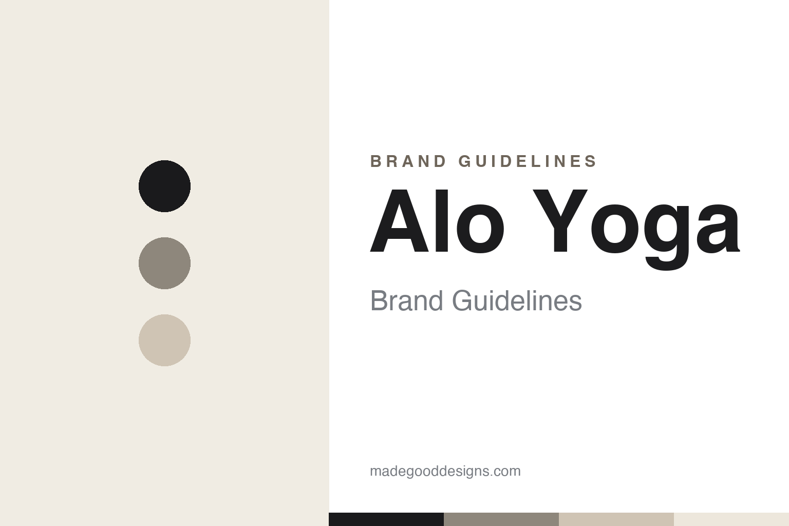
Alo Yoga Brand Guidelines
A calm lowercase wordmark, Air-Land-Ocean and LA neutrals — yoga wear from studio to street.
Aa
Two constants: a neutral, minimal palette and a calm, rounded sans. Abstract homage — not the Alo wordmark.
Air, land, ocean
Alo built a Lululemon rival on calm minimalism and a mindful name.
Alo Yoga’s identity is calm and minimal: a lowercase, text-only wordmark — “alo” (and “alo yoga”) — set in a clean, rounded geometric sans, with no icon or symbol. All-lowercase and soft, it reads as calm, mindful and approachable, exactly the register of a yoga and wellness brand (the exact typeface is undocumented, so treat font guesses as unverified). The name carries the philosophy: “ALO” stands for Air, Land, Ocean — a nod to mindfulness and a connection to nature (confirmed by Alo’s own materials).
Alo Yoga was founded in 2007 in Los Angeles by Danny Harris and Marco DeGeorge (childhood friends), under their parent manufacturing company Color Image Apparel (which they’d launched back in 1992). Alo grew into a major yoga and athleisure brand — a direct rival to Lululemon — powered heavily by influencer and celebrity marketing: seeding to yogi-influencers, a huge social-media presence, celebrity fans (Taylor Swift, Hailey Bieber, Kendall Jenner), and experiential retail (Alo “sanctuaries”/studios). Its positioning is “studio to street” — apparel (famously leggings) that moves from the yoga mat to everyday LA-cool style — supported by Alo Moves, a subscription yoga/fitness/mindfulness streaming platform (launched around 2016–2017). On ownership: Alo is privately held via Color Image Apparel, with founders Harris and DeGeorge each owning roughly half — it is not publicly traded.
Colour
Alo lives in neutral minimalism. Click a swatch to copy the hex.
Alo’s palette is minimalist and neutral — black, white and soft, muted neutrals (sand, bone, warm grey), an LA-cool, monochrome-leaning aesthetic with earthy tones appearing seasonally. It reads as calm, elevated and wellness-adjacent: understated colours that feel serene and premium rather than loud or sporty, matching the brand’s mindful, “studio to street” positioning. The honest caveat: Alo publishes no official public hex palette, so treat these neutrals as approximate. The restraint is the point — a soft, neutral palette signals calm, taste and versatility (clothes that work from the mat to the café), which is exactly the aspirational LA-wellness feeling Alo sells.
The lesson is a neutral palette that sells a feeling and a lifestyle. Alo’s soft, minimalist neutrals evoke calm, wellness and elevated everyday style — colour used to convey a mindful, aspirational lifestyle rather than athletic performance. For designers, it’s a reminder that a restrained, neutral palette can communicate a whole mood (serenity, taste, versatility) and support a “wear it everywhere” positioning. The takeaways: choose a palette that expresses the lifestyle and feeling your brand sells (calm neutrals for mindful, elevated athleisure); keep it soft and versatile to support “studio to street” wearability; and present specific hexes as approximate when no official palette is published.
Typography
The wordmark is a calm, rounded sans — soft and mindful.
Alo’s calm, rounded, lowercase sans wordmark is soft and mindful — the typographic embodiment of a yoga-and-wellness brand. The all-lowercase treatment feels gentle and unassuming (no shouting capitals), while the rounded, geometric letterforms read as friendly, modern and serene. It’s deliberately quiet and approachable, avoiding the aggressive, performance-driven look of many athletic brands in favour of something calmer and more elevated — “studio to street” rather than “gym.” The minimalism also keeps it versatile and premium, working across leggings, packaging and the brand’s polished social feeds. (Because the exact face is undocumented, the honest description is “a calm, rounded sans,” not a named font.) The typography behaves like the brand: soft, mindful and quietly aspirational.
Aa
A calm, rounded, lowercase sans — soft and mindful. (Specimen set in Quicksand, a rounded geometric sans in the spirit of the Alo wordmark; the real face is undocumented.)
Selling a lifestyle
Alo built a brand on calm, community and LA-wellness culture.
Alo Yoga is a lesson in selling a lifestyle, not just apparel. Its calm lowercase wordmark, mindful “Air, Land, Ocean” name and soft neutral palette all express one aspirational feeling — serene, elevated, LA-wellness cool — and the brand grew by immersing people in that world: influencer and celebrity seeding, a huge social presence, experiential “sanctuary” studios, and the Alo Moves platform. Alo doesn’t just sell leggings; it sells a mindful, aesthetic lifestyle, and every element of the identity (the quiet type, the neutral palette, the “studio to street” idea) reinforces that. It’s branding as a complete, aspirational atmosphere.
For designers and brand-builders, Alo offers a clear takeaway: a coherent lifestyle brand is built by making every element express one aspirational feeling. The lessons: align the name, wordmark, palette and marketing around a single mood (calm, mindful, elevated) so the brand sells a lifestyle, not just a product; a restrained, neutral identity can feel premium and versatile, supporting “wear it everywhere” positioning; and modern growth levers (influencer and celebrity marketing, community, experiential retail, a content platform) can build a lifestyle brand as powerfully as any logo. It’s also a reminder to keep facts precise — “Alo” means Air, Land, Ocean, it was founded in 2007 in LA by Harris and DeGeorge (the 1992 date is the parent, Color Image Apparel), and it’s privately held. Alo turned calm minimalism and LA-wellness culture into a Lululemon rival — proof that selling a coherent lifestyle can be the whole brand.
Explore & save
Keep Alo Yoga’s identity on hand — save it to a board in the Made Good inspiration library.
Alo Yoga identity set
Pin the neutral-minimal palette and the type spirit to your own board.


