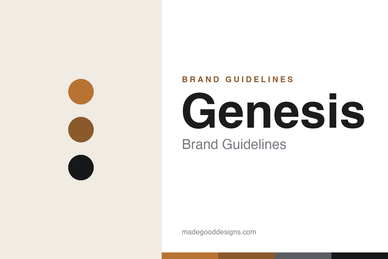
Genesis Brand Guidelines
A winged crest, two-line lamps and a copper glow — Hyundai’s luxury challenger, since 2015.
Aa
Two constants: a copper-and-matte palette and a refined sans. Abstract homage — not the Genesis winged crest or wordmark.
A crest that becomes the car
Genesis designed a winged emblem that flows straight into its cars.
Genesis’ emblem is a winged crest — a shield flanked by two outstretched wings — and, cleverly, the design maps directly onto the car: Genesis says the crest becomes the Crest Grille, and the wings “morph into two lines” that wrap the vehicle and appear as the signature “Quad Lamps” (the double thin-slot head- and tail-lamps). As chief designer Luc Donckerwolke put it, the Quad Lamp graphic is meant to be “the most recognizable, unique signature of Genesis design.” A second motif is the “G-Matrix” — a diamond/lozenge pattern (“light reflecting off an illuminated diamond”) used in the lamps, grille mesh, wheels and interior trim. The wordmark is custom, bespoke lettering (no official typeface is documented, so don’t name a font).
Genesis is a modern brand with a clear origin. It launched as a standalone luxury brand on 4 November 2015, spun off from Hyundai (an important distinction: the earlier Hyundai Genesis luxury sedan, from 2008, seeded the name and was renamed the Genesis G80 when the marque went independent — so the brand dates to 2015, not the 2008 car). Its design language is “Athletic Elegance,” and it positions itself as a luxury challenger to the German premium brands, with a lineup of G70/G80/G90 sedans and GV70/GV80 SUVs, under acclaimed design leaders Luc Donckerwolke and SangYup Lee. Genesis is part of the Hyundai Motor Group.
Colour
Genesis glows in copper and matte tones. Click a swatch to copy the hex.
Genesis’ signature accent is a warm copper / bronze, paired with matte finishes, black, white and grey. That copper is an unusual, sophisticated choice — warmer and more distinctive than the silvers and blues that dominate luxury cars — and it gives Genesis an ownable, slightly avant-garde luxury feel across its badging, trim and marketing. The honest caveat: Genesis publishes no confirmed official brand hex (the commonly-cited #B87333 copper comes from third-party sites), so treat these values as approximate. The copper-and-matte palette reads as modern, confident and quietly premium — a young luxury brand signalling that it’s doing things a little differently from the establishment.
The lesson is an ownable accent that differentiates a new luxury brand. Genesis’ warm copper sets it apart from a category full of cool silvers — colour used to stake out a distinctive, modern-luxury position. For designers, it’s a reminder that a young challenger brand can differentiate itself with an unexpected signature accent, provided it’s applied with restraint and consistency. The takeaways: choose a distinctive accent colour to stand apart from category conventions (warm copper vs. cool silver); keep it disciplined against neutral, premium base tones; and treat specific hexes as approximate when the official spec isn’t published.
Typography
The wordmark is a refined sans — modern, wide and elegant.
Genesis’ refined, bespoke wordmark is modern and elegant — wide, clean letterforms that read as contemporary luxury rather than old-world heritage. That’s deliberate: as a young brand challenging century-old rivals, Genesis wants to look forward-looking and design-led, not derivative, and its custom lettering (paired with the winged crest) signals exactly that. The type is quiet and sophisticated, letting the crest, the Quad Lamps and the copper accent carry the brand’s personality. It’s luxury typography for the modern era — elegant without being fussy, premium without leaning on tradition. (Because the exact face is custom, the honest description is “a refined, bespoke sans,” not a named font.) The typography behaves like the brand: modern, elegant and confidently new.
Aa
A refined, wide sans — modern luxury. (Specimen set in Jost, a geometric sans in the spirit of the Genesis wordmark; the real lettering is custom.)
Designing an identity into the product
Genesis made its logo and its cars express the same idea.
Genesis is a lesson in integrating brand identity and product design. Its most powerful idea is that the emblem is the car: the winged crest becomes the Crest Grille and the two-line Quad Lamps, so the logo and the vehicle speak the same visual language, and the Quad Lamps make any Genesis recognisable from a distance without reading a badge. Add the G-Matrix diamond motif, the copper accent and the “Athletic Elegance” language, and you have a young luxury brand with unusual design coherence — every element, from the logo to the headlights to the wheels, expresses one aesthetic. That integration is how a 2015 upstart earned genuine design credibility fast.
For designers and brand-builders, Genesis offers a clear takeaway: the strongest identities connect the logo directly to the product. The lessons: designing a signature that flows into the product (the winged crest becoming the grille and the Quad Lamps) makes a brand instantly recognisable and deeply coherent; a consistent secondary motif (the G-Matrix) reinforces the system across every touchpoint; and a distinctive accent (copper) and a clear design language (“Athletic Elegance”) let a young brand stand apart from established rivals. It’s also a reminder to keep facts precise — the Genesis brand launched in 2015 (the Hyundai Genesis car was 2008), and it’s part of the Hyundai Motor Group. Genesis turned a winged crest into its cars’ actual design — proof that connecting identity to product is a powerful way to build a coherent, recognisable brand.
Explore & save
Keep Genesis’s identity on hand — save it to a board in the Made Good inspiration library.
Genesis identity set
Pin the copper-and-matte palette and the type spirit to your own board.


