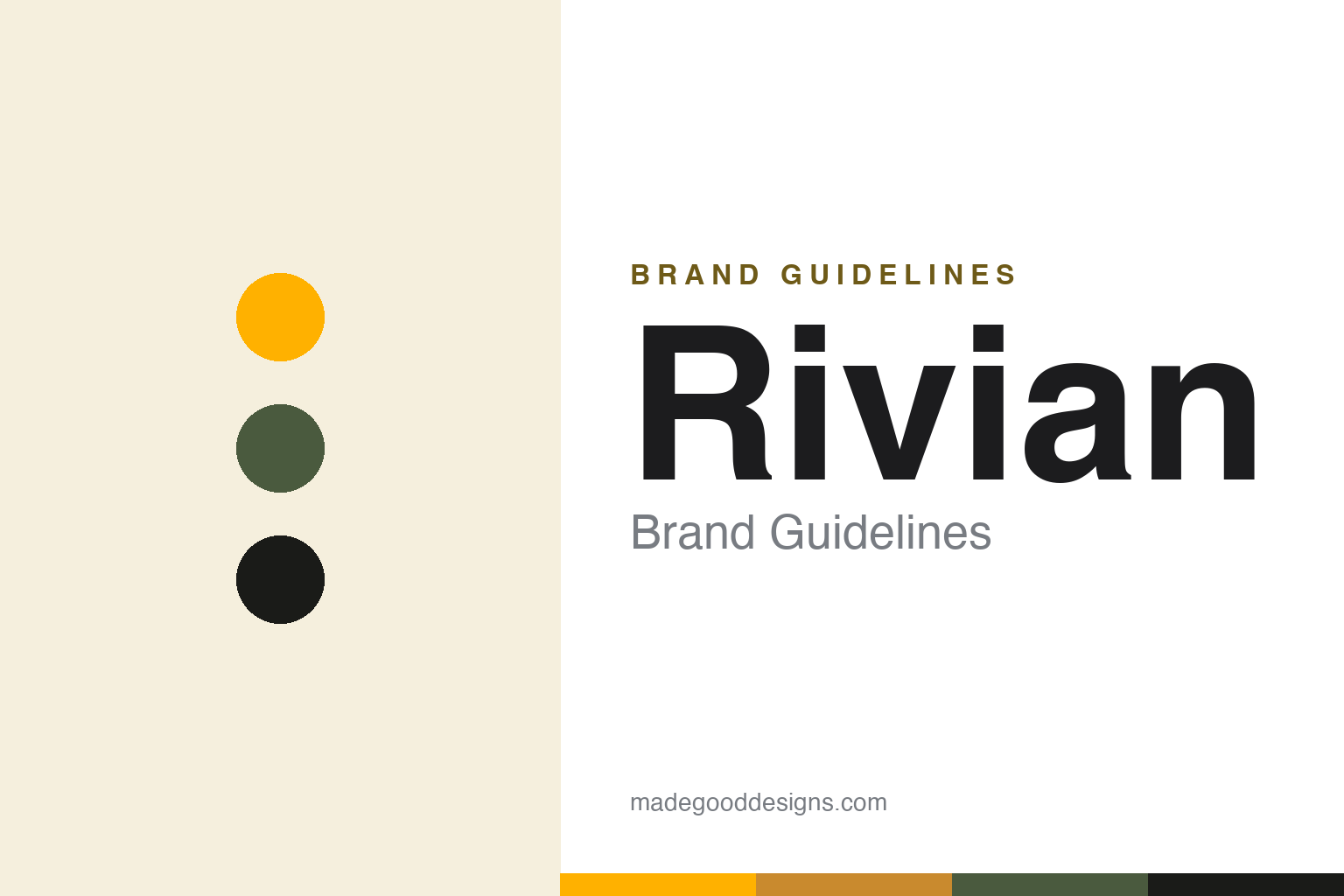
Rivian Brand Guidelines
A compass, vertical-oval headlights and a burst of yellow — electric trucks built for adventure.
Aa
Two constants: a signature yellow with outdoor green and a geometric sans. Abstract homage — not the Rivian compass, oval lamps or wordmark.
A compass for adventure
Rivian’s emblem points outward — and its headlights make it unmistakable.
Rivian’s identity, designed by Pentagram (2018), has three parts. The emblem is a compass-inspired mark: two tilted, nested squares forming a diamond that reads as four opposing arrows (a navigation reference) — fittingly, it’s a compass, not a literal “R” or a steering wheel. The most recognisable feature isn’t a logo at all: the distinctive vertical-oval headlights of the R1T and R1S, which the emblem and letterforms deliberately echo. And the wordmark is a customized version of Klim Type Foundry’s “Söhne” (a geometric grotesque), tweaked by Pentagram — so, unusually, it’s a documented, named typeface, not a from-scratch bespoke one.
Rivian was founded in 2009 by RJ Scaringe (an MIT-trained engineer) — originally named Mainstream Motors, then Avera, before becoming Rivian in 2011 — and later pivoted to an adventure-EV focus, building electric trucks and SUVs for the outdoors (now HQ’d in Irvine, California). Its R1T pickup and R1S SUV (deliveries from late 2021) feature outdoor-minded touches like the Gear Tunnel pass-through storage. Rivian also makes the Amazon electric delivery vans — Amazon led a big 2019 investment and ordered 100,000 vans (that exclusivity has since ended, and the van is now sold to others). On ownership: Rivian Automotive is publicly traded (NASDAQ: RIVN) after a huge November 2021 IPO; Amazon and (formerly) Ford were major early investors, and a Volkswagen Group joint venture (up to ~$5.8 billion) launched in 2024.
Colour
Rivian runs on yellow and outdoor green. Click a swatch to copy the hex.
Rivian’s signature colour is a bright yellow / yellow-green, paired with outdoorsy green and khaki and dark neutrals — a palette that feels adventurous, energetic and at home in the wild. The yellow is distinctive and ownable in a category of silvers and blues, and the earthy greens tie the brand to its outdoor, exploration positioning. The honest caveat: Rivian publishes no confirmed official brand hex, and it’s worth distinguishing two “yellows” — the digital brand yellow (aggregators cite values around #FFB100) versus “Compass Yellow,” which was actually a vehicle paint colour (an earthy ochre, since retired) — don’t conflate the two. Treat all values as approximate. The yellow-and-green combination is the ownable, adventurous core.
The lesson is a palette that expresses a lifestyle. Rivian’s bright yellow and outdoor greens evoke adventure and the outdoors — colour used to sell an exploration lifestyle, not just a vehicle. For designers, it’s a reminder that a palette can convey a brand’s world and values (rugged, outdoorsy, energetic) as much as its category. The takeaways: choose colours that express the lifestyle your brand belongs to (adventurous yellow, outdoor green); use a distinctive accent to stand apart in a neutral category; and be precise about colour — distinguish a digital brand colour from a product paint colour, and treat specific hexes as approximate when no official spec exists.
Typography
The wordmark is a geometric sans — modern and adventurous.
Rivian’s geometric sans wordmark — a customized Söhne, tweaked with small cuts in the horizontal bars of the “r” and “a” — is modern, clean and quietly distinctive. The grotesque letterforms feel contemporary and confident, and the subtle Pentagram customisations (plus the way the letterforms echo the vertical-oval headlights) tie the wordmark to the product and make it ownable rather than generic. It reads as a modern tech brand with an outdoor soul — approachable, capable and forward-looking. Because it’s built on a documented typeface (Söhne) rather than invented from scratch, it’s a smart, efficient way to get a distinctive, high-quality wordmark. (The honest description is “a customized Söhne,” a named typeface, not a bespoke-from-scratch face or a spotter guess.) The typography behaves like the brand: modern, clean and adventure-ready.
Aa
A clean geometric sans — modern and adventurous. (Specimen set in Manrope, a geometric sans in the spirit of the Rivian wordmark, which is a customized Klim “Söhne”.)
A product feature as the logo
Rivian’s real signature is its headlights, not its badge.
Rivian is a lesson in a distinctive product feature becoming the brand’s signature. The compass emblem is smart, but Rivian’s most recognisable identity element is the vertical-oval headlights — a bold, unusual lighting signature that makes an R1T or R1S instantly identifiable on the road, more so than any badge. The whole identity reinforces it: the emblem and wordmark echo those ovals, the yellow-and-green palette expresses the adventure positioning, and the outdoor-minded product details (Gear Tunnel, camp features) back up the brand story. It’s a coherent system where the product design is the brand’s most powerful mark.
For designers and brand-builders, Rivian offers a clear takeaway: a distinctive product-design feature can be your most valuable brand signature — build the identity around it. The lessons: a bold, unusual product element (the vertical-oval headlights) can be more recognisable than a logo, and worth echoing across the identity; a palette can express a brand’s lifestyle and values (adventure, the outdoors); and using a customized existing typeface (Söhne) is a smart way to get a distinctive, high-quality wordmark efficiently. It’s also a reminder to keep facts precise — Rivian was founded in 2009 by RJ Scaringe (Mainstream Motors → Avera → Rivian, 2011), the emblem is a compass, the wordmark is a customized Söhne, and Amazon/VW are key backers. Rivian turned its headlights into its signature — proof that a distinctive product feature can anchor a whole brand identity.
Explore & save
Keep Rivian’s identity on hand — save it to a board in the Made Good inspiration library.
Rivian identity set
Pin the yellow-and-green palette and the type spirit to your own board.


