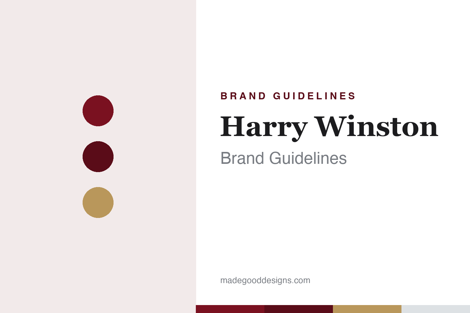
Harry Winston Brand Guidelines
The King of Diamonds — a Didone wordmark, an emerald-cut monogram and the first Oscars jewels.
Aa
Two constants: a deep-red-and-white palette and a high-contrast Didone serif. Abstract homage — not the Harry Winston wordmark or HW monogram.
The King of Diamonds
Harry Winston made the diamond the star — and invented the red-carpet loan.
Harry Winston’s identity is an elegant, high-contrast Didone-style serif wordmark (thin-to-thick strokes, refined capitals; the exact typeface is undocumented, so treat “Bodoni/Trajan” guesses as unverified). Alongside it is the “HW” monogram, whose lozenge/octagonal silhouette is based on the emerald-cut diamond — Winston’s preferred cut — a detail the 2016 “HW Logo” collection made explicit. But Harry Winston’s deepest identity is a reputation: “The King of Diamonds” and “Jeweler to the Stars.” He pioneered the modern red carpet: in 1944, Jennifer Jones became the first actress to wear Harry Winston jewels to the Academy Awards (and won Best Actress that night), founding the Oscars jewelry-lending tradition.
Harry Winston was founded in 1932 in New York City by Harry Winston (1896–1978), and he handled some of history’s most legendary stones. The most famous story: Winston owned the Hope Diamond and donated it to the Smithsonian in 1958, sending it by registered U.S. Mail in a plain brown-paper package — total cost $145.29, of which only $2.44 was postage (the rest was insurance for its $1 million valuation). His signature design was the Winston Cluster (1940s), setting diamonds at varying angles with minimal visible metal so the stones appear to float — the philosophy that the diamonds, not the setting, are the star (reportedly inspired by frost on a holly wreath). On ownership: the Swatch Group acquired Harry Winston Inc. in 2013 (about $750 million in cash plus assumed debt, ≈ $1 billion) — so the jeweler is now part of Swatch Group (distinct from the former diamond-mining arm, which became Dominion Diamond).
Colour
Harry Winston lives in deep red and white. Click a swatch to copy the hex.
Harry Winston’s brand presentation trends toward deep red and white — a rich, regal combination that reads as glamour, luxury and red-carpet occasion, perfectly matched to the house’s Hollywood associations. Red signals prestige and drama; white keeps it clean and lets the diamonds sparkle. The honest caveat: Harry Winston publishes no official brand hex, so the deep-red and gold values here are approximate and observed rather than specified. The jewelry itself, of course, is all about the stones — white, yellow and rose gold set to maximise brilliance — so the brand’s red-and-white identity frames the diamonds as the true stars.
The lesson is a palette that evokes occasion and glamour. Harry Winston’s deep-red-and-white identity conjures the red carpet and old-Hollywood prestige — colour used to frame the product (the diamonds) as the star of a glamorous moment. For designers, it’s a reminder that a palette can set a scene and an emotional register (occasion, celebration, prestige) that supports the product. The takeaways: choose colours that evoke the moment your brand belongs to (red-carpet glamour here); keep the frame clean so the hero product shines; and treat specific hexes as approximate when a house publishes no official palette.
Typography
The wordmark is a Didone serif — high glamour, high contrast.
Harry Winston’s high-contrast Didone-style serif wordmark is pure glamour. The dramatic thin-to-thick strokes and refined capitals read as elegance, prestige and old-Hollywood sophistication — the typographic equivalent of a red-carpet gown. That high contrast suits a brand whose whole world is the sparkle and drama of exceptional diamonds; the letterforms feel as considered and luxurious as the jewels. The emerald-cut-based HW monogram adds a distinctive, ownable mark tied directly to Winston’s favourite diamond cut. (Because the exact face is undocumented, the honest description is “a high-contrast Didone-style serif,” not a named font.) The typography behaves like the brand: glamorous, refined and unmistakably first-class.
Aa
A high-contrast Didone serif — glamorous and refined. (Specimen set in Bodoni Moda, a Didone in the spirit of the Harry Winston wordmark; the real face is custom.)
Making the diamond the star
Harry Winston built a brand on a philosophy — and a legendary reputation.
Harry Winston is a lesson in a brand built on a philosophy and a reputation. The Didone wordmark and emerald-cut monogram are elegant, but the house’s real identity is its idea — make the diamond the star, expressed in the Winston Cluster’s near-invisible settings — and its legendary status as “The King of Diamonds,” cemented by handling stones like the Hope Diamond and by inventing the red-carpet loan in 1944. That reputation is the brand: when you think Harry Winston, you think the greatest diamonds and the Oscars, not a logo. The deep-red identity simply frames that world of glamour and rarity.
For designers and brand-builders, Harry Winston offers a powerful takeaway: a clear philosophy and a legendary reputation can be a brand’s most valuable assets. The lessons: a strong design philosophy (letting the product be the star, via minimal-metal settings) gives a brand coherence and meaning beyond any mark; a reputation built on genuine feats (legendary stones, the Hope Diamond donation, founding the Oscars tradition) is worth more than advertising; and an identity — a glamorous Didone wordmark, a deep-red palette, an emerald-cut monogram — should frame and support that reputation. It’s also a reminder to keep the facts precise — the Hope Diamond’s postage was $2.44 (not $145), the red-carpet origin is 1944, and the jeweler is now Swatch Group’s (distinct from Dominion Diamond). Harry Winston turned a philosophy and a legend into a brand — proof that reputation, earned, can be the whole identity.
Explore & save
Keep Harry Winston’s identity on hand — save it to a board in the Made Good inspiration library.
Harry Winston identity set
Pin the deep-red palette and the type spirit to your own board.


