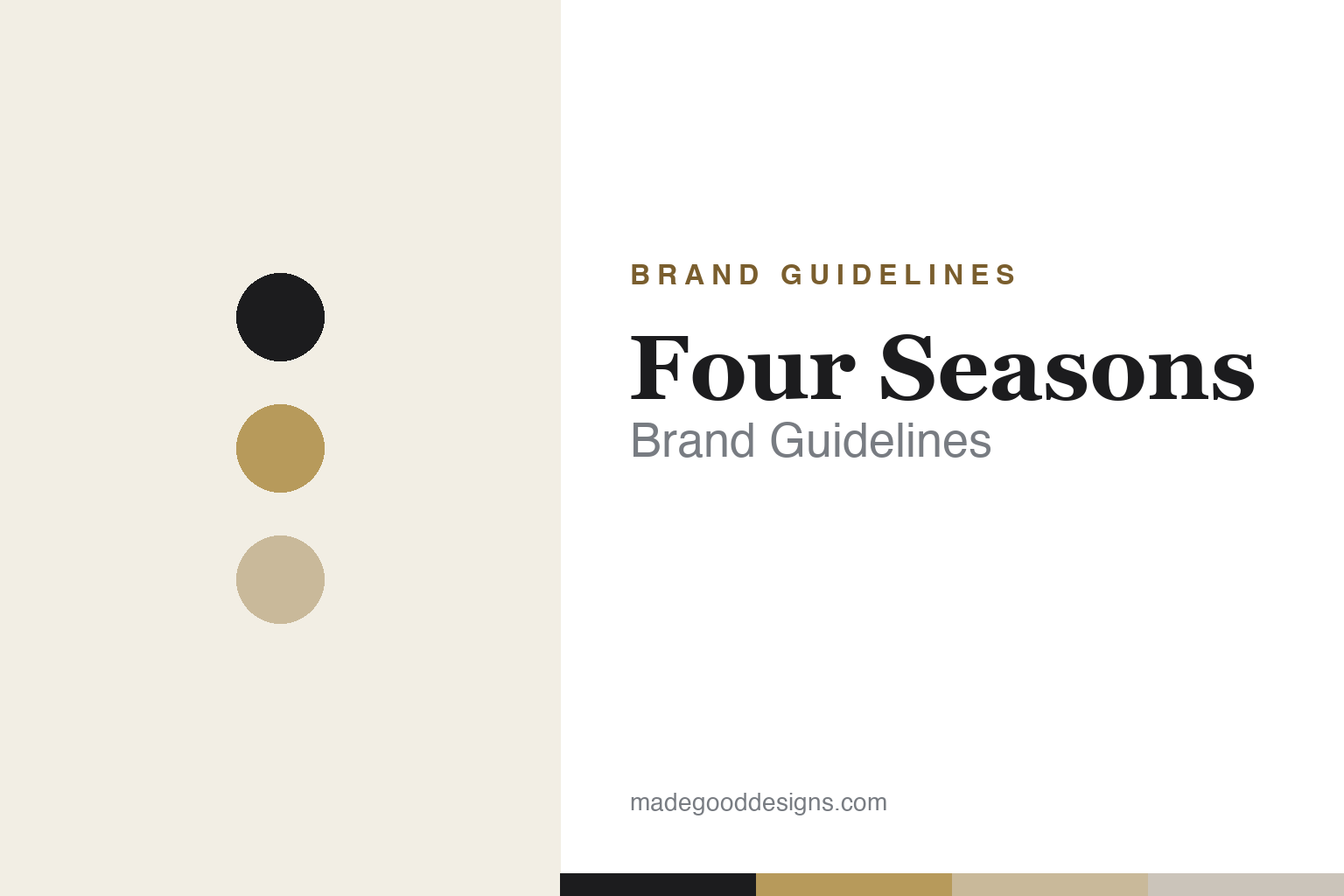
Four Seasons Brand Guidelines
A tree of all four seasons, and a Golden Rule — the byword for personalised luxury service.
Aa
Two constants: a black-and-gold palette and a refined serif. Abstract homage — not the Four Seasons tree emblem or wordmark.
A tree of all four seasons
Four Seasons built a byword for service — and an emblem that holds all four seasons at once.
Four Seasons’ emblem is a stylised tree whose canopy shows all four seasons at once — branches in full leaf through to bare — a quiet symbol of nature and the passing seasons. The “Four Seasons” wordmark is a bespoke, refined serif; no official typeface is documented, so treat font-spotter guesses (like “Aviano Didone”) as unverified. (An honest caveat: the notable full creative rebrand — “Luxury Is Our Love Language,” with updated logo, typography and palette — launched in 2023, not 2020; an earlier, minor 2014 tweak dropped the “Hotels and Resorts” line.) The identity is understated and elegant, exactly as a service-first luxury brand wants to appear.
Four Seasons was founded by Isadore “Issy” Sharp, a Toronto architect; the first property, the Four Seasons Motor Hotel on Jarvis Street, opened in 1961 (the company story is often dated 1960, the first hotel 1961). From that modest start in Toronto, Sharp built Four Seasons into a global byword for luxury service, guided by his stated core principle — the Golden Rule: treat others as you would want to be treated. That philosophy, plus 24-hour service and empowered staff, defined the brand. A crucial business fact: Four Seasons is primarily a hotel-management company — it manages and brands properties owned by others rather than owning the real estate (an “asset-light” model). On ownership, the company has been privately held since 2007: a partnership of Bill Gates’s Cascade Investment, Prince Al-Waleed bin Talal’s Kingdom Holding, and the Sharp family; in 2021 Cascade raised its stake to about 71% (Kingdom ~24%, Sharp ~5%), so Cascade holds the majority — but Gates does not own it outright.
Colour
Four Seasons lives in black and gold. Click a swatch to copy the hex.
Four Seasons’ palette is restrained luxury — black and charcoal, white and cream, with warm gold and tan accents. It reads as elegant, timeless and understated, letting the properties and the service (rather than a loud brand colour) carry the experience. The honest caveat: Four Seasons publishes no official brand hex, so these values are approximate and reconstructed. The point of the palette is quiet confidence: black-and-gold signals heritage luxury without shouting, which suits a brand whose reputation rests on personalised service and consistency rather than flash. It’s a palette designed to feel refined and reassuring in any of the brand’s hotels, anywhere in the world.
The lesson is restraint that lets service lead. Four Seasons’ understated black-and-gold identity deliberately steps back so the experience — the legendary service — becomes the brand. For designers working on service-led brands, it’s a reminder that the visual identity’s job can be to reassure and get out of the way, not to dominate: quiet, consistent elegance signals reliability and quality. The takeaways: match your palette to what the brand actually delivers (understated luxury for a service brand); prioritise consistency and reassurance over a bold signature colour; and treat specific hexes as approximate when no official palette is published.
Typography
The wordmark is a refined serif — quiet, elegant, timeless.
Four Seasons’ refined serif wordmark is quiet and elegant — the typographic equivalent of impeccable, understated service. The classic serif reads as heritage, quality and timelessness, while the restraint keeps it from ever looking trendy or loud, which matters for a brand whose luxury is felt in the experience rather than announced by branding. Paired with the four-seasons tree, it forms a calm, confident identity that reassures rather than dazzles. The type behaves like a great concierge: refined, dependable and never showy. (Because the exact face is undocumented, the honest description is “a refined serif,” not a named font.) It’s typography that signals timeless luxury and quiet excellence — exactly the Four Seasons promise.
Aa
A refined, classic serif — quiet and timeless. (Specimen set in Cormorant Garamond, a refined serif in the spirit of the Four Seasons wordmark; the real face is custom.)
Service as the brand
Four Seasons proves that a reputation for service can be the whole identity.
Four Seasons is the definitive case of service as the brand. The tree emblem and black-and-gold identity are elegant, but the company’s real brand is its reputation — decades of legendary, personalised service, built on Isadore Sharp’s Golden Rule and empowered, well-trained staff. When people say “Four Seasons,” they mean a standard of care, not a logo; the understated visual identity exists precisely to let that experience be the star. It’s a brand whose most valuable asset is intangible: consistency and human excellence, delivered the same way in every hotel, which is far harder to build (and to copy) than any mark.
For designers and brand-builders, Four Seasons offers a powerful takeaway: a reputation for consistent excellence can be a brand’s deepest asset, and the identity should serve it. The lessons: when the product is an experience (service), the visual identity’s role is often to reassure and stay understated, letting the experience lead; a clear, human philosophy (the Golden Rule) can guide a brand more powerfully than any style guide; and consistency across every touchpoint — every hotel, every interaction — is what turns a name into a byword. It’s also a reminder to keep facts precise: Four Seasons was founded by Isadore Sharp in Toronto (first hotel 1961), it primarily manages rather than owns hotels, the big rebrand was 2023, and Cascade (Gates) holds ~71% but doesn’t own it outright. Four Seasons turned a Golden Rule and relentless consistency into one of luxury’s most trusted identities — proof that service, done superbly, can be the whole brand.
Explore & save
Keep Four Seasons’s identity on hand — save it to a board in the Made Good inspiration library.
Four Seasons identity set
Pin the black-and-gold palette and the type spirit to your own board.