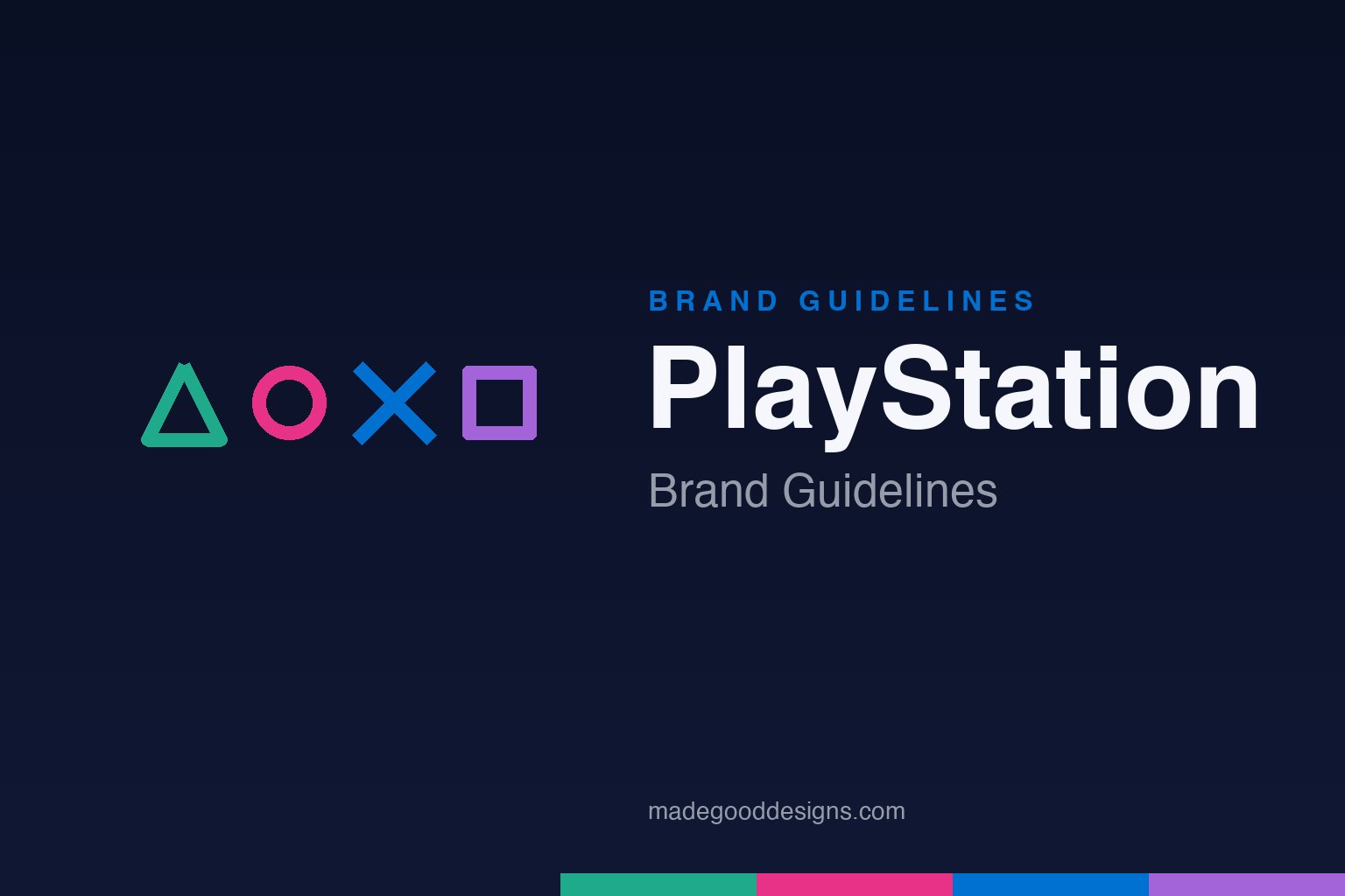
PlayStation Brand Guidelines
A triangle, a circle, a cross and a square — four shapes that everyone can draw, and that almost nobody knows the meaning of.
Aa
Two constants: the four symbols and a clean, neutral sans. Homage renderings — the symbols shown in a row, deliberately not the PlayStation button-cluster lockup.
The shapes have meanings
The controller symbols aren’t random decoration — the designer gave each one a specific idea.
Designer Teiyu Gotō has explained (in a much-quoted Famitsu interview) that PlayStation’s four face-button symbols each mean something:
- △Triangle — a viewpoint or direction; “the head,” where you’re looking
- ◯Circle — “yes” (decide)
- ✕Cross — “no” (cancel)
- ◻Square — a sheet of paper; a menu or document
The twist: Gotō deliberately made circle = yes and cross = no (following a Japanese convention), and reportedly had to defend it to management. It’s a lovely piece of design intent hiding in plain sight on hundreds of millions of controllers.
A logo built for 3D
The “PS” mark was drawn to announce a new era of gaming — one rendered in three dimensions.
The “PS” logo, widely credited to Manabu Sakamoto at Sony, launched with the original PlayStation in 1994. Its design is a small thesis statement: the “P” stands upright while the “S” lies flat in perspective, like an object casting a shadow on a ground plane — a nod to the leap from 2D sprites to 3D worlds that the console represented. Originally rendered in the four PlayStation colours, the mark has stayed essentially unchanged in shape for 30 years, gradually simplifying to a flat, single-colour form for the modern master brand. Continuity plus a built-in idea: that’s a durable logo.
Colour: from four colours to mono
PlayStation’s palette split in two — a monochrome master brand, and a colourful symbol set. Click a swatch to copy the hex.
Worth flagging: the current master-brand logo is monochrome (black and white), and heritage “PlayStation Blue” (≈#003791) is a secondary colour, not the logo’s colour today. The four symbols, meanwhile, keep their own set — commonly rendered as a green triangle, pink circle, blue cross and purple square. As always, these hexes are community reconstructions rather than an official public spec. Copy the working values below.
Type: SST
PlayStation reads in the same disciplined typeface as its parent — Sony’s global sans.
The interface and much of the branding run on SST, the custom superfamily Sony built with Monotype (type director Akira Kobayashi) — the same neutral, Helvetica-and-Frutiger-lineage sans used across Sony’s electronics, and the PS4/PS5 system font. Two notes: SST is a Sony-wide typeface, not a PlayStation-exclusive one, and the historic “PlayStation” wordmark itself is custom lettering, not set in SST. The current tagline sums up the brand in four words: “Play Has No Limits.” The specimen below is set in a comparable neutral grotesque.
Play has no limits
Neutral, legible and premium — a sans that stays out of the way of the game. (Specimen set in Inter, a grotesque in SST’s spirit.)
Sound, shapes and a generation
PlayStation’s identity lives in more than a logo — it’s a startup chime, a set of buttons and a cultural attitude.
Some of the brand’s strongest recognition is sonic rather than visual: the reverberating boot-up tones of the PS1 and later the PS2 are burned into a generation’s memory as surely as any wordmark, an early example of deliberate sound design as branding. The four face-button symbols do parallel work as a tactile, universal language — triangle, circle, cross and square are drawn by the player’s own thumbs thousands of times, so the identity is literally rehearsed through use. It is a rare brand whose core marks are things you hear and press, not just things you see, which binds it to the physical experience of playing in a way a printed logo never could.
The visual restraint of the modern monochrome master brand also reflects a hard-won maturity. PlayStation launched in the mid-1990s with an unabashedly youthful, clubby, counter-cultural swagger — positioning games as entertainment for adults at a moment when consoles were still seen as toys — and over three decades it has settled into the calm, premium, black-and-white confidence of an established platform. Letting the four coloured symbols carry playfulness while the master logo stays sober is the same division of labour many enduring brands rely on: a stable, grown-up signature at the centre, with room around it for colour, sound and personality to keep the thing feeling alive.
Explore & save
Keep PlayStation’s system on hand — save it to a board in the Made Good inspiration library.
PlayStation identity set
Pin the four symbols, the palette and the neutral type to your own board.


