Telegram Brand Guidelines
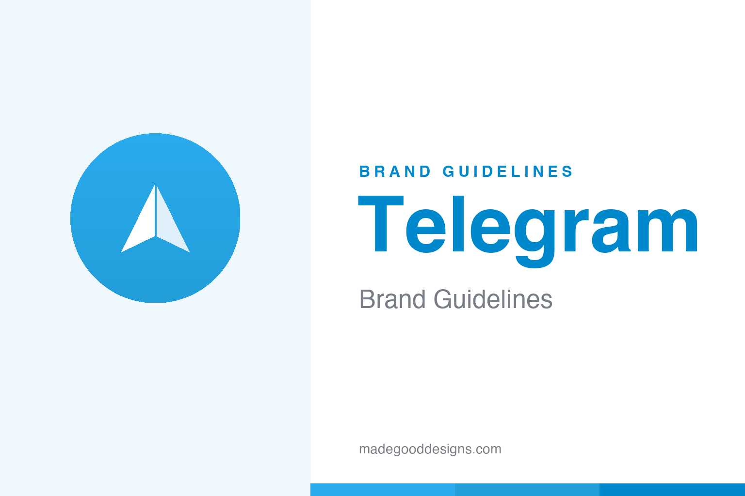
A paper plane in a blue circle — a two-symbol promise of speed, and a brand built around the idea of sending.
Aa
Two constants: the paper plane and a friendly blue. Homage renderings — a generic plane at a different angle, deliberately not the Telegram logo.
Speed in a paper plane
Telegram’s logo says everything the app is about in a single, universal object.
The mark is a white paper plane inside a blue circle — and it’s hard to imagine a cleaner metaphor for a messaging app. A paper plane means “send,” “fast,” “light,” even a little playful; the blue circle reads as friendly and global (some see a hint of a globe). It’s the same idea a “send” button uses everywhere, elevated to a brand. The genius is legibility: it needs no explanation in any language, at any size, which is exactly what a product used across the world requires. Send, received — that’s the whole story.
The Durov brothers
Telegram was built by two brothers with a very particular obsession: privacy and independence.
Telegram launched in 2013, founded by Pavel and Nikolai Durov — the same brothers behind VKontakte (VK), Russia’s biggest social network. Pavel drove the product and its fiercely independent, privacy-forward positioning; Nikolai built the underlying MTProto cryptography. That founding stance shapes the whole brand voice: fast, secure, cloud-based, and pointedly non-corporate. One accuracy note worth making: Telegram’s cloud chats are encrypted client-to-server, while full end-to-end encryption applies to “Secret Chats” — a nuance the brand’s “heavily encrypted” messaging sometimes glosses over.
Colour: Telegram blue
One clean, optimistic blue — flat in the old days, a gradient now. Click a swatch to copy the hex.
Telegram runs almost entirely on a single blue. The classic flat brand blue is #0088CC (the old web/link tone), while the modern app icon uses a gentle gradient from #2AABEE down to #229ED9. As always, treat these as widely-cited reconstructions — Telegram doesn’t publish a public brand spec. The blue does exactly what a messaging app wants: it feels trustworthy, calm and clear, never shouting, so the conversation stays the focus. Copy the working values below.
Type & voice: system fonts & speed
Telegram, like the best messengers, brings almost no type of its own — on purpose.
The “Telegram” wordmark is custom lettering, but the app itself uses each platform’s system font — San Francisco on Apple, Roboto on Android, Segoe UI on Windows. That’s a deliberate performance-and-familiarity choice: the app feels native, loads fast, and never looks like a branded skin over your phone. The voice matches the plane: fast, light and free. It’s a good reminder that for a utility used constantly, the most confident branding move can be to get out of the way. The specimen below is set in a comparable system-style sans.
Fast. Free. Secure.
Neutral and legible — type that behaves like a native part of your device. (Specimen set in Inter, in the system-font spirit.)
Grown by product, not advertising
Telegram became one of the world’s biggest messengers on almost no marketing budget — the app itself did the selling.
Telegram has spent famously little on conventional advertising, and for most of its life it carried no ads at all, funded directly out of Pavel Durov’s own pocket. Growth came instead from word of mouth and from the moments when rivals stumbled: the sign-up spikes are well documented, most dramatically in January 2021, when a change to a competitor’s privacy terms sent tens of millions of new users to Telegram in a matter of days. When your entire pitch is privacy and independence, a rival’s misstep becomes the best campaign money can’t buy.
The brand lives less in a style guide than in the things the app lets people make. Telegram leaned early into custom stickers, animated emoji, public channels and an open Bot API, turning the platform into a canvas its users decorate themselves. Through all of it the two constants — the paper plane and the friendly blue — stay exactly where they are, stamping a fast-moving, feature-stuffed product with one calm signature. A paid Premium tier arrived in 2022 to help fund the growth, but the underlying promise never shifted: the identity gets out of the way so the conversation, and the community around it, can be the point. That restraint has scaled remarkably well: the paper plane now flies over a service with hundreds of millions of monthly users, and it still looks and behaves much the way it did on the day the app launched.
Explore & save
Keep Telegram’s system on hand — save it to a board in the Made Good inspiration library.
Telegram identity set
Pin the paper-plane idea, the blue and the neutral type to your own board.