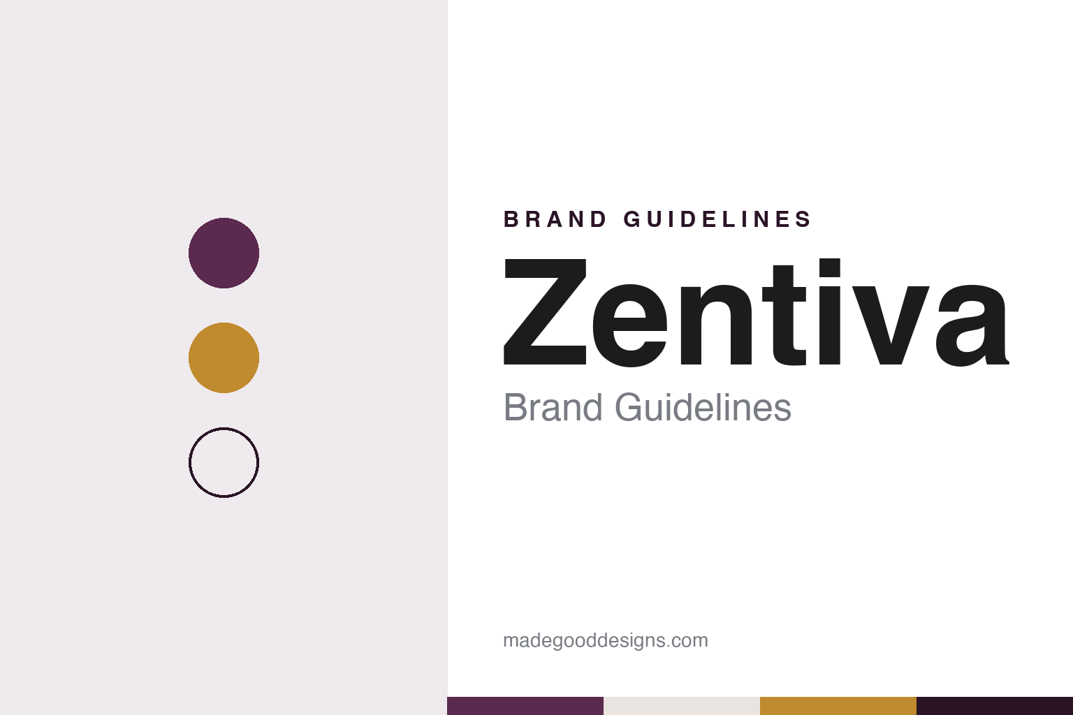
Zentiva Brand Guidelines
A Prague pharmacy of 1488 renamed for a European market.
Aa
Two constants: a plum, stone and amber palette and a typographic sans register. Abstract homage — not a Zentiva product or mark; no pack, logo or nameplate is reproduced.
The Black Eagle
A Malá Strana pharmacy and a family factory.
Zentiva traces its roots to the Black Eagle pharmacy, U Černého orla, on the Malá Strana square in Prague, which the company, English and Czech Wikipedia and the Czech tourism portal Kudy z nudy all say was already trading in 1488. In 1857 the pharmacist Benjamin Fragner bought it. Kudy z nudy says he soon added a small production and research laboratory, where he made medicines and herbal liqueurs to his own recipes, including a Prague household ointment that was exported as far as the United States.
His son Karel Fragner took over the pharmacy in 1886 and, the company says, made it the most modern in Prague; Kudy z nudy adds that he set up large-scale production in the rear wing and a research laboratory in the basement. His son Jiří Fragner, a chemist and pharmacist, then moved manufacturing out of the old town. With his brother, the architect Jaroslav Fragner, he planned a new factory in Dolní Měcholupy, now part of Prague, and the plant, named B. Fragner or BF, began producing medicines in August 1930. Zentiva’s headquarters stand on the same site today.
The German occupation followed within a decade. After the Nazi authorities closed the Czech universities, English and Czech Wikipedia and Kudy z nudy say, the Fragner factory became a refuge for many specialists and young scientists. ČT24, the Czech public broadcaster’s news service, reported in 2012 that penicillin was first prepared in the Czech lands in 1944 at the factory in Dolní Měcholupy, under the name BF Mykoin 510.
After the war the business was taken into state ownership. The company says B. Fragner was nationalised in 1946 together with 25 other drug makers; iDNES.cz reported in 2008 that nationalisation began in 1945 under the Beneš decrees and was completed only after February 1948. The factory was separated from the pharmacy and joined SPOFA, the United Pharmaceutical Works, and later became the base of the national enterprise Léčiva. In 2008, iDNES.cz reported, a Prague district court ruled that the founding family’s descendants were entitled to compensation for the factory.
Colour
From Léčiva to a European generics group.
After 1989 the state enterprise went through a series of ownership changes. The privatisation of Léčiva was completed in 1998, iDNES.cz reported, and the company says its management then took a majority stake and refocused the business on branded generic medicines.
The name came next. The weekly Strategie reported in September 2003 that Léčiva and the Slovak drug maker Slovakofarma had joined at the start of that month as a new company called Zentiva; the company’s own timeline dates the adoption of the name to 1993, and says it was inspired by an anagram of the Czech word vítězný, “victorious.” In 2004 Zentiva listed its shares in Prague and London and expanded into Poland, Russia and other central and eastern European markets. It bought Sicomed in Romania in 2005 and the generics business of Turkey’s Eczacıbaşı in 2007, Wikipedia says.
Then came a larger owner. Zentiva’s timeline dates its combination with the French group Sanofi to 2008, and Kudy z nudy says it belonged to Sanofi from 2009; Sanofi made it the platform for its European generics. In 2018 the private-equity firm Advent International bought the business from Sanofi, and a run of purchases followed: Creo Pharmaceuticals in the UK and Solacium in Romania in 2019, Alvogen’s central and eastern European business, and a manufacturing and research site at Ankleshwar in India.
The latest change is recent. On 9 April 2026 Zentiva announced that the American private-equity firm GTCR had completed its purchase of the company from Advent, with the management team led by chief executive Steffen Saltofte staying in place. Zentiva describes itself as a maker of generic, branded specialty and over-the-counter medicines serving more than 100 million people in over 40 countries, with portfolios in cardiology, diabetes, oncology, respiratory medicine, the central nervous system and consumer health.
Typography
Design and documentation.
Europe’s mid-sized drug makers tend to present themselves through their origins. Many began as a single pharmacist, doctor or industrialist with a laboratory, and their corporate histories still open with a founder, a town and a first product. Family holding companies and foundations often remain in the background as long-term shareholders, and the companies’ own timelines give as much space to new factories and research centres as to the medicines that came out of them.
The visual language that follows is restrained. Corporate sites and annual reports favour photographs of scientists at the bench, production lines seen through glass, and patients in ordinary settings — at home, at work, outdoors — rather than in hospital. Long-serving research campuses, some in use for half a century or more, appear again and again as proof of continuity, alongside newer laboratories in biotech districts abroad.
Identity systems are usually simple: a short word mark or set of initials, a single deep blue or green as the lead colour, and a clean sans for running text. Because prescription medicines cannot be advertised to the general public in the European Union, much of the visible branding lives at medical congresses rather than in shop windows: the dermatology meeting of the EADV, the multiple sclerosis congress of ECTRIMS and the reproductive-medicine meeting of ESHRE are among the places where these companies set up stands, posters and symposia for specialists.
This guide sets out what can be checked about each company — who founded it, who owns it, where it makes and researches its medicines, and how its history is told — and marks plainly what rests only on the company’s own word. The palettes and typefaces shown here are our own interpretations, not official brand assets.
Aa
A typographic sans — a mark its designer described as a compromise between drawing and type. (Specimen set in Sora, a sans STAND-IN; NOT the Zentiva logo.)
Zentiva
A typographic mark for a name without accents.
The Zentiva name and mark were built for export. Strategie reported in September 2003 that the decision to replace the Léčiva name had been taken about four years earlier: the old name carried a long tradition at home, but its Czech diacritics made it hard for clients elsewhere in Europe to remember or pronounce. The new name, a company director told the magazine, had to be easy to understand, to suggest nothing specific, and not already be registered anywhere in the world.
The identity followed a tender in spring 2003. Strategie says the agency Ogilvy CID and the Prague graphic studio Heyduk, Musil & Hošek were chosen, with the studio handling the implementation. The mark’s author, Martin Strnad of that studio, told the magazine that it had to be typographic and easy to read rather than built from complicated drawn elements, and that the final form was a compromise between drawing and typography, joining graphic originality with a play on letterforms. The last stage, he said, would be strict adherence to the rules for using the mark.
The magazine also noted where the brand sits in practice. In pharmaceuticals, the company’s director said, the product brand matters more to patients than the maker’s name, and prescription medicines in the Czech Republic may only be advertised in professional medical titles, so doctors and pharmacists are the core audience. The company itself now tells a story that, it says, reaches back more than 530 years.
For a design guide, Zentiva shows a company choosing a name for how it travels rather than what it means, and a mark kept typographic so it reads in every market. Compare its former owner in our Sanofi brand guidelines and another European drug group in our Novartis brand guidelines. For this guide we use Malá Strana plum, night ink, Prague stone and amber with a typographic sans, an unofficial interpretation; no product or logo is reproduced.
Explore & save
Keep Zentiva’s identity on hand — save it to a board in the Made Good inspiration library.
Zentiva identity set
Pin the plum, stone and amber palette and the typographic sans register to your own board.