Iberdrola Brand Guidelines
Bilbao’s 1992 merger, three leaves and a family of typefaces.
Aa
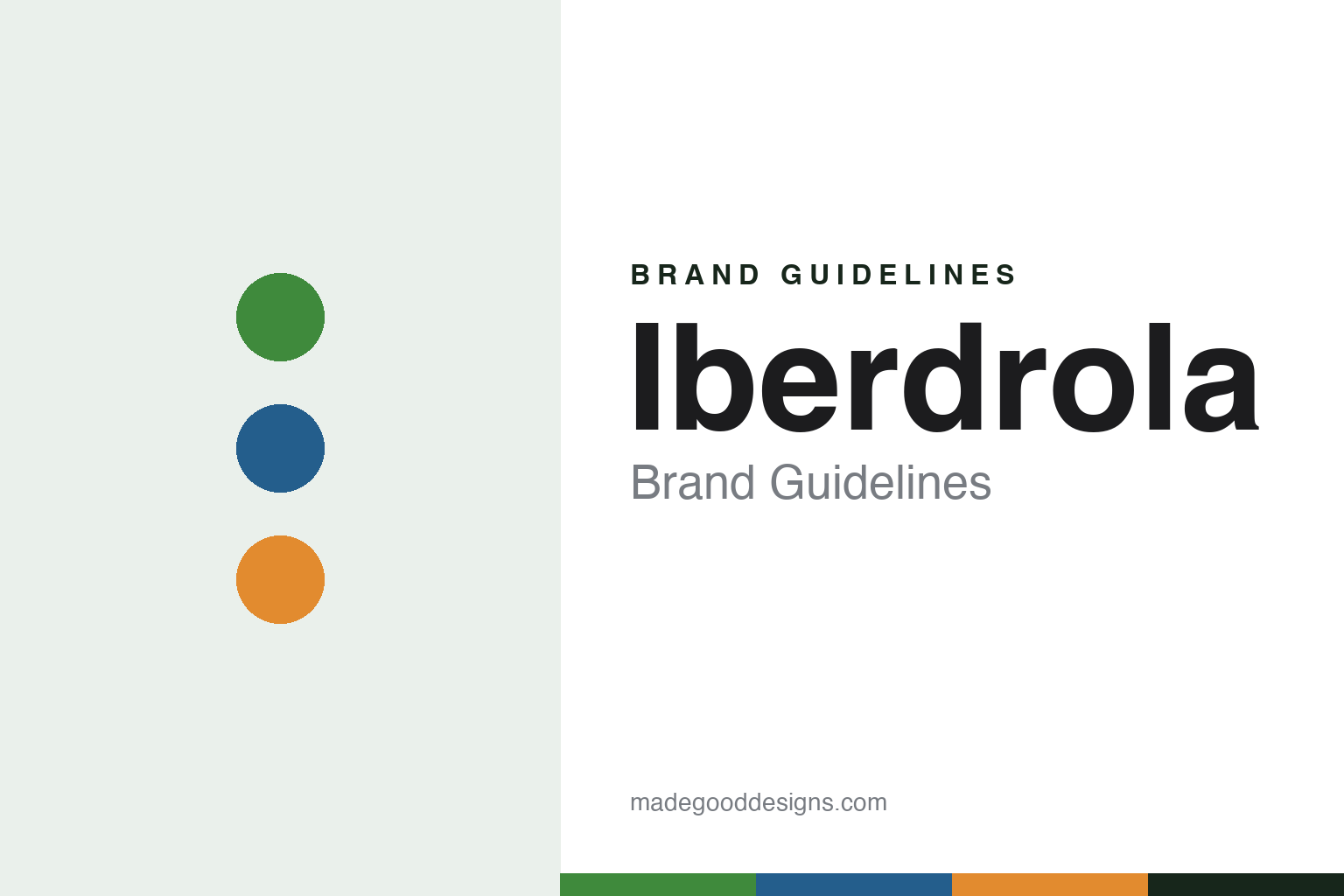
Two constants: an Iberdrola green, blue and orange palette and a humanist sans register. Abstract homage — not an Iberdrola asset; no logo, leaf symbol or wordmark is reproduced.
Hidrola and Iberduero
Two hydro companies, ninety years apart from the merger.
Iberdrola is a merger name. English Wikipedia dates the company to 1 November 1992, when Hidroeléctrica Española, known as Hidrola, combined with Iberduero; the Spanish marketing magazine Reason Why, writing in May 2023, dates the birth of the Iberdrola brand to 1991. Both predecessors were themselves the product of earlier mergers, and the group’s headquarters remain in Bilbao, in the Basque Country.
The oldest root is in Bilbao. Spanish Wikipedia says that in 1901 a group of businessmen led by the engineer Juan de Urrutia founded Hidroeléctrica Ibérica there. In 1907 its shareholders created Hidroeléctrica Española to supply Madrid and Valencia, and in 1918 Saltos del Duero was founded to harness the Duero river; it opened the Ricobayo hydroelectric scheme in 1935. In 1944 Hidroeléctrica Ibérica and Saltos del Duero merged to form Iberduero.
The middle of the century was difficult for the industry. Spanish Wikipedia says the Civil War from 1936 abruptly halted development, destroyed installations and made it hard to maintain what equipment was left, and that in the 1940s Spain struggled to obtain technology and materials. English Wikipedia adds that the predecessor companies benefited from the legal and social framework of the Franco dictatorship in growing their economic and social weight. Spanish Wikipedia lists among the group’s Spanish assets the José María de Oriol hydroelectric plant at Alcántara, on the Tajo, built between 1960 and 1970.
Colour
From Spanish hydro to ScottishPower, Avangrid and Neoenergia.
After the merger Iberdrola expanded abroad, first into Latin America, mainly Mexico and Brazil, according to Wikipedia. The large steps came in the 2000s. It bought ScottishPower in 2006 and integrated it in April 2007, and acquired the American group Energy East in 2008. In Brazil it added Elektro in 2011, and in August 2017 folded Elektro into Neoenergia, which listed on the São Paulo exchange in 2019.
In the United States, Iberdrola USA and UIL Holdings were combined in 2015 to form Avangrid, which traded on the New York Stock Exchange. In 2024 Iberdrola agreed to buy the 18.4 per cent of Avangrid it did not own, and Spanish Wikipedia says the deal was completed in December 2024 after approval from the New York regulator. A separate bid for PNM Resources, announced in 2020, was abandoned in 2024. In Britain, ScottishPower bought 88 per cent of the distribution network operator Electricity North West; the deal was agreed in August 2024 and completed in March 2025 after clearance by the Competition and Markets Authority.
Wikipedia describes a group that turned towards renewable power from 2001. Its projects include the West of Duddon Sands offshore wind farm in the Irish Sea, opened in 2014; East Anglia ONE, which began generating in 2019; Wikinger in the German Baltic, from 2017; the Saint-Brieuc wind farm, its first in France, inaugurated in 2024; and the Tâmega pumped-storage complex in northern Portugal, opened in 2022. In 2019 its Spanish distribution business was renamed i-DE. In 2022 it opened a green hydrogen plant at Puertollano, supplying the Fertiberia fertiliser works there, and in March 2023 it signed an alliance with BP to build fast and ultra-fast electric-car charging points in Spain and Portugal, English Wikipedia says.
Typography
How Europe’s utilities present themselves.
Many of Europe’s big electricity and gas groups began as something narrower: a regional hydro company, a national gas board, a coal-fired generator, a city lighting firm. Many of today’s names were assembled through mergers, nationalisations and privatisations, and their identities often had to stand for several older companies at once. A single short name and a simple symbol became the usual answer.
The pictures these groups choose tell the same story. Offshore wind farms standing in grey northern seas, hydro dams in mountain valleys, solar fields and transmission lines now carry more of the visual weight than power stations and chimneys. Colour often follows: greens and blues, sometimes with a warm accent for the sun, are common in the sector’s newer identities. Iberdrola’s three leaves, introduced in 2002 when it tied its brand to renewable energy, and Engie’s rising sun, adopted with the new name in 2015, are two examples.
Much of the brand now lives on screens rather than letterheads. Customers meet these companies through smart-home energy apps, online accounts and the electric-car charging points that carry their names on streets and motorways. Iberdrola, for example, redrew its logo in 2023 for digital use, with solid colours and a custom typeface shared by the companies it owns in other countries.
The sector also presents itself through long annual sustainability reports, sponsorship and industry gatherings such as Eurelectric’s Power Summit and the WindEurope annual event. This guide sets out what can be checked about each brand — where it came from, who owns it, and how its name and symbol changed — and marks clearly what rests only on the company’s own word.
Aa
A humanist sans — the company uses IberPangea, adapted from Fontwerk’s Pangea. (Specimen set in Figtree, a sans STAND-IN; NOT the Iberdrola logo or typeface.)
Iberdrola
Three leaves, first used in 2002.
Iberdrola’s symbol is a group of three leaves. Reason Why reported on 24 May 2023 that the leaves were introduced in 2002, when the brand tied its strategy to renewable energy, and that their colours stand for renewables in green, water and wind in blue, and solar energy in orange. In May 2023 the company presented a revised identity developed with the branding agency Design Bridge and Partners, part of WPP: the leaves were simplified into solid colours and the name was set in lower case. Atalayar reported on 30 May 2023 that the company describes the new logo as 50 per cent lighter, which it says means faster downloads, and that the change would be rolled out first online and then gradually in physical formats.
Type is part of the system. The new corporate family is IberPangea, with a companion text version, adapted from the typeface Pangea by the German foundry Fontwerk, which described the project in January 2024. Fontwerk says the family was supplied in 20 weights, that access to the leaf symbol is built into the fonts, and that the same type is used across Iberdrola, Avangrid, ScottishPower, Neoenergia and Iberdrola México. Design Bridge and Partners says the symbol links the countries where the group trades under other names. The brand is also visible through sport: since the 2016–17 season Spain’s top women’s football league has carried the Iberdrola name as the Primera Iberdrola, according to Wikipedia.
For a design guide, Iberdrola shows how one small symbol and one typeface can tie together companies that keep their own names. Compare Ørsted, another utility rebuilt around offshore wind, and Engie, a European group formed from older companies. For this guide we use a leaf green, a reservoir blue and a sun orange with a sans, an unofficial interpretation; no product or logo is reproduced.
Explore & save
Keep Iberdrola’s identity on hand — save it to a board in the Made Good inspiration library.
Iberdrola identity set
Pin the Iberdrola green, blue and orange palette and the humanist sans register to your own board.