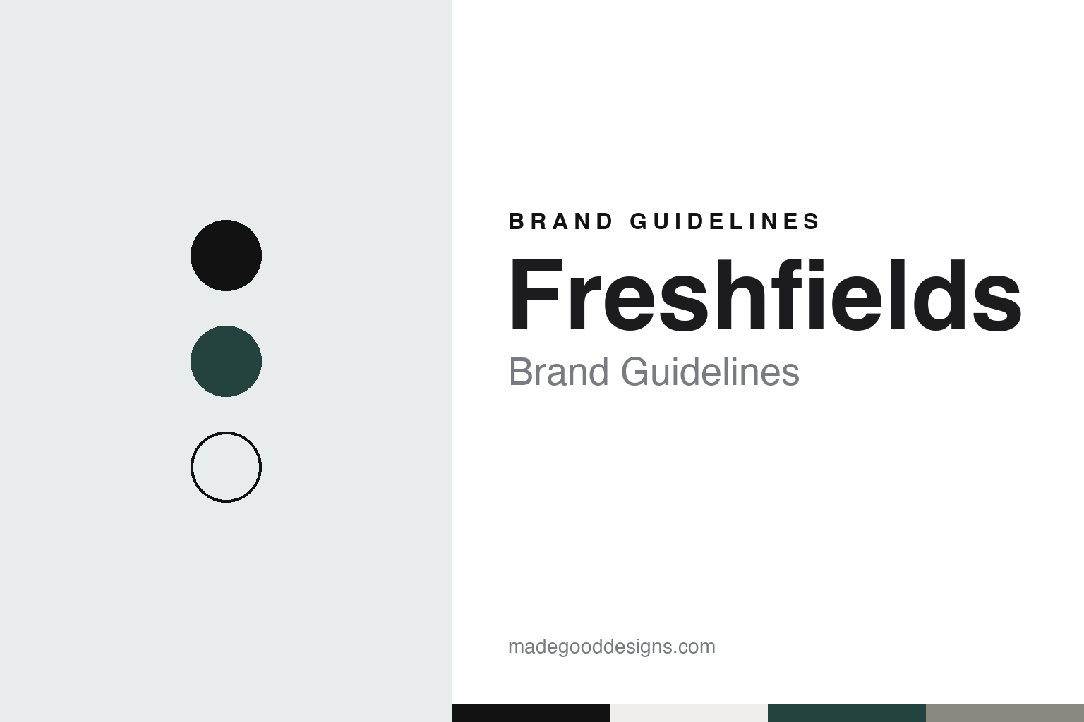
Freshfields Brand Guidelines
A 1743 London firm that shortened its name to the one people already used.
Aa
Two constants: a black, white and ledger green palette and an all-caps sans register. Abstract homage — not a Freshfields mark; no wordmark, logo or document is reproduced.
Since 1743
A City practice, the Bank of England and a name that changed with its partners.
Freshfields traces its roots to 1743 in London. The firm’s own history page says it has supported ambitious businesses “since 1743,” and when it announced a new name in 2024 its senior partner spoke of a “280-year history.” Legal Cheek, reporting that change in September 2024, called it the oldest of the magic circle firms, with roots dating back to 1743.
The firm has a long documented record as solicitors to the Bank of England. The National Archives’ Discovery catalogue lists a collection held by the Bank of England Archive described as papers on “the firm’s work as solicitors to the Bank of England,” with covering dates that run to 1984. Other entries in the same catalogue show the firm’s name changing over two centuries: “Freshfields & Co.” in an 1843 record at The National Archives, letters from “Messrs. Freshfields” in Kent’s county archives from the 1830s to the 1850s, and, between the wars, Freshfields, Leese and Munns, in records held at Kew covering 1920 to 1931. By the 1970s and 1980s the catalogue entries use the plain name “Freshfields.”
The modern firm was made by a merger. In 2000 Freshfields combined with two German firms, Deringer Tessin Herrmann & Sedemund and the German-Austrian Bruckhaus Westrick Heller Löber, and took the name Freshfields Bruckhaus Deringer, Legal Cheek reported; the firm’s history page calls it a “landmark 2000 merger” that made Freshfields Bruckhaus Deringer “a firm without borders.” The sources used for this guide do not say how the German predecessor firms fared between 1933 and 1945.
Colour
Three names become one.
For almost a quarter of a century the firm carried three names. On 24 September 2024 it announced a brand refresh in which its legal name would be shortened to Freshfields, with a new wordmark. The refreshed brand was to be rolled out from October, alongside a formal name change, with what the firm called a sustainable and phased implementation around the world over the following months.
The reasoning was stated plainly. “Our refreshed brand is dynamic and bold, reflecting the entrepreneurial spirit of Freshfields today and our momentum as a firm,” said the senior partner, Georgia Dawson, in the firm’s announcement. The shorter name, she added, “embraces the reality of what people call us in the market and how we refer to ourselves.”
Legal Cheek described the new logo as a bold, black-and-white, all-caps wordmark spelling out the firm’s name.
The firm has since given its brand a senior post of its own. In August 2026 it announced the appointment of a Chief Brand and Communications Officer, based in New York and recruited from A&O Shearman, to lead its global brand, communications and reputation agenda alongside the firm’s leadership and business development teams. Its buildings carry the name too: when it opened a new Silicon Valley office at Redwood City in June 2022, in a space designed by Gensler, the firm noted that the building and lobby carried Freshfields signage.
Typography
How law firms present themselves.
Large UK and global law firms sell advice rather than objects, so their identities rest on names, words and a small number of visual constants. Many trade under founders’ surnames that have been shortened or combined through mergers, and the wordmark is usually set plainly, in one weight, with the colour doing quiet work: often a single accent, used sparingly against white, grey or a dark neutral.
The firm website carries most of the brand. A typical site is organised around expertise and sectors, with practice pages for areas such as finance, disputes or competition, and an office list or map that shows how many cities and countries the firm covers. Partner profiles, with photographs, practice areas and contact details, sit at the centre of the client-facing pages, because clients often choose a lawyer as much as a firm.
Firms also publish a steady stream of thought leadership: insights, briefings, blogs, webinars and seminars on regulation, markets and technology. Alongside these sit annual reports or results pages, statements on responsible business, inclusion and sustainability, and pro bono reports that describe unpaid work for charities and community groups. Graduate-recruitment pages, sometimes run as separate microsites, address law students with a different, warmer voice, while alumni networks keep former lawyers in touch.
The firms in this guide, many of them with long roots in London, share that vocabulary, but their histories differ: some go back to the eighteenth or nineteenth century, others are the products of mergers this century, and several now operate as international partnerships spanning dozens of countries. This guide sets out what can be checked about each one, from founding and mergers to how it presents itself today, and marks clearly what rests on the firm’s own word.
AA
An all-caps sans, after the firm’s 2024 wordmark. (Specimen set in Archivo, a sans STAND-IN; NOT the Freshfields wordmark or logo.)
Freshfields
A London firm with a growing US base.
The firm’s history page describes the 25 years after the merger as a period in which it strengthened its US platform, expanded into technology hubs such as Silicon Valley and deepened its presence in the Middle East. Its Silicon Valley practice launched in July 2020 with seven founding partners, the firm said in 2022, and moved from Menlo Park to the Redwood City office two years later.
In November 2026 the firm’s website described about 5,700 people, including some 2,800 lawyers, across 33 offices. Its leadership is shared between London, New York and Germany: Georgia Dawson is senior partner, with global managing partners based in New York and San Francisco and in Frankfurt and Düsseldorf. The firm says the Financial Times named it the Most Innovative Law Firm in Europe at the newspaper’s Innovative Lawyers Awards Europe in September 2025, citing work across innovation, digital, people and social responsibility. The same release says it was highly commended for responsible business, for pro bono work that secured compensation for a survivor of modern slavery from the Criminal Injuries Compensation Authority, and its website reports some 85,000 pro bono hours in the 2023–24 financial year.
The longer name has not vanished from the record. Releases from before the change, such as the 2022 Silicon Valley announcement, still refer to Freshfields Bruckhaus Deringer LLP, while archive catalogues keep the older forms — Freshfields & Co., and Freshfields, Leese and Munns — that the firm used in earlier centuries.
For a design guide, Freshfields shows how an old firm can simplify its identity by adopting the name people already use, and let a plain wordmark carry the brand. It is a reminder that a shorter name can be the most practical rebrand of all. Compare Linklaters, which chose a single bold colour in 2002, and Slaughter and May, another long-established London firm. For this guide we use black, white and a deep green with a sans, an unofficial interpretation; no product or logo is reproduced.
Explore & save
Keep Freshfields’s identity on hand — save it to a board in the Made Good inspiration library.
Freshfields identity set
Pin the Freshfields black, white and ledger green palette and the all-caps sans register to your own board.