Kohl’s Brand Guidelines
A mid-tier, off-mall department store with a currency all its own — Kohl’s Cash and a clean black wordmark.
Aa
Two constants: a monochrome palette and a clean sans. Abstract homage — not the Kohl’s wordmark.
From grocery to off-mall giant
Kohl’s grew from a Milwaukee grocery store.
Kohl’s is a lesson in owning the middle of the market. It traces to Maxwell Kohl, a Polish immigrant who opened a corner grocery in Milwaukee, Wisconsin in 1927, later building it into the area’s largest supermarket chain. In September 1962, Kohl opened his first department store in Brookfield, Wisconsin — deliberately positioned between high-end department stores and discounters. (An honest correction to a common assumption: Kohl’s began as a grocery business, not a department store, and it’s a mid-tier retailer, not a discount/dollar chain.) (Honest caveats: no official brand hex or wordmark typeface is published, so the colours and type here are approximate.)
The ownership history is a classic corporate journey: British American Tobacco took a controlling interest in the early 1970s (later BATUS), a management-led investor group bought the roughly 40-store chain in 1986, and Kohl’s went public in 1992 (NYSE: KSS), headquartered in Menomonee Falls, Wisconsin. Its winning format was the off-mall, standalone store — convenient, easy-in-easy-out locations selling moderately-priced apparel, footwear and home goods, with a heavy emphasis on value and couponing across more than a thousand stores.
Kohl’s signature brand mechanic is Kohl’s Cash: during earn windows, customers get $10 in Kohl’s Cash for every $50 spent, redeemable as coupon-like currency in a later window (it expires and isn’t redeemable for cash). That loop keeps shoppers coming back and has become a genuine part of American shopping culture. The brand has also modernised through partnerships — accepting Amazon returns in all stores (nationwide from 2019) and adding Sephora at Kohl’s shop-in-shops (from 2021). The identity is understated: a clean black “Kohl’s” wordmark. A brand built on value, convenience and a currency of its own.
Colour
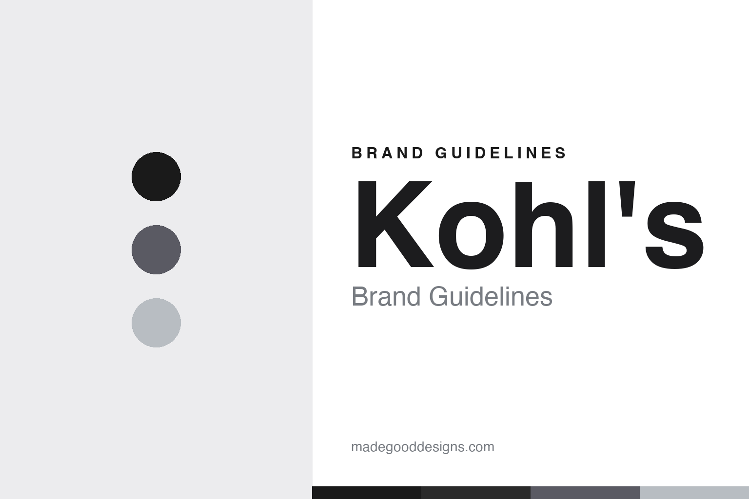
Kohl’s lives in understated monochrome. Click a swatch to copy the hex.
Kohl’s palette is deliberately monochrome — a clean black wordmark on white, with slate and silver grays. The restraint reads as modern, versatile and quietly confident, letting the merchandise and the promotions carry the colour. It’s an accessible, department-store-appropriate scheme that feels current and uncluttered rather than loud, matching a mid-tier retailer that wants to feel both value-driven and a step above the discounters. The honest caveat: Kohl’s publishes no official public brand hex — the black-and-white here is the observed, conventional palette, not a confirmed spec.
The lesson is versatile restraint. Kohl’s monochrome wordmark works across everything from apparel to home goods to seasonal promotions without clashing. For designers, it’s a reminder that a simple black-and-white identity is flexible and timeless. The takeaways: use a restrained, monochrome palette for versatility across a broad assortment; let product and promotions supply the colour; and treat specific values as observed when no official spec is published.
Typography
The wordmark is a clean sans — modern and versatile.
Kohl’s clean sans wordmark — the current black “Kohl’s,” with its distinctive lowercase — is modern and versatile. The simple, contemporary letters read as approachable, value-friendly and current, matching a mid-tier department store that wants to feel accessible yet a cut above discount. The understated black keeps it flexible across a huge range of products and promotions, and the lowercase treatment feels friendly rather than formal. (The mark has evolved over the years — from a 1946 black-and-white origin through a purple all-caps era — so black is correct for the current logo, not for every era.) (Because the exact face is custom and undocumented, the honest description is “a clean sans,” not a named font.) The type behaves like the brand: modern, versatile and accessible.
Aa
A clean sans — modern and versatile. (Specimen set in Poppins, a geometric sans in the spirit of the Kohl’s wordmark; the real face is undocumented.)
Owning the middle
Kohl’s built a brand on value and convenience.
Kohl’s is a lesson in owning the middle of the market with value and convenience. Rather than compete with luxury department stores or race to the bottom with dollar chains, Kohl’s planted itself in the accessible middle — moderately-priced brands, convenient off-mall locations, and a relentless value message reinforced by coupons and Kohl’s Cash. That clear positioning, plus modern partnerships (Amazon returns, Sephora at Kohl’s), kept it relevant. The understated black identity supports the strategy: flexible, approachable and value-forward. Sometimes the winning move is to own the sensible middle that everyone else overlooks.
For designers and brand-builders, Kohl’s offers a clear takeaway: a clear mid-market positioning, plus a memorable loyalty mechanic, can build a durable brand. The lessons: stake out a clear position (accessible mid-tier, off-mall convenience); invest in an ownable loyalty loop (Kohl’s Cash); and keep the identity flexible and value-friendly (the clean black wordmark). It’s also a reminder to keep the facts precise — Kohl’s began as Maxwell Kohl’s 1927 Milwaukee grocery, opened its first department store in 1962, is a mid-tier off-mall retailer (not a discounter), is famous for Kohl’s Cash, added Amazon returns and Sephora at Kohl’s, and is publicly traded (NYSE: KSS). Kohl’s owned the middle — proof that a clear position and a loyalty loop can build a lasting brand.
Explore & save
Keep Kohl’s’s identity on hand — save it to a board in the Made Good inspiration library.
Kohl’s identity set
Pin the monochrome palette and the clean-sans spirit to your own board.