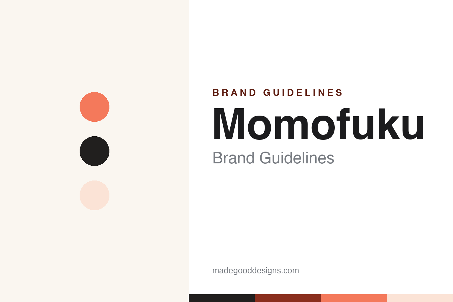
Momofuku Brand Guidelines
David Chang’s restaurant flavours, brought to the pantry.
Aa
Two constants: a peach-coral palette and a clean sans. Abstract homage — not the Momofuku wordmark or logo.
Restaurant to pantry
Momofuku brought chef flavour home.
Momofuku is a lesson in extending a chef’s brand into the pantry. The name — meaning “lucky peach,” a nod to instant-ramen inventor Momofuku Ando — began with chef David Chang’s Momofuku Noodle Bar in New York in 2004. In 2020, its consumer arm, Momofuku Goods, launched a line of packaged pantry products, led by its hit Chili Crunch, alongside noodles, soy sauce, tare and seasoned salts.
Built on Chang’s celebrity (from Ugly Delicious to Lucky Peach magazine and the memoir Eat a Peach), the Goods business became a major success — reportedly surpassing the restaurant group’s revenue by 2024 — selling direct and through Whole Foods and Target. Its packaging is clean and bold, keyed to a signature peach/coral that plays on the “lucky peach” motif.
(Honest notes: Momofuku the restaurant group is distinct from Momofuku Goods, the CPG line; and the brand’s most-discussed moment is the 2024 “Chili Crunch” trademark controversy — Momofuku tried to enforce a trademark on the term and sent cease-and-desist letters to smaller, often Asian-owned brands, drew heavy backlash, and then David Chang publicly apologised and Momofuku dropped enforcement, acknowledging the term belongs to the culture. No official brand hex is published.)
Colour
Momofuku lives in a peach-coral palette. Click a swatch to copy the hex.
Momofuku Goods’ identity is warm, clean and bold — a lucky-peach coral, a soft blush, a charcoal ink, a warm paper, and a burnt terracotta. The palette reads like a modern, minimal pantry: a warm peach hero on clean, uncluttered ground. It signals chef-driven, premium, contemporary food rather than a busy grocery label. The honest caveat: with no published brand hex, these tones are an original, unofficial interpretation, not first-party values.
The lesson is a peach-coral palette signals a modern, chef-driven pantry. Momofuku’s world reads as warm and confident. For designers, it is a reminder that a single warm hero colour (peach) on clean ground conveys premium, modern food, matching a brand built on the “lucky peach” motif and restaurant pedigree. The takeaways: anchor on one warm signature colour; keep the ground clean and minimal; and treat any single hex as unofficial — using a dark terracotta for small text so the coral stays in the palette.
Typography
The wordmark spirit is a clean sans — modern and confident.
Momofuku Goods’ identity carries a modern, confident, chef-driven spirit — a “MOMOFUKU” wordmark whose clean forms match a premium pantry brand. A clean sans captures the mood: it is minimal and assured, the register of a design-led restaurant-to-pantry line rather than a cluttered grocery product. Set against a peach-coral palette, the clean sans feels modern and confident — exactly the lucky-peach, restaurant-pedigree personality Momofuku carries. It is assured rather than busy, mirroring premium, minimal packaging. (Momofuku’s real wordmark is a trademark we describe but do not reproduce, and the exact typeface is not something we assert.) Because the specific mark is not ours to use, the honest description is “a clean sans spirit,” not the Momofuku logo. The type behaves like the brand: modern, confident and chef-driven.
Aa
A clean sans spirit — modern and confident. (Specimen set in Instrument Sans, a clean modern sans; NOT the Momofuku logo, which is a trademark.)
Chef pedigree as the difference
Momofuku stands for restaurant flavour at home.
Momofuku is a lesson in turning a chef’s credibility into a pantry brand. Rather than a faceless food startup, Momofuku Goods carried the weight of David Chang’s restaurants, shows and writing — so its Chili Crunch and noodles felt like the real thing brought home. That pedigree, plus clean modern design, made the CPG line a standout and eventually its biggest business. The differentiator is authentic chef credibility, packaged well.
For designers and brand-builders, Momofuku offers a clear takeaway: genuine pedigree, well-designed, can carry a new product line — but reputation must be handled with care. The lessons: let real credibility (a chef’s restaurants) anchor a consumer line; keep the design clean so the pedigree reads as premium; and remember that trust is fragile — the 2024 chili-crunch trademark episode showed how quickly goodwill can turn, and how an honest apology can begin to repair it. It is also a reminder to stay accurate: Momofuku Goods (the 2020 CPG line) is distinct from the restaurants, and the trademark dispute ended in an apology and dropped enforcement — with the palette here an unofficial interpretation. Momofuku brought the restaurant home — proof that chef pedigree can be the difference.
Explore & save
Keep Momofuku’s identity on hand — save it to a board in the Made Good inspiration library.
Momofuku identity set
Pin the peach-coral palette and the clean-sans spirit to your own board.


