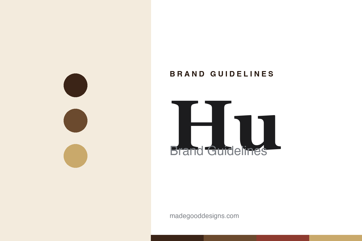
Hu Brand Guidelines
Simple-ingredient chocolate — “get back to human.”
Aa
Two constants: a cacao-and-cream palette and a refined serif. Abstract homage — not the Hu wordmark or logo.
Get back to human
Hu makes chocolate from simple ingredients.
Hu is a lesson in a restaurant philosophy becoming a product. Founded in 2012 as Hu Kitchen, a paleo-inspired restaurant in New York, by siblings Jordan Brown and Jessica Karp with Jason Karp (Jessica’s husband), it grew out of a simple idea captured in its name: “Hu” is short for “human,” and the mission is to “get back to human” — real, simple, unprocessed food.
Unable to find a chocolate that met their standards, they made their own — and Hu Chocolate bars became the flagship: paleo, vegan, organic and radically simple (the plainest bar is just cacao, unrefined coconut sugar and cocoa butter), with no dairy, soy, emulsifiers or refined sugar and a “No Weird Ingredients” promise. The range extends to grain-free crackers and snacks.
(Honest notes: “Hu” stands for “human,” per the brand’s stated “get back to human” philosophy; Hu started as an NYC restaurant (2012), with chocolate coming later; its chocolate is the flagship, paleo/vegan/simple-ingredient; and it has been owned by Mondelez (the maker of Oreo and Cadbury) since a full acquisition in January 2021, following a 2019 minority stake. No official brand hex is published.)
Colour
Hu lives in a cacao-and-cream palette. Click a swatch to copy the hex.
Hu’s identity is clean, minimal and natural — a rich cacao brown, a mid cocoa, a cream, a kraft tan, and a cacao red. The palette reads like a simple chocolate bar: deep cacao browns on clean cream, with a natural kraft warmth. It signals purity and premium simplicity rather than busy, sugary packaging. The honest caveat: with no published brand hex, these tones are an original, unofficial interpretation, not first-party values.
The lesson is a cacao-and-cream palette signals clean, premium chocolate. Hu’s world reads as natural and refined. For designers, it is a reminder that deep cacao browns on clean cream convey simplicity and quality, matching a brand whose whole promise is “no weird ingredients.” The takeaways: build from real cacao browns and cream with a natural accent; let simplicity read as premium; and treat any single hex as unofficial — using the deep cacao for small text, where it already leads.
Typography
The wordmark spirit is a refined serif — clean and premium.
Hu’s identity carries a clean, premium, natural spirit — a “HU” wordmark whose refined forms match a simple-ingredient chocolate. A refined serif captures the mood: it is elegant and restrained, the register of a premium, clean-label product rather than a busy candy bar. Set against a cacao-and-cream palette, the refined serif feels clean and premium — exactly the get-back-to-human, simple-ingredient personality Hu carries. It is understated rather than loud, mirroring a pared-back, quality product. (Hu’s real wordmark is a trademark we describe but do not reproduce, and the exact typeface is not something we assert.) Because the specific mark is not ours to use, the honest description is “a refined serif spirit,” not the Hu logo. The type behaves like the brand: clean, premium and natural.
Aa
A refined serif spirit — clean and premium. (Specimen set in Cormorant Garamond, a refined serif; NOT the Hu logo, which is a trademark.)
Simplicity as the difference
Hu stands for chocolate with nothing weird in it.
Hu is a lesson in making simplicity the entire promise. Born from a restaurant that could not find a chocolate clean enough to serve, Hu built its whole brand on a short, honest ingredient list — “get back to human,” “no weird ingredients” — and let that purity be the premium. In a category full of additives and busy wrappers, radical simplicity, cleanly designed, became the point of difference. The differentiator is a clear, credible promise: real food, nothing extra.
For designers and brand-builders, Hu offers a clear takeaway: simplicity, made premium, can define a brand. The lessons: build the promise on a short, honest ingredient list; let clean, minimal design signal quality; and root it in a genuine philosophy (get back to human). It is also a reminder to stay accurate: “Hu” means “human,” it started as an NYC restaurant, and it has been Mondelez-owned since 2021 — with the palette here an unofficial interpretation. Hu kept it simple — proof that simplicity can be the difference.
Explore & save
Keep Hu’s identity on hand — save it to a board in the Made Good inspiration library.
Hu identity set
Pin the cacao-and-cream palette and the refined-serif spirit to your own board.


