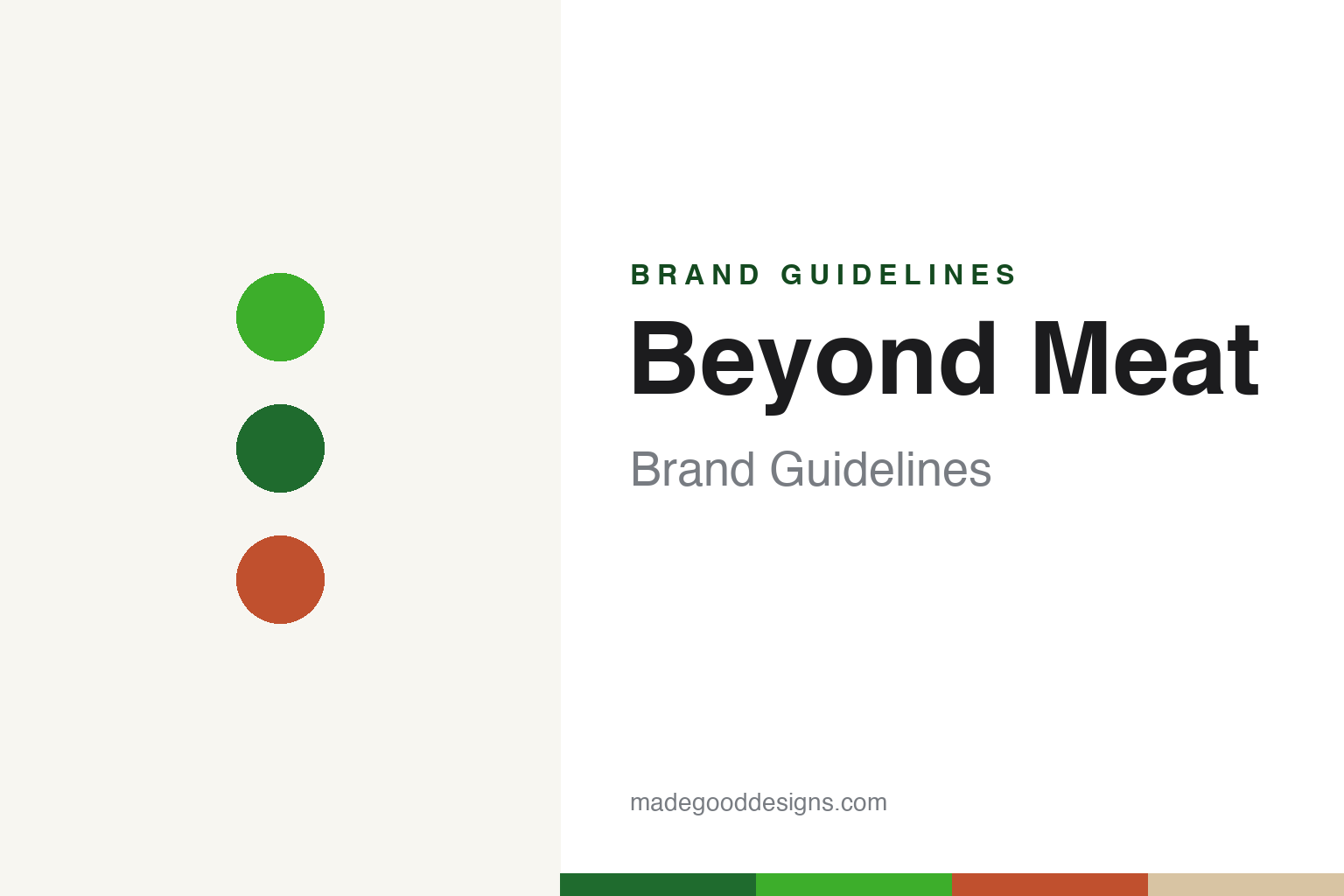
Beyond Meat Brand Guidelines
Plant-based meat — built for the meat aisle.
Aa
Two constants: a green-and-white palette and a clean sans. Abstract homage — not the Beyond Meat wordmark or logo.
Meat from plants
Beyond Meat put plant-meat in the meat aisle.
Beyond Meat is a lesson in reframing a product’s place in the market. Founded in 2009 by Ethan Brown in El Segundo, California, it makes plant-based meat from pea protein — the Beyond Burger (2016), which “bleeds” using beet juice, plus Beyond Sausage, Beef and Chicken. Its key strategic choice was to sell it in the refrigerated meat case, next to beef and chicken, aimed at meat-eaters and flexitarians rather than vegans.
It made history as the first plant-based-meat company to go public — a 2019 Nasdaq IPO (ticker BYND) that surged over 160% on its first day, one of the best debuts in years — backed by investors from Bill Gates to Kleiner Perkins, with celebrity fans and fast-food pilots (McDonald’s, Dunkin’, KFC and more).
(Honest notes: Beyond Meat is pea-protein-based and “bleeds” with beet juice — a clean contrast with Impossible’s soy-heme; it is merchandised in the meat aisle by design, not as a niche vegan product; it was the first plant-based-meat IPO (2019); and after that soaring debut it has faced a documented multi-year decline — falling sales, losses and layoffs amid a category slowdown. No official brand hex is published.)
Colour
Beyond Meat lives in a green-and-white palette. Click a swatch to copy the hex.
Beyond Meat’s identity is fresh, clean and green — a fresh green, a deep green, a clean white, a meaty terracotta, and a kraft tan. The palette reads like the pitch: plant-fresh greens signalling “from plants,” with a warm, meaty accent for the product itself. It signals a plant product built to sit credibly beside real meat. The honest caveat: with no published brand hex, these tones are an original, unofficial interpretation, not first-party values.
The lesson is a green-and-white palette signals plant-based meat. Beyond Meat’s world reads as fresh and clean. For designers, it is a reminder that plant greens with a warm meaty accent convey “plant protein that acts like meat,” matching a brand engineered for the meat aisle. The takeaways: lead with fresh greens for the plant story; add a warm meaty accent for the product; and treat any single hex as unofficial — using the deep green for small text so the bright green stays in the palette.
Typography
The wordmark spirit is a clean sans — fresh and confident.
Beyond Meat’s identity carries a fresh, confident, modern spirit — a “BEYOND MEAT” wordmark and flame-like mark whose clean forms match a plant-meat brand built for the mainstream. A clean sans captures the mood: it is confident and contemporary, the register of a modern food brand that belongs in the meat aisle. Set against a green-and-white palette, the clean sans feels fresh and confident — exactly the plant-protein, mainstream personality Beyond Meat carries. It is confident rather than niche, mirroring a product made to compete with meat. (Beyond Meat’s real wordmark and mark are trademarks we describe but do not reproduce, and the exact typeface is not something we assert.) Because the specific mark is not ours to use, the honest description is “a clean sans spirit,” not the Beyond Meat logo. The type behaves like the brand: fresh, confident and modern.
Aa
A clean sans spirit — fresh and confident. (Specimen set in Public Sans, a clean sans; NOT the Beyond Meat logo, which is a trademark.)
Positioning as the difference
Beyond Meat stands for plant-meat for meat-eaters.
Beyond Meat is a lesson in where you compete, not just what you make. Its boldest move was not the pea-protein burger itself but the decision to sell it in the meat aisle, aimed at meat-eaters — reframing plant protein as a direct alternative to beef rather than a vegetarian niche. That positioning, plus a landmark 2019 IPO, made Beyond Meat the face of the plant-meat boom. The differentiator was placement and framing: meat from plants, sold like meat.
For designers and brand-builders, Beyond Meat offers a clear takeaway: positioning can be as powerful as the product. The lessons: choose the frame that expands the market (meat-eaters, not just vegans); merchandise where that audience already shops (the meat case); and let a fresh, confident identity carry it. It is also a reminder to stay accurate: Beyond Meat is pea-based (bleeding with beet juice), it was the first plant-based-meat IPO, and it has since faced a real decline — with the palette here an unofficial interpretation. Beyond Meat chose the meat aisle — proof that positioning can be the difference.
Explore & save
Keep Beyond Meat’s identity on hand — save it to a board in the Made Good inspiration library.
Beyond Meat identity set
Pin the green-and-white palette and the clean-sans spirit to your own board.


