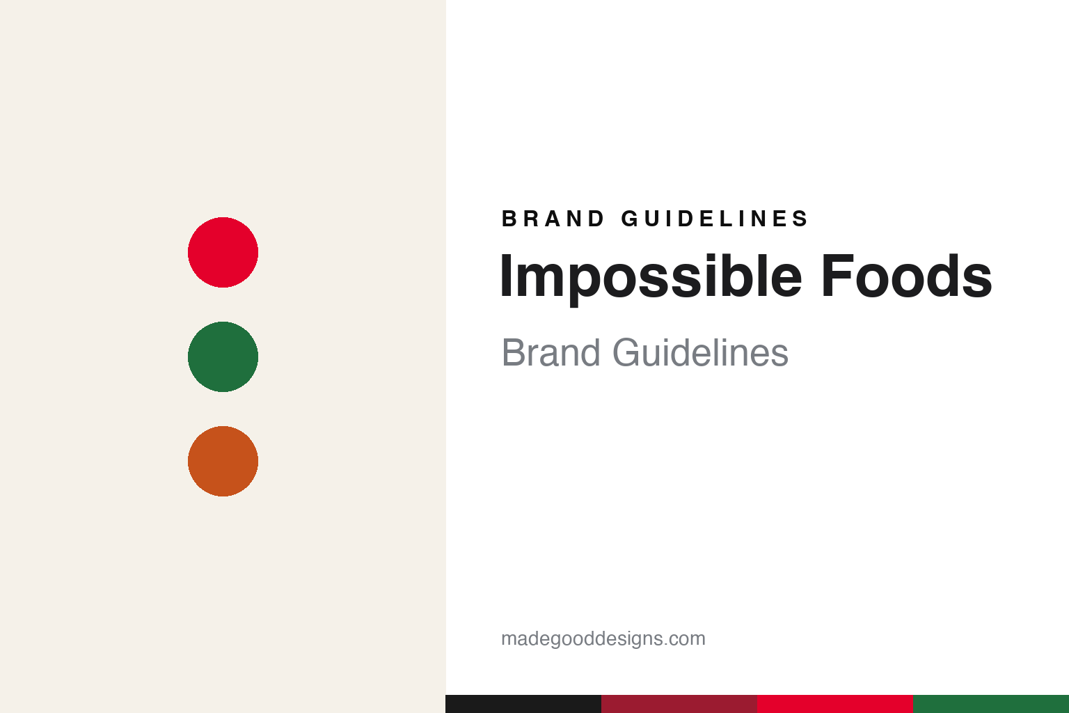
Impossible Foods Brand Guidelines
Plant-based meat, engineered to bleed.
Aa
Two constants: a bold red-and-green palette and a modern sans. Abstract homage — not the Impossible Foods wordmark or logo.
The science of bleeding
Impossible engineered meat from plants.
Impossible Foods is a lesson in science as the brand. Founded in 2011 by Patrick Brown, a Stanford biochemistry professor, in Redwood City, California, its signature is heme — specifically soy leghemoglobin, an iron-containing molecule produced by a genetically engineered yeast through fermentation — which makes the Impossible Burger (2016) look, cook and taste meaty, and appear to “bleed.”
It launched restaurant-first — debuting at chef David Chang’s Momofuku Nishi in New York in 2016, then going mainstream with the Burger King Impossible Whopper in 2019 — before retail. Driven by a mission to replace animals in the food system for the climate, it drew investors from Bill Gates to Serena Williams, and, unlike Beyond Meat, it stayed private.
(Honest notes: Impossible’s heme is soy leghemoglobin from genetically engineered yeast — not blood, not animal-derived; it launched restaurant-first, not retail-first; and, in the sharpest contrast with rival Beyond Meat, it has remained privately held (soy-and-heme versus Beyond’s pea-and-beet) — later pivoting to a bolder, meat-aisle-red identity in the early 2020s. No official brand hex is published.)
Colour
Impossible lives in a bold red-and-green palette. Click a swatch to copy the hex.
Impossible Foods’ identity is bold, science-forward and meaty — an Impossible red, a deep crimson, a lab green, a warm sear, and a clean bone. The palette reads like its pivot into the meat aisle: a bold “bleeding” red and seared warmth, with a lab-green nod to its plant-science heritage. It signals a confident, science-led product that means to compete with meat. The honest caveat: with no published brand hex, these tones are an original, unofficial interpretation, not first-party values.
The lesson is a bold red-and-green palette signals science-led plant meat. Impossible’s world reads as bold and technical. For designers, it is a reminder that a meaty red with a lab-green accent conveys plant science engineered to taste like meat, matching a brand built on heme. The takeaways: lead with a bold, meaty red; keep green as a single science-heritage accent; and treat any single hex as unofficial — using a charcoal for small text so the red stays in the palette.
Typography
The wordmark spirit is a modern sans — bold and technical.
Impossible Foods’ identity carries a bold, technical, science-forward spirit — an “IMPOSSIBLE” wordmark whose confident forms match a science-led plant-meat brand. A modern sans captures the mood: it is strong and contemporary, the register of a biotech-backed food company rather than a rustic natural brand. Set against a bold red-and-green palette, the modern sans feels bold and technical — exactly the heme, engineered-meat personality Impossible carries. It is confident rather than folksy, mirroring a science-driven product. (Impossible’s real wordmark is a trademark we describe but do not reproduce, and the exact typeface is not something we assert.) Because the specific mark is not ours to use, the honest description is “a modern sans spirit,” not the Impossible logo. The type behaves like the brand: bold, technical and science-forward.
Aa
A modern sans spirit — bold and technical. (Specimen set in Red Hat Display, a modern sans; NOT the Impossible logo, which is a trademark.)
Science as the difference
Impossible stands for engineered plant meat.
Impossible Foods is a lesson in building a brand on a scientific breakthrough. Its whole story is heme — a molecule it produces with engineered yeast to make a plant burger genuinely taste and “bleed” like beef. That science, launched restaurant-first for credibility and tied to a climate mission, set Impossible apart from anyone simply shaping vegetables into patties. The differentiator is a real technical breakthrough, worn openly as the brand’s identity.
For designers and brand-builders, Impossible offers a clear takeaway: a genuine scientific difference can be the whole brand. The lessons: lead with the real breakthrough (heme) rather than generic “natural” claims; earn credibility where experts are (restaurants first); and let a bold, technical identity carry it. It is also a reminder to stay accurate: heme is soy leghemoglobin from engineered yeast, Impossible launched restaurant-first, and it stayed private (unlike Beyond) — with the palette here an unofficial interpretation. Impossible engineered the bleed — proof that science can be the difference.
Explore & save
Keep Impossible Foods’s identity on hand — save it to a board in the Made Good inspiration library.
Impossible Foods identity set
Pin the bold red-and-green palette and the modern-sans spirit to your own board.


