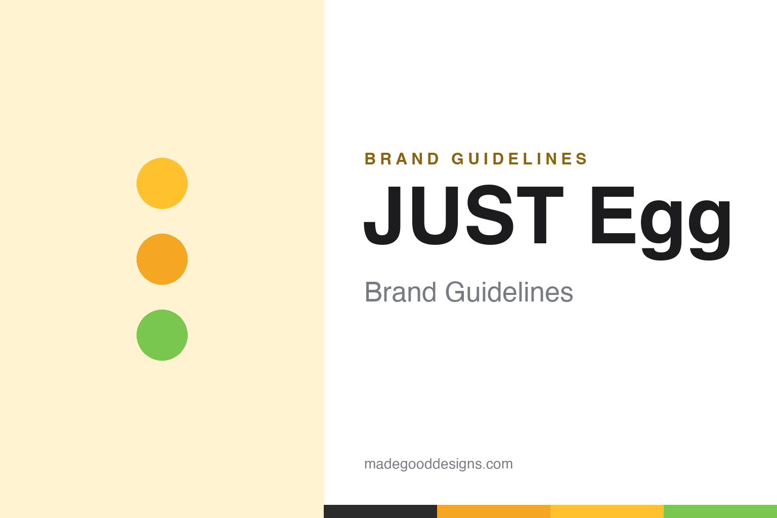
JUST Egg Brand Guidelines
Plant-based eggs, made from mung beans.
Aa
Two constants: an egg-yolk-yellow palette and a friendly rounded. Abstract homage — not the JUST Egg wordmark or logo.
An egg from a bean
JUST Egg scrambles like a real egg.
JUST Egg is a lesson in an unlikely ingredient solving a familiar problem. It is made by Eat Just, Inc. — the company formerly known as Hampton Creek, founded in 2011 by Josh Tetrick and Josh Balk in the San Francisco Bay Area. Its hit product, JUST Egg (launched 2017), is a plant-based liquid egg made from mung-bean protein that scrambles and cooks like a real egg, sold as a pourable bottle and a folded patty.
The company has a colourful history: as Hampton Creek it was famous for Just Mayo, which drew an FDA labeling dispute (mayonnaise’s legal definition requires eggs, and Just Mayo has none). Its sister brand, GOOD Meat, made history with the world’s first regulatory approval of cultivated (lab-grown) chicken in Singapore in 2020, later cleared in the US.
(Honest notes: JUST Egg is mung-bean-based; it is made by Eat Just, formerly Hampton Creek (the Just Mayo company); the Just Mayo name was disputed with the FDA precisely because real mayo needs eggs; its cultivated-meat sister GOOD Meat achieved the Singapore world-first; and it is headquartered in the SF Bay Area (Alameda), not San Francisco proper. No official brand hex is published.)
Colour
JUST Egg lives in an egg-yolk-yellow palette. Click a swatch to copy the hex.
JUST Egg’s identity is bright, warm and friendly — an egg-yolk yellow, a golden amber, a pale cream, a soft charcoal, and a fresh green. The palette reads like a scramble: a warm, saturated yolk-yellow that instantly says “egg,” grounded by clean neutrals. It signals a familiar, appetising, mainstream food rather than a niche health product. The honest caveat: with no published brand hex, these tones are an original, unofficial interpretation, not first-party values.
The lesson is an egg-yolk-yellow palette signals a plant-based egg. JUST Egg’s world reads as warm and appetising. For designers, it is a reminder that a saturated yolk-yellow makes a plant product read instantly as “egg,” matching a brand that wants to sit in everyone’s fridge. The takeaways: borrow the real food’s signature colour (yolk-yellow); keep it bright and friendly; and treat any single hex as unofficial — using a dark gold or charcoal for small text so the yellow stays in the palette.
Typography
The wordmark spirit is a friendly rounded — warm and approachable.
JUST Egg’s identity carries a warm, approachable, friendly spirit — a “JUST Egg” wordmark whose rounded forms match a mainstream, appetite-forward food. A friendly rounded sans captures the mood: it is warm and welcoming, the register of an everyday grocery product rather than a clinical alt-protein. Set against an egg-yolk-yellow palette, the friendly rounded feels warm and approachable — exactly the familiar, mainstream personality JUST Egg carries. It is welcoming rather than technical, mirroring an everyday breakfast staple. (JUST Egg’s real wordmark is a trademark we describe but do not reproduce, and the exact typeface is not something we assert.) Because the specific mark is not ours to use, the honest description is “a friendly rounded spirit,” not the JUST Egg logo. The type behaves like the brand: warm, approachable and friendly.
Aa
A friendly rounded spirit — warm and approachable. (Specimen set in Nunito, a friendly rounded sans; NOT the JUST Egg logo, which is a trademark.)
Familiarity as the difference
JUST Egg stands for a plant egg that feels normal.
JUST Egg is a lesson in making a novel product feel completely familiar. A liquid made from mung beans could have read as strange; instead JUST Egg wrapped it in the most familiar cues possible — a yolk-yellow colour, a scramble on the pack, a friendly name — so it behaves and looks like the egg people already know. That familiarity, plus real cooking performance, is what pushed a plant egg into mainstream fridges. The differentiator is normality: an unusual ingredient made to feel ordinary.
For designers and brand-builders, JUST Egg offers a clear takeaway: familiar cues can carry an unfamiliar product. The lessons: borrow the reference food’s strongest signals (yolk colour, scramble imagery); keep the name and look friendly, not clinical; and let real performance back it up. It is also a reminder to stay accurate: JUST Egg is mung-bean-based, made by Eat Just (formerly Hampton Creek), and its GOOD Meat sibling achieved the cultivated-chicken world-first — with the palette here an unofficial interpretation. JUST Egg felt normal — proof that familiarity can be the difference.
Explore & save
Keep JUST Egg’s identity on hand — save it to a board in the Made Good inspiration library.
JUST Egg identity set
Pin the egg-yolk-yellow palette and the friendly-rounded spirit to your own board.


