Mast Brand Guidelines
Brooklyn chocolate — and its famous patterned wrappers.
Aa
Two constants: a decorative-pastel palette and an elegant serif. Abstract homage — not the Mast wordmark or logo.
The wrapper that launched a look
Mast made packaging the story.
Mast is a lesson in the power — and peril — of packaging. Founded in 2007 in Brooklyn by brothers Rick and Michael Mast (originally from Iowa), Mast Brothers became the bearded face of the American craft-chocolate movement. But its most lasting legacy is design: its bars were wrapped in beautiful, custom patterned paper — decorative geometric and floral prints — that became Instagram-famous, hugely influential, and widely imitated across craft food. The packaging was so celebrated that many argued it was more famous than the chocolate itself.
That fame came with a reckoning. In 2015, an exposé alleged that in its early years, before it was fully bean-to-bar, Mast had re-melted industrial couverture chocolate and presented it within a handmade image. The brothers acknowledged early experimentation with couverture, said they had discontinued it around 2009, and maintained their early products were not misrepresented as fully bean-to-bar. The episode became a cautionary tale about style over substance. The company later rebranded to simply “Mast.”
(Honest notes: Mast’s enduring legacy is its iconic patterned-paper design and its outsized influence; the 2015 controversy is best presented as an allegation plus the brothers’ response, not a settled verdict; the shift to genuine bean-to-bar from around 2009 is their stated position; and today “Mast” is a smaller operation than at its peak. No official brand hex is published.)
Colour
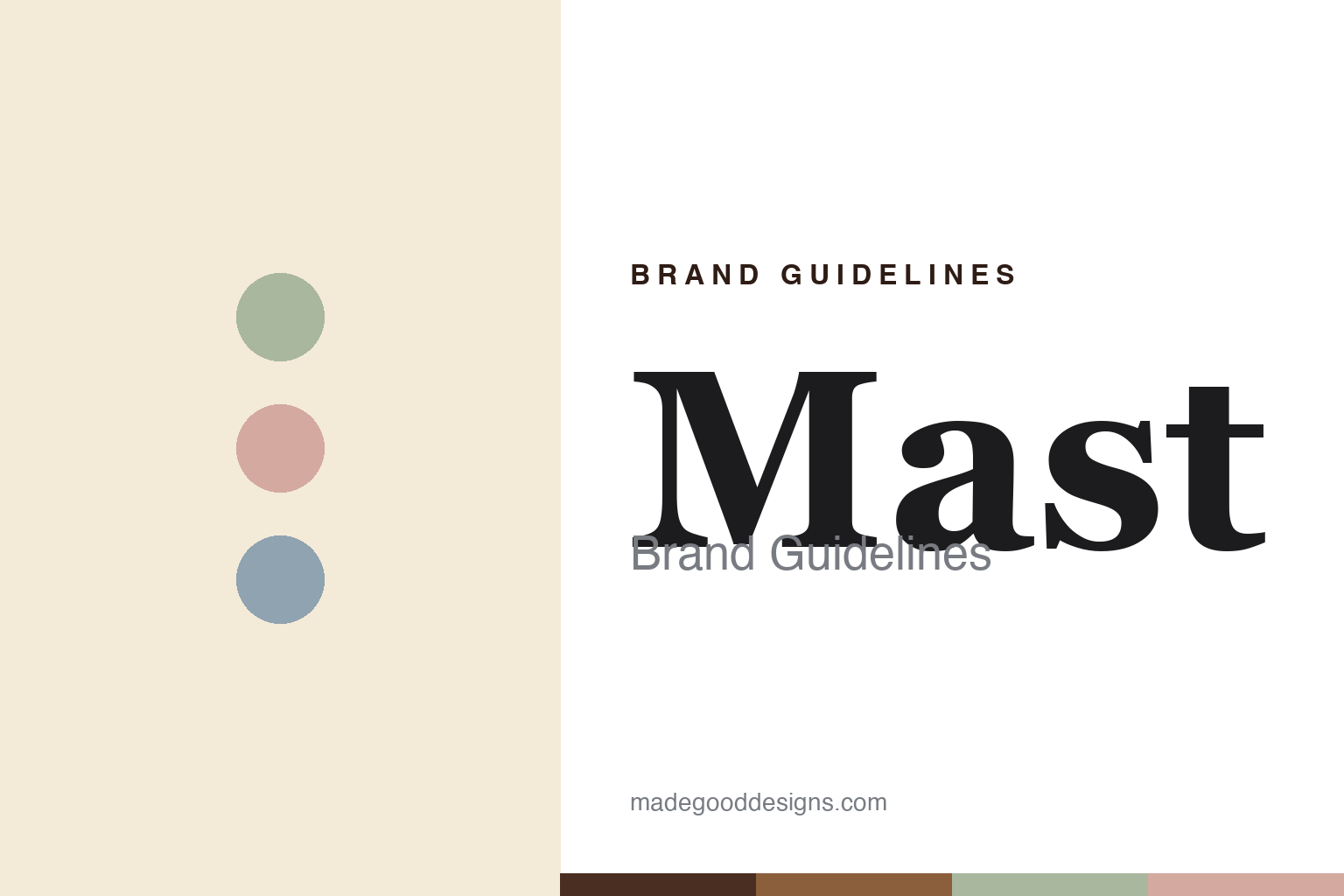
Mast lives in a decorative-pastel palette. Click a swatch to copy the hex.
Mast’s identity is decorative, elegant and soft — a cocoa brown, a milk-chocolate mid, a cream, a muted sage, a dusty rose, and a soft slate-blue. The palette reads like its patterned wrappers: cocoa tones grounding soft, decorative pastels, refined and print-like. It signals elegant, design-led craft rather than loud packaging. The honest caveat: with no published brand hex, these tones are an original, unofficial interpretation, not first-party values.
The lesson is a decorative-pastel palette signals design-led, decorative packaging. Mast’s world reads as elegant and refined. For designers, it is a reminder that cocoa tones with soft decorative pastels evoke patterned, print-forward packaging, matching a brand whose wrappers became a design icon. The takeaways: ground decorative pastels with cocoa tones; let a print-like, elegant feel lead; and treat any single hex as unofficial — using the cocoa brown for small text so the pastels stay in the palette.
Typography
The wordmark spirit is an elegant serif — refined and decorative.
Mast’s identity carries a refined, decorative, elegant spirit — a “MAST” wordmark whose graceful forms match a design-led, patterned-paper brand. An elegant serif captures the mood: it is refined and decorative, the register of a design-forward luxury bar rather than a rustic maker. Set against a decorative-pastel palette, the elegant serif feels refined and decorative — exactly the patterned-paper, design-icon personality Mast carries. It is polished rather than plain, mirroring beautiful, decorative packaging. (Mast’s real wordmark and patterned papers are trademarks/trade dress we describe but do not reproduce, and the exact typeface is not something we assert.) Because the specific mark is not ours to use, the honest description is “an elegant serif spirit,” not the Mast logo. The type behaves like the brand: refined, decorative and elegant.
Aa
An elegant serif spirit — refined and decorative. (Specimen set in Playfair Display, a high-contrast serif; NOT the Mast logo, which is a trademark.)
Design power (and its limits) as the lesson
Mast shows how much — and how little — design can do.
Mast is a lesson in how far design can carry a brand, and where it can’t. Its patterned-paper wrappers were so distinctive that they created a whole aesthetic, made a small Brooklyn maker famous, and were copied everywhere — proof that packaging design can be a genuine competitive force. But the 2015 controversy is the flip side: when the story questioned whether the substance matched the style, the very design fame that built Mast amplified the fall. The lesson is that great design is powerful, but it cannot substitute for substance.
For designers and brand-builders, Mast offers a clear, two-sided takeaway: invest in distinctive design, but make sure the substance holds. The lessons: distinctive packaging can create outsized fame (the patterned paper); that same visibility raises the stakes if the story is questioned; and durable brands align look and substance. It is also a reminder to stay accurate: Mast’s patterned paper is its design legacy, the 2015 remelting story is an allegation plus the brothers’ response, and the brand is smaller today — with the palette here an unofficial interpretation. Mast showed design’s power and its limits — proof that look and substance both matter.
Explore & save
Keep Mast’s identity on hand — save it to a board in the Made Good inspiration library.
Mast identity set
Pin the decorative-pastel palette and the elegant-serif spirit to your own board.