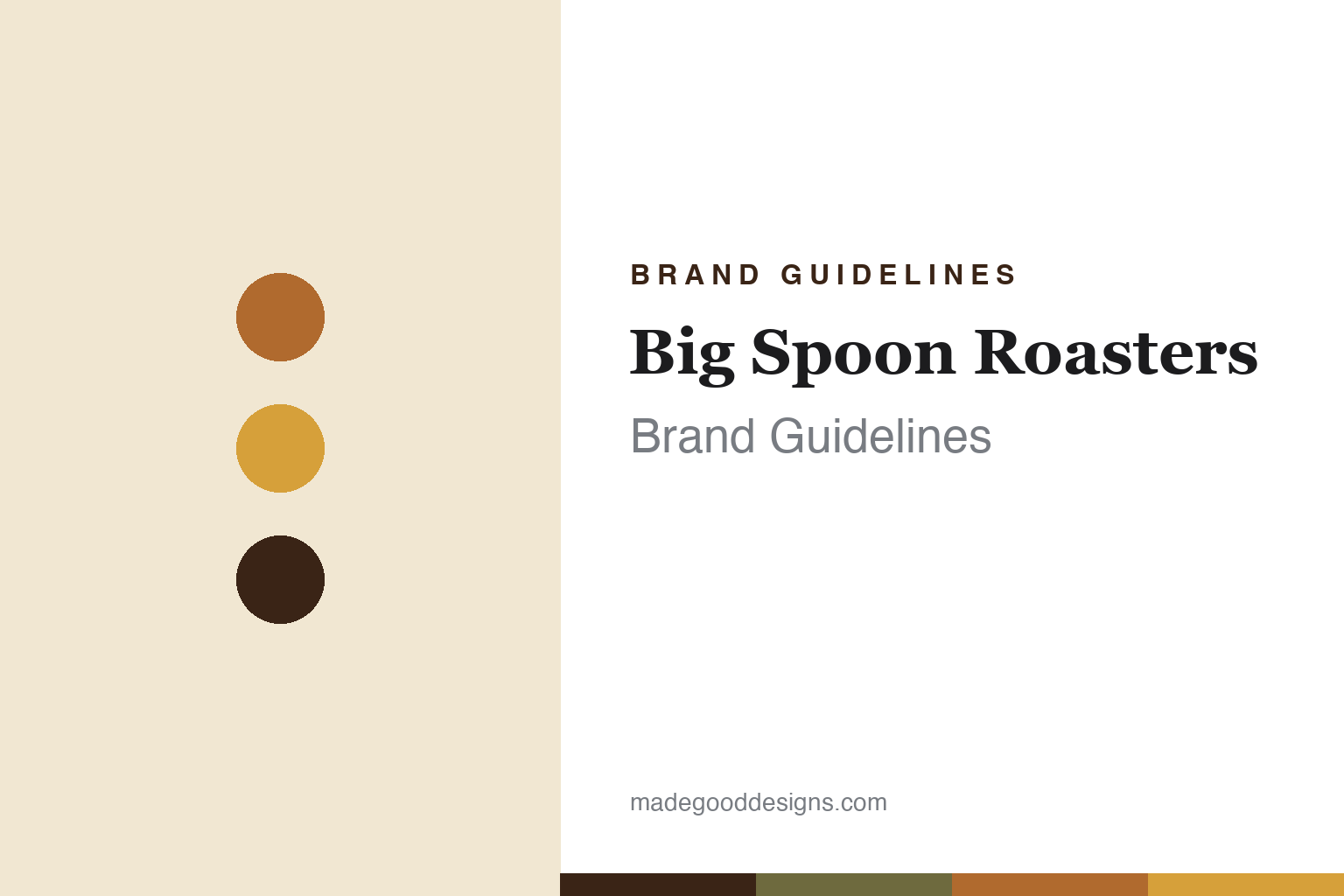
Big Spoon Roasters Brand Guidelines
Small-batch artisan nut butters and bars.
Aa
Two constants: a warm, roasted palette and a craft serif. Abstract homage — not the Big Spoon Roasters wordmark or logo.
Handcrafted from the roast
Big Spoon began in the Peace Corps.
Big Spoon Roasters is a lesson in craft with a story. Founded in 2011 by husband-and-wife Mark and Megan Overbay — the first products sold at a bicycle race — its origin is personal: Mark had served in the Peace Corps in Zimbabwe, where he learned to make peanut butter by roasting nuts and grinding them with stones, later adding honey, sea salt and coconut oil.
The company hand-makes small-batch nut butters from freshly roasted nuts, plus nut-butter bars — a signature Megan created as an athlete who couldn’t find a bar that suited her. It rejects palm oil, fillers and generic “natural flavours,” embracing natural oil separation. It is independent, founder-owned and a Certified B Corporation.
(Honest notes: the company was founded in the Durham, North Carolina area and is now based in nearby Hillsborough, NC — don’t say “Durham” flatly; both founders share the surname Overbay; flavour line-ups rotate seasonally, so we describe the style rather than fixed SKUs; and no official brand hex is published, so colours are an interpretation.)
Colour
Big Spoon lives in a warm, roasted palette. Click a swatch to copy the hex.
Big Spoon’s identity is warm, roasted and artisan — a roasted amber, a honey gold, a deep roast brown, a cream, and an olive. The palette reads like the product: roasted nuts, honey, deep toasty browns — the colours of a small roastery. It signals a hand-made, craft producer rather than a mass-market spread. The honest caveat: with no published brand hex, these tones are an original, unofficial interpretation, not first-party values.
The lesson is warm, roasted tones read as artisan craft. Big Spoon’s world feels hand-made and honest. For designers, it is a reminder that roasted ambers, honey golds and toasty browns communicate small-batch, ingredient-forward craft, matching a brand that roasts and grinds by hand. The takeaways: build on roasted, honeyed tones; keep the look warm and ingredient-forward; and treat any single hex as unofficial — using the deep roast brown for small text so the ambers stay warm.
Typography
The wordmark spirit is a craft serif — warm and handmade.
Big Spoon Roasters’ identity carries a warm, handmade, artisan spirit — a “Big Spoon Roasters” wordmark with a spoon motif that nods to the name. A craft serif captures the mood: it is warm and considered, the register of a small roastery that hand-makes each batch. Set against roasted, honeyed tones, the craft serif feels artisanal and honest — exactly the “handcrafted nut butters and snack bars,” “food matters” personality Big Spoon carries. It is craft rather than corporate, mirroring a made-by-hand producer. (Big Spoon’s real wordmark is a trademark we describe but do not reproduce, and the exact typeface is not something we assert.) Because the specific mark is not ours to use, the honest description is “a craft-serif spirit,” not the Big Spoon logo. The type behaves like the brand: warm, handmade and artisan.
Aa
A craft-serif spirit — warm and handmade. (Specimen set in Vollkorn, a warm serif; NOT the Big Spoon Roasters logo, which is a trademark.)
Craft and conscience as the difference
Big Spoon stands for hand-made integrity.
Big Spoon Roasters is a lesson in staying small on purpose. It did not chase mass distribution; it doubled down on hand-made craft — roasting and grinding in small batches, refusing palm oil and fillers — and on values, as a founder-owned B Corp. That craft-plus-conscience stance, rooted in a genuine origin story, is the whole brand. The differentiator is integrity you can taste: make it by hand, and mean it.
For designers and brand-builders, Big Spoon offers a clear takeaway: an artisan identity should look and feel hand-made. The lessons: build on warm, roasted tones and a craft serif; let a real origin story (Peace Corps, stone-ground peanut butter) carry the brand; and let genuine values (no palm oil, B Corp) do the persuading. It is also a reminder to stay accurate: Big Spoon was founded in 2011 by the Overbays, is based in Hillsborough NC, and is an independent B Corp — with the palette here an unofficial interpretation. Big Spoon stayed hand-made — proof that craft and conscience can be the difference.
Explore & save
Keep Big Spoon Roasters’s identity on hand — save it to a board in the Made Good inspiration library.
Big Spoon Roasters identity set
Pin the warm, roasted palette and the craft-serif spirit to your own board.


