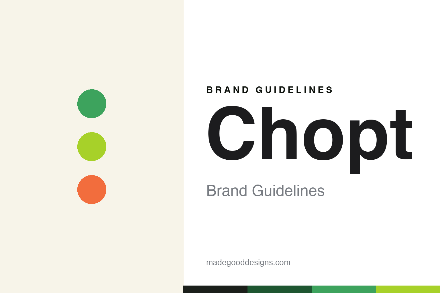
Chopt Brand Guidelines
Creative chopped salads — craveable and bold.
Aa
Two constants: a bold fresh-green palette and a bold sans. Abstract homage — not the Chopt wordmark or logo.
The creative salad company
Chopt makes salads craveable and creative.
Chopt is a lesson in making salad exciting. Founded in 2001 in New York by Tony Shure and Colin McCabe, the Chopt Creative Salad Company built its name on chopped salads — ingredients finely chopped together with a mezzaluna before dressing — and on being genuinely creative about it. Its signature is a rotating series of chef-driven, cuisine- and destination-inspired limited-time menus, drawing flavours from places around the world.
That creative, travel-inspired energy makes Chopt bolder and more craveable than the ultra-minimalist salad chains. A private company of around 70 locations concentrated in the Northeast and Mid-Atlantic, it sits within the Founders Table Restaurant Group.
(Honest notes: Chopt was founded by Tony Shure and Colin McCabe in 2001; it is genuinely a chopped-salad concept, not just build-your-own bowls; its creative angle is rotating cuisine/destination-inspired chef-driven limited-time menus; and on structure, in January 2020 Chopt merged with Dos Toros Taqueria to form the Founders Table Restaurant Group — a merger creating a parent group, not a “2021 acquisition.” No official brand hex is published.)
Colour
Chopt lives in a bold fresh-green palette. Click a swatch to copy the hex.
Chopt’s identity is bold, fresh and craveable — a fresh green, a bright lime, a deep leaf green, a warm tomato accent, and a cream. The palette reads like a vibrant chopped salad: crisp greens energised by a bright lime and a warm, appetising accent. It signals craveable, creative freshness rather than minimalist restraint. The honest caveat: with no published brand hex, these tones are an original, unofficial interpretation, not first-party values.
The lesson is a bold fresh-green palette signals creative, craveable salads. Chopt’s world reads as fresh and energetic. For designers, it is a reminder that crisp greens with a bright lime and a warm accent convey craveable creativity, matching a brand that treats salad as exciting. The takeaways: use bold, fresh greens with an energetic accent; lean into craveable energy over minimalism; and treat any single hex as unofficial — using a near-black for small text so the greens stay in the palette.
Typography
The wordmark spirit is a bold sans — energetic and craveable.
Chopt’s identity carries a bold, energetic, craveable spirit — a “CHOPT” wordmark whose confident forms match a creative salad brand. A bold sans captures the mood: it is energetic and contemporary, the register of a craveable, playful chain rather than a pared-back minimalist one. Set against a bold fresh-green palette, the bold sans feels energetic and craveable — exactly the creative, chopped-salad personality Chopt carries. It is lively rather than restrained, mirroring fresh, exciting food. (Chopt’s real wordmark is a trademark we describe but do not reproduce, and the exact typeface is not something we assert.) Because the specific mark is not ours to use, the honest description is “a bold sans spirit,” not the Chopt logo. The type behaves like the brand: bold, energetic and craveable.
Aa
A bold sans spirit — energetic and craveable. (Specimen set in Bricolage Grotesque, a characterful sans; NOT the Chopt logo, which is a trademark.)
Creativity as the difference
Chopt stands for salads with imagination.
Chopt is a lesson in keeping a simple category exciting. Salad can be boring; Chopt made it creative — the chopped format, plus rotating, chef-driven menus inspired by cuisines and places, so there is always something new and craveable to try. That creativity, matched to a bold, energetic identity, is what set Chopt apart from more minimalist salad chains. The differentiator is imagination: salad treated as a creative, craveable canvas.
For designers and brand-builders, Chopt offers a clear takeaway: creativity and novelty can keep a simple product exciting. The lessons: give a plain category a real point of difference (chopped, chef-driven, travel-inspired); keep it fresh with rotating creative menus; and let a bold, energetic identity match the craveability. It is also a reminder to stay accurate: Chopt was founded by Shure and McCabe in 2001, it is a genuine chopped-salad concept, and it merged with Dos Toros in 2020 to form Founders Table — with the palette here an unofficial interpretation. Chopt made salad creative — proof that imagination can be the difference.
Explore & save
Keep Chopt’s identity on hand — save it to a board in the Made Good inspiration library.
Chopt identity set
Pin the bold fresh-green palette and the bold-sans spirit to your own board.


