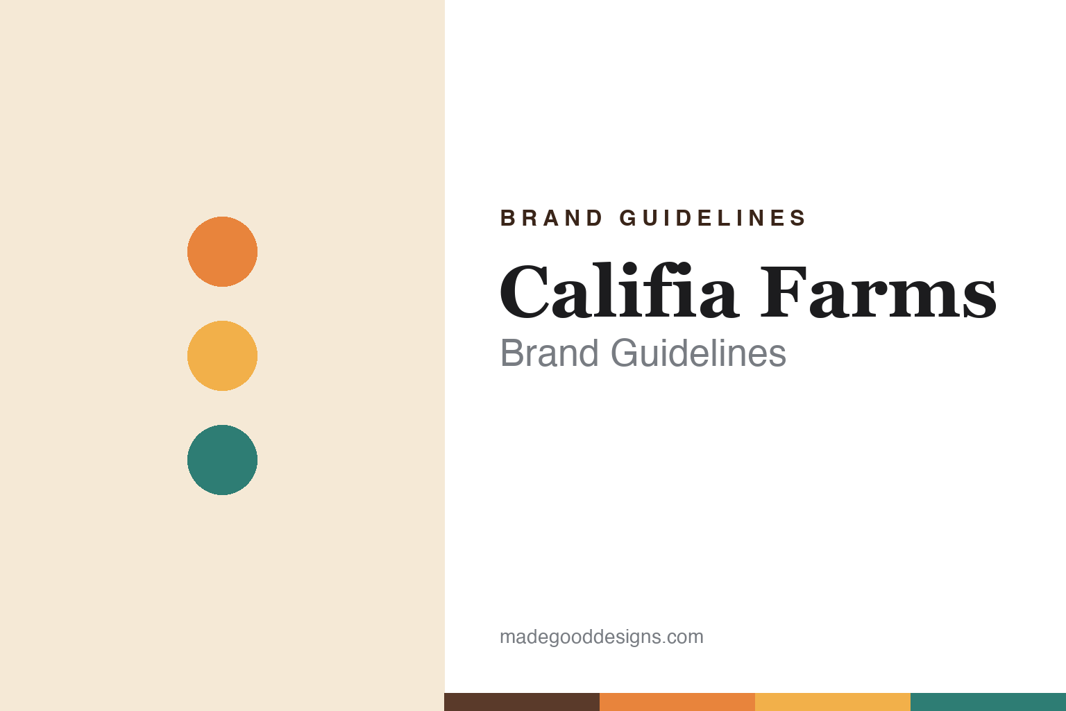
Califia Farms Brand Guidelines
Sunny California plant milk — in the iconic curvy bottle.
Aa
Two constants: a sunny-California palette and a warm serif. Abstract homage — not the Califia wordmark or logo.
The bottle you recognise
Califia is known by its curvy bottle.
Califia Farms is a lesson in a package becoming the brand. Founded in 2010 by Greg Steltenpohl — the juice pioneer who had co-founded Odwalla — in Los Angeles, it makes plant-based milks (almond, oat), creamers, cold brew and ready-to-drink coffees. But its most recognisable asset is its packaging: a distinct, curvy bottle that, in the brand’s own words, “sets us apart in the dairy aisle.”
Its name comes from Queen Calafia, the mythical warrior queen for whom California itself is named — fitting for a sunny, California-rooted brand. Wrapped in warm, golden, West-Coast branding, Califia grew into one of the best-known plant-milk names, backed by major investors.
(Honest notes: founder Greg Steltenpohl co-founded Odwalla (later bought by Coca-Cola) and passed away in 2021; the curvy bottle is the brand’s own stated signature, though the popular stories about what its shape “represents” are design lore, not confirmed fact; “Califia” refers to Queen Calafia, California’s namesake; and it is a private company, with a large 2020 investment round led by the Qatar Investment Authority. No official brand hex is published.)
Colour
Califia lives in a sunny-California palette. Click a swatch to copy the hex.
Califia’s identity is warm, sunny and Californian — a sunset orange, a golden amber, a warm cream, a coffee brown, and a California teal. The palette reads like a West-Coast morning: warm sunset tones and golden light over cream, with a coffee-brown depth and a cool teal accent. It signals warmth, sunshine and easy California living rather than clinical health food. The honest caveat: with no published brand hex, these tones are an original, unofficial interpretation, not first-party values.
The lesson is a sunny-California palette signals warm, plant-based refreshment. Califia’s world reads as warm and inviting. For designers, it is a reminder that sunset oranges and golds over cream evoke a sunny, West-Coast brand, matching a plant-milk maker rooted in California. The takeaways: build from warm sunset and gold tones over cream; add a coffee-brown depth and a cool accent; and treat any single hex as unofficial — using the coffee brown for small text so the sunset tones stay in the palette.
Typography
The wordmark spirit is a warm serif — sunny and characterful.
Califia’s identity carries a warm, sunny, characterful spirit — a “CALIFIA FARMS” wordmark whose warm forms match a sunny California brand. A warm serif captures the mood: it is characterful and inviting, the register of a hand-lettered, West-Coast label rather than a clinical health product. Set against a sunny-California palette, the warm serif feels sunny and characterful — exactly the curvy-bottle, Golden-State personality Califia carries. It is warm rather than sterile, mirroring a sunny, refreshing brand. (Califia’s real wordmark and bottle shape are trademarks/trade dress we describe but do not reproduce, and the exact typeface is not something we assert.) Because the specific mark is not ours to use, the honest description is “a warm serif spirit,” not the Califia logo. The type behaves like the brand: warm, sunny and characterful.
Aa
A warm serif spirit — sunny and characterful. (Specimen set in Fraunces, a warm display serif; NOT the Califia logo, which is a trademark.)
Distinctive packaging as the difference
Califia stands for sunny, recognisable plant milk.
Califia Farms is a lesson in owning a shelf with a shape. In a crowded dairy-alternative aisle, its distinct curvy bottle does the work a logo alone cannot — you recognise Califia from across the store by its silhouette. Paired with a warm, sunny California identity and a genuine founder pedigree (Odwalla’s Greg Steltenpohl), that distinctive packaging became the brand’s most valuable asset. The differentiator is a proprietary shape: instantly recognisable trade dress.
For designers and brand-builders, Califia offers a clear takeaway: a distinctive package shape can be a brand’s strongest asset. The lessons: invest in an ownable form (the curvy bottle) that reads at a glance; back it with a warm, coherent identity and a real story (Odwalla heritage, Queen Calafia); and let the silhouette carry recognition. It is also a reminder to stay accurate: the curvy bottle is Califia’s stated signature (the shape-meaning stories are lore), the name honours Queen Calafia, and it is a private company — with the palette here an unofficial interpretation. Califia owns its shape — proof that distinctive packaging can be the difference.
Explore & save
Keep Califia Farms’s identity on hand — save it to a board in the Made Good inspiration library.
Califia Farms identity set
Pin the sunny-California palette and the warm-serif spirit to your own board.


