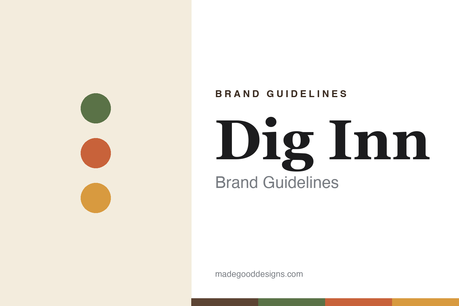
Dig Inn Brand Guidelines
Farm-to-table fast-casual — scratch-made, done right.
Aa
Two constants: a warm earthy palette and a warm slab. Abstract homage — not the Dig Inn wordmark or logo.
Scratch-cooked seasonal veg
Dig Inn celebrates the vegetable.
Dig Inn is a lesson in making the vegetable the hero. Founded in 2011 in New York by Adam Eskin, it is a farm-to-table, scratch-cooked, seasonal fast-casual — build-your-own warm bowls and plates centred on seasonal vegetables and proteins, cooked from scratch (“Scratch-made food, done right”). It even ran its own farm, Dig Acres, in New York’s Hudson Valley, used to grow produce and train chefs and farmers.
Its name has travelled: it began as Dig Inn, rebranded to just “DIG” in 2019, then reverted to “Dig Inn” in 2025 after a brand review. A smaller, Northeast-focused chain (around three dozen locations), it is privately held and VC-backed — with Danny Meyer’s Enlightened Hospitality Investments among its backers.
(Honest notes: the brand is currently “Dig Inn” again after the Dig Inn → DIG → Dig Inn arc; founder is Adam Eskin; Dig Acres is best framed as brand heritage (its early farm-and-training program); it is smaller than Sweetgreen or CAVA and privately held; and its backers include Danny Meyer’s Enlightened Hospitality Investments. No official brand hex is published.)
Colour
Dig Inn lives in a warm earthy palette. Click a swatch to copy the hex.
Dig Inn’s identity is warm, earthy and natural — a garden green, a carrot terracotta, a cream, a soil brown, and a golden squash. The palette reads like a farm harvest: garden greens and root-vegetable warmth on cream, grounded by soil brown. It signals seasonal, scratch-cooked, vegetable-forward food rather than processed fast fare. The honest caveat: with no published brand hex, these tones are an original, unofficial interpretation, not first-party values.
The lesson is a warm earthy palette signals farm-to-table food. Dig Inn’s world reads as wholesome and natural. For designers, it is a reminder that garden greens and root-vegetable tones over cream convey seasonal, scratch-cooked cooking, matching a brand that celebrates vegetables. The takeaways: draw the palette from real produce (greens, carrot, squash); ground it with soil brown and cream; and treat any single hex as unofficial — using the soil brown for small text so the warm tones stay in the palette.
Typography
The wordmark spirit is a warm slab — wholesome and grounded.
Dig Inn’s identity carries a wholesome, grounded, natural spirit — a “DIG INN” wordmark whose sturdy forms match a farm-to-table brand. A warm slab serif captures the mood: it is honest and grounded, the register of seasonal, scratch-cooked food rather than sleek fast fare. Set against a warm earthy palette, the warm slab feels wholesome and grounded — exactly the vegetable-forward, scratch-cooking personality Dig Inn carries. It is honest rather than slick, mirroring real, seasonal food. (Dig Inn’s real wordmark is a trademark we describe but do not reproduce, and the exact typeface is not something we assert.) Because the specific mark is not ours to use, the honest description is “a warm slab spirit,” not the Dig Inn logo. The type behaves like the brand: wholesome, grounded and natural.
Aa
A warm slab spirit — wholesome and grounded. (Specimen set in Zilla Slab, a slab serif; NOT the Dig Inn logo, which is a trademark.)
Vegetable-forward cooking as the difference
Dig Inn stands for scratch-cooked seasonal food.
Dig Inn is a lesson in building a brand on the vegetable. Where much of fast-casual centres protein, Dig Inn put seasonal, scratch-cooked vegetables at the heart of the plate — sourcing from farms (even its own Dig Acres), training chefs, and celebrating produce rather than hiding it. That culinary, farm-to-table seriousness, in an accessible fast-casual format, is what set Dig Inn apart. The differentiator is a genuine vegetable-forward, scratch-cooking ethos.
For designers and brand-builders, Dig Inn offers a clear takeaway: a clear culinary point of view can differentiate a fast-casual brand. The lessons: choose a real focus (seasonal vegetables) and commit to it; back it with credible sourcing and craft (farms, scratch cooking, training); and let a warm, earthy identity carry it. It is also a reminder to stay accurate: the brand is “Dig Inn” again after its name arc, Dig Acres is part of its heritage, and it is a smaller, private, Northeast chain — with the palette here an unofficial interpretation. Dig Inn championed the vegetable — proof that a culinary point of view can be the difference.
Explore & save
Keep Dig Inn’s identity on hand — save it to a board in the Made Good inspiration library.
Dig Inn identity set
Pin the warm earthy palette and the warm-slab spirit to your own board.


