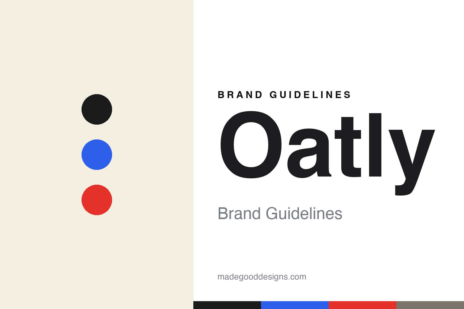
Oatly Brand Guidelines
Oat milk — and the wordiest branding in the fridge.
Aa
Two constants: a monochrome-plus-accent palette and a DIY condensed. Abstract homage — not the Oatly wordmark or logo.
Milk, but made for humans
Oatly turned oat milk into a cult brand.
Oatly is a lesson in a rebrand transforming a company. It was established in 1994 in Sweden by Rickard Öste, based on enzyme research at Lund University — making it an oat-milk pioneer. But for years it was a sleepy ingredient business. The turnaround came in the early 2010s under CEO Toni Petersson, when a radical rebrand (creative direction led by John Schoolcraft, around 2014) gave it a wordy, irreverent, self-aware voice.
Cartons became covered in rambling, witty copy and hand-drawn scrawls — “Milk, but made for humans” (a line the Swedish dairy lobby sued over) and “Wow no cow.” Its Barista Edition became a coffee-shop staple, and it leaned hard into sustainability, printing its climate footprint on packs. It went public on Nasdaq in 2021 (ticker OTLY).
(Honest notes: Oatly is Swedish, founded in 1994 — not a new American startup; it was the 2014-era rebrand, not the product, that made it a cult brand; its identity is copy- and voice-driven, not logo-driven; a Blackstone-led group invested in 2020 (drawing controversy) and it has been publicly traded since 2021, with a struggling post-IPO share price. No official brand hex is published.)
Colour
Oatly lives in a monochrome-plus-accent palette. Click a swatch to copy the hex.
Oatly’s identity is monochrome, hand-drawn and witty — a cream, a black ink, a newsprint gray, a cobalt blue, and a punchy red. The palette reads like a DIY zine: black ink on off-white paper, with the occasional bold accent hit. It signals honesty, humour and anti-corporate charm rather than glossy branding. The honest caveat: with no published brand hex, these tones are an original, unofficial interpretation, not first-party values.
The lesson is a monochrome-plus-accent palette signals a copy-driven, DIY brand. Oatly’s world reads as witty and human. For designers, it is a reminder that black ink on cream, with one bold accent, lets the words be the hero, matching a brand where the copy is the design. The takeaways: keep the palette mostly monochrome so the writing leads; add one bold accent for punch; and treat any single hex as unofficial — the ink already carries the small text.
Typography
The wordmark spirit is a DIY condensed — bold and hand-made.
Oatly’s identity carries a bold, hand-made, irreverent spirit — an “OATLY” wordmark and a carton covered in scrawled copy, whose DIY forms match a witty, anti-corporate brand. A DIY condensed type captures the mood: it is bold and characterful, the register of a hand-lettered poster rather than a polished CPG label. Set against a monochrome-plus-accent palette, the DIY condensed feels bold and hand-made — exactly the wordy, human personality Oatly carries. It is characterful rather than slick, mirroring a brand that talks like a person. (Oatly’s real wordmark is a trademark we describe but do not reproduce, and the exact typeface is not something we assert.) Because the specific mark is not ours to use, the honest description is “a DIY condensed spirit,” not the Oatly logo. The type behaves like the brand: bold, hand-made and irreverent.
Aa
A DIY condensed spirit — bold and hand-made. (Specimen set in Barlow Condensed, a condensed sans; NOT the Oatly logo, which is a trademark.)
Voice as the difference
Oatly stands for a brand that talks like a human.
Oatly is a lesson in making voice the entire brand. The product — oat milk — was not new; what transformed Oatly was a wordy, funny, self-aware identity that treated the carton as a place to talk, argue and joke, all in a hand-drawn DIY style. That distinctive voice, plus a genuine sustainability stance, turned a commodity into a cult brand and a public company. The differentiator is personality: Oatly sounds like nothing else in the fridge.
For designers and brand-builders, Oatly offers a clear takeaway: a distinctive voice can outweigh the product. The lessons: give the brand a real personality and let it talk (copy as the hero); use a DIY, hand-made look so the voice feels human; and back the wit with a genuine stance (climate). It is also a reminder to stay accurate: Oatly is Swedish (1994), its cult status came from the 2014 rebrand, and it has been publicly traded since 2021 — with the palette here an unofficial interpretation. Oatly found its voice — proof that personality can be the difference.
Explore & save
Keep Oatly’s identity on hand — save it to a board in the Made Good inspiration library.
Oatly identity set
Pin the monochrome-plus-accent palette and the DIY-condensed spirit to your own board.


