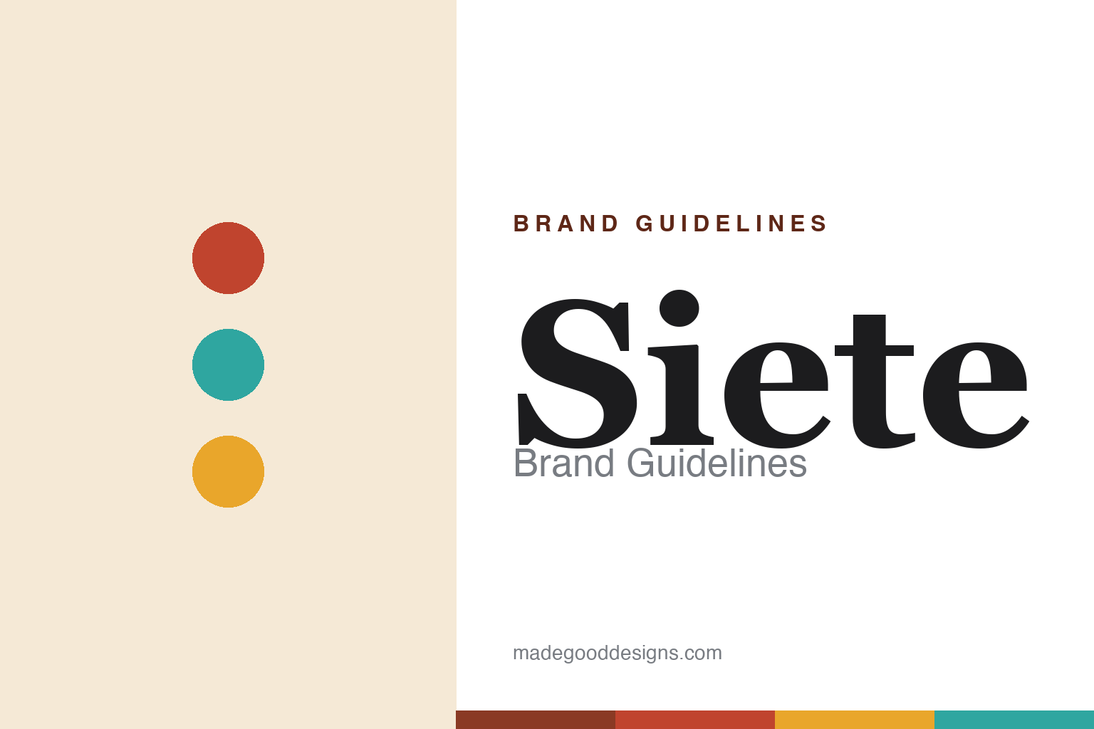
Siete Brand Guidelines
Grain-free Mexican-American foods — from one family of seven.
Aa
Two constants: a warm heritage palette and a warm serif. Abstract homage — not the Siete wordmark or logo.
A family of seven
Siete makes grain-free Mexican-American food.
Siete is a lesson in heritage and health as one story. Founded in 2014 in Austin, Texas by the Garza family — a multigenerational Mexican-American family — it began when Veronica Garza developed almond-flour tortillas after her family adopted a grain-free, paleo diet to help her autoimmune conditions. Its name, “Siete” (Spanish for seven), honours the seven members of the Garza family in the business.
Its flagship is the grain-free tortilla (almond, cassava and coconut flours), and the range grew into grain-free tortilla chips, salsas, seasonings, enchilada sauce and cookies — Mexican-American heritage foods reimagined grain-free and better-for-you. The brand pairs genuine cultural pride with a health-driven origin, and its success drew a landmark acquisition.
(Honest notes: “Siete” refers to the seven family members, not seven ingredients; the company was originally called “Must B Nutty” before rebranding to Siete; its products are grain-free/paleo (almond/cassava/coconut), not corn or wheat; and on ownership, PepsiCo agreed to acquire Siete for about $1.2 billion in 2024, completing the deal in early 2025. No official brand hex is published.)
Colour
Siete lives in a warm heritage palette. Click a swatch to copy the hex.
Siete’s identity is warm, colourful and family-forward — a terracotta red, a warm turquoise, a marigold, a warm cream, and a cactus green. The palette reads like a festive Mexican-American table: warm terracotta and marigold, bright turquoise, and cream. It signals family, heritage and warmth rather than clinical “health food.” The honest caveat: with no published brand hex, these tones are an original, unofficial interpretation, not first-party values.
The lesson is a warm heritage palette signals Mexican-American family food. Siete’s world reads as warm and welcoming. For designers, it is a reminder that terracotta, marigold and turquoise convey cultural warmth and family, matching a brand built on heritage and a family of seven. The takeaways: draw on warm, festive heritage colour; let family and culture lead; and treat any single hex as unofficial — using a deep clay for small text so the brights stay in the palette.
Typography
The wordmark spirit is a warm serif — heritage and welcoming.
Siete’s identity carries a warm, heritage, family spirit — a “SIETE” wordmark whose warm forms match a Mexican-American family brand. A warm serif captures the mood: it is inviting and rooted, the register of family and heritage rather than a clinical health label. Set against a warm heritage palette, the warm serif feels welcoming and rooted — exactly the family-of-seven, grain-free personality Siete carries. It is warm rather than sterile, mirroring heritage food made with love. (Siete’s real wordmark is a trademark we describe but do not reproduce, and the exact typeface is not something we assert.) Because the specific mark is not ours to use, the honest description is “a warm serif spirit,” not the Siete logo. The type behaves like the brand: warm, heritage and welcoming.
Aa
A warm serif spirit — heritage and welcoming. (Specimen set in Vollkorn, a warm serif; NOT the Siete logo, which is a trademark.)
Heritage plus health as the difference
Siete stands for family, culture and better-for-you food.
Siete is a lesson in making family and culture the brand. Its origin is genuinely personal — a daughter’s health, a family going grain-free together — and its name literally counts the family. That authenticity, applied to Mexican-American staples made grain-free, gave Siete a story no competitor could copy: real heritage, real family, real health need. The differentiator is authentic cultural and family identity, tied to a genuine better-for-you product.
For designers and brand-builders, Siete offers a clear takeaway: authentic heritage can be a brand’s deepest asset. The lessons: let a real, personal story anchor the brand (the Garza family, Veronica’s health); honour the culture rather than diluting it; and let a warm, family identity carry it. It is also a reminder to stay accurate: “Siete” means the seven family members, the company began as “Must B Nutty,” and PepsiCo acquired it (announced 2024, completed 2025) — with the palette here an unofficial interpretation. Siete made family the brand — proof that authentic heritage can be the difference.
Explore & save
Keep Siete’s identity on hand — save it to a board in the Made Good inspiration library.
Siete identity set
Pin the warm heritage palette and the warm-serif spirit to your own board.


