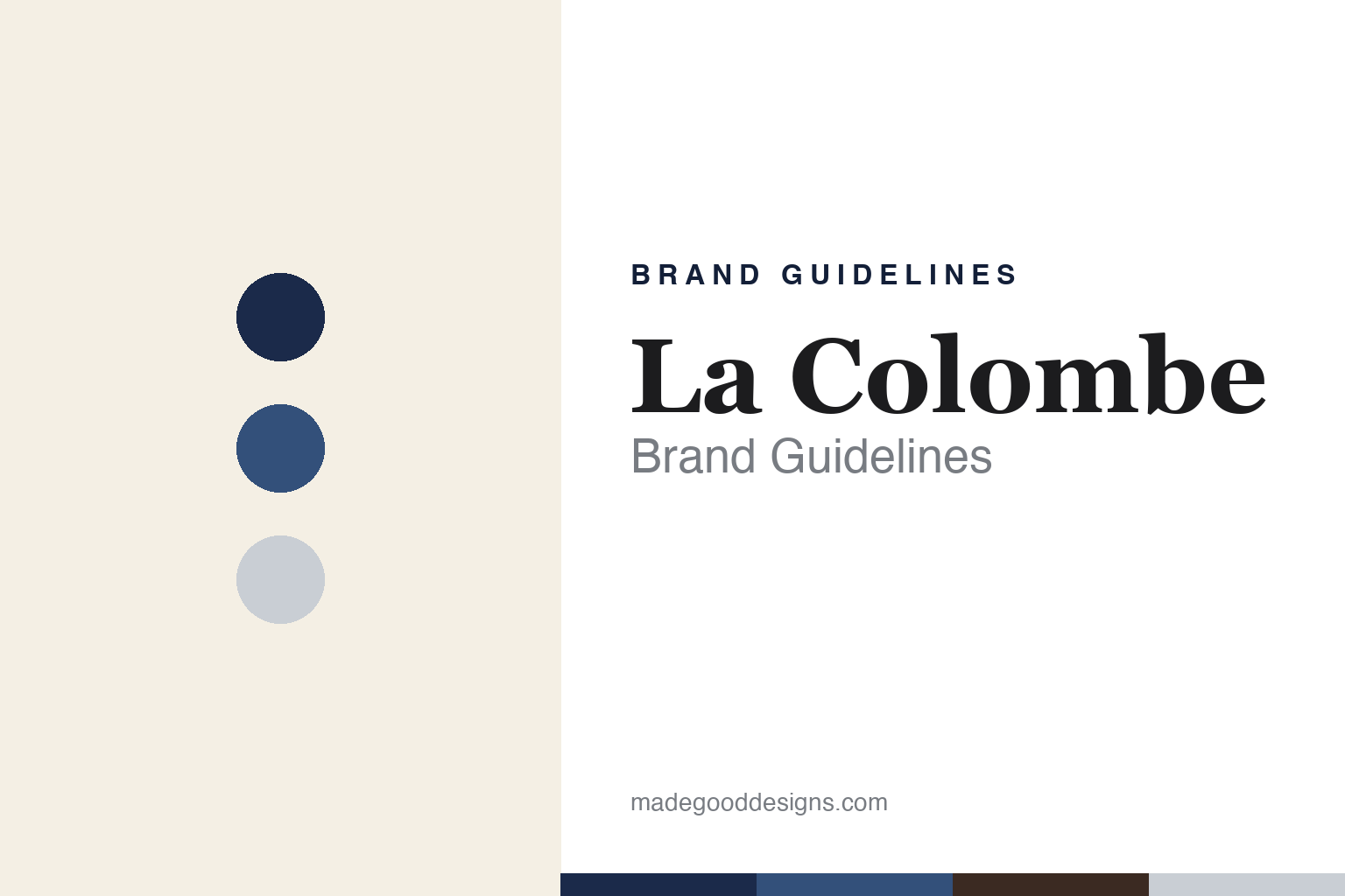
La Colombe Brand Guidelines
Philadelphia coffee, the dove, and the Draft Latte.
Aa
Two constants: a navy-and-cream palette and a refined serif. Abstract homage — not the La Colombe wordmark or logo.
The dove and the Draft Latte
La Colombe pioneered the Draft Latte.
La Colombe is a lesson in a product innovation reshaping a brand. Founded in 1994 in Philadelphia by Todd Carmichael and JP Iberti, its name means “the dove” in French, reflected in its logo, and it grew into a refined, European-style roaster and a mid-size café chain. Carmichael became its public face, even trekking to remote origins for the TV series Dangerous Grounds.
Its landmark innovation is the Draft Latte: a cold, frothy latte poured from a tap (debuting in 2015 as the “first latte on tap”) and then a canned, ready-to-drink version in 2016 using a nitrogen-valve can, which made La Colombe a major RTD canned-coffee player. Its classic Corsica dark roast and Nizza espresso anchor the cafés.
(Honest notes: “La Colombe” means “the dove” in French, not a place or person; the Draft Latte is a real innovation (on tap 2015, canned RTD 2016); and on ownership, Chobani fully acquired La Colombe in December 2023 for about $900 million — while Keurig Dr Pepper distributes the RTD line and became a minority Chobani stakeholder, so Chobani owns and KDP distributes. No official brand hex is published.)
Colour
La Colombe lives in a navy-and-cream palette. Click a swatch to copy the hex.
La Colombe’s identity is refined, classic and European — a deep navy, a café blue, a cream, an espresso brown, and a soft dove grey. The palette reads like a classic European café: navy and cream, calm and understated, with a coffee-brown depth. It signals refinement and heritage rather than loud modern branding. The honest caveat: with no published brand hex, these tones are an original, unofficial interpretation, not first-party values.
The lesson is a navy-and-cream palette signals a refined European café brand. La Colombe’s world reads as classic and calm. For designers, it is a reminder that navy with cream and a soft grey conveys understated refinement, matching a dove-marked, European-style coffee house. The takeaways: pair a deep navy with cream and a soft neutral; keep it understated; and treat any single hex as unofficial — using the navy for small text, where it reads well.
Typography
The wordmark spirit is a refined serif — classic and calm.
La Colombe’s identity carries a refined, classic, calm spirit — a “LA COLOMBE” wordmark and dove whose elegant forms match a European-style café. A refined serif captures the mood: it is graceful and understated, the register of a classic coffee house rather than a loud modern startup. Set against a navy-and-cream palette, the refined serif feels classic and calm — exactly the dove, Draft-Latte personality La Colombe carries. It is understated rather than shouty, mirroring a refined café. (La Colombe’s real wordmark and dove are trademarks we describe but do not reproduce, and the exact typeface is not something we assert.) Because the specific mark is not ours to use, the honest description is “a refined serif spirit,” not the La Colombe logo. The type behaves like the brand: refined, classic and calm.
Aa
A refined serif spirit — classic and calm. (Specimen set in Source Serif 4, a refined serif; NOT the La Colombe logo, which is a trademark.)
An innovation as the difference
La Colombe stands for refined coffee and the Draft Latte.
La Colombe is a lesson in pairing refinement with a real innovation. It built a classic, European café brand — the dove, the navy-and-cream calm — and then made a genuine mark on the category with the Draft Latte, a textured latte on tap and in a can that opened a big ready-to-drink business. That mix of understated refinement and a concrete product innovation is what set it apart and, ultimately, drew a $900M acquisition. The differentiator is a real innovation carried by a refined, trusted brand.
For designers and brand-builders, La Colombe offers a clear takeaway: refinement and innovation can reinforce each other. The lessons: keep a calm, classic identity (the dove, navy-and-cream); back it with a genuine product breakthrough (the Draft Latte); and let the innovation open new formats (RTD cans). It is also a reminder to stay accurate: “La Colombe” means “the dove” in French, the Draft Latte debuted on tap in 2015, and Chobani owns the brand (KDP distributes the RTD) since 2023 — with the palette here an unofficial interpretation. La Colombe poured the first latte on tap — proof that an innovation can be the difference.
Explore & save
Keep La Colombe’s identity on hand — save it to a board in the Made Good inspiration library.
La Colombe identity set
Pin the navy-and-cream palette and the refined-serif spirit to your own board.


