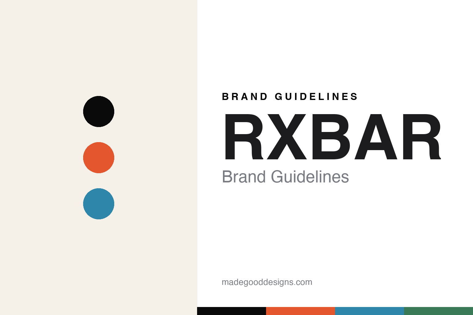
RXBAR Brand Guidelines
The protein bar that made its ingredient list the design.
Aa
Two constants: a bold minimalist palette and a block sans. Abstract homage — not the RXBAR wordmark or logo.
The ingredients are the brand
RXBAR made radical transparency the design.
RXBAR is a lesson in turning honesty into design. Founded in 2013 in the Chicago area by childhood friends Peter Rahal and Jared Smith, it was bootstrapped from a basement with about $10,000 and no venture capital. Its product is a whole-food protein bar with a minimal formula — egg whites, dates and nuts — and a trademarked “No B.S.” platform, born in the CrossFit community before going mainstream.
Its defining move was a 2015 packaging redesign (developed with Chicago firm Scott & Victor) that put the ingredient list in big bold type across the front of the wrapper — “3 Egg Whites, 6 Almonds, 4 Cashews, 2 Dates, No B.S.” The ingredients became the branding: radical transparency as a bold, high-contrast graphic, each flavour a distinct colour. That redesign is widely credited with driving explosive growth, and in 2017 Kellogg acquired RXBAR for $600 million.
(Honest notes: RXBAR was bootstrapped, not VC-funded — a rare $600M exit with no venture backing; the celebrated redesign was developed with the firm Scott & Victor, not purely in-house; “No B.S.” is a real trademarked platform, not editorial slang; and it has been Kellogg-owned since 2017. No official brand hex is published.)
Colour
RXBAR lives in a bold minimalist palette. Click a swatch to copy the hex.
RXBAR’s identity is bold, minimal and high-contrast — an ink black, a warm off-white, a chocolate orange, a blueberry blue, and a mint green. The palette reads like its wrapper: mostly black type on off-white, with a single bold flavour colour per bar. It signals honesty and clarity rather than decoration. The honest caveat: with no published brand hex, these tones are an original, unofficial interpretation, not first-party values.
The lesson is a bold minimalist palette signals radical transparency. RXBAR’s world reads as clean and confident. For designers, it is a reminder that black type on off-white with a single bold accent per variant conveys honesty and simplicity, matching a brand whose ingredients are its design. The takeaways: strip the palette to ink and off-white with one bold accent; let the content be the design; and treat any single hex as unofficial — using the ink for small text, where it already leads.
Typography
The wordmark spirit is a block sans — bold and honest.
RXBAR’s identity carries a bold, honest, no-nonsense spirit — an “RXBAR” wordmark and a front-of-pack ingredient list whose heavy forms match a radically transparent brand. A bold block sans captures the mood: it is strong and unadorned, the register of plain-spoken honesty rather than marketing gloss. Set against a bold minimalist palette, the block sans feels bold and honest — exactly the No-B.S., ingredients-as-design personality RXBAR carries. It is direct rather than decorative, mirroring a brand that lists exactly what is inside. (RXBAR’s real wordmark is a trademark we describe but do not reproduce, and the exact typeface is not something we assert.) Because the specific mark is not ours to use, the honest description is “a block sans spirit,” not the RXBAR logo. The type behaves like the brand: bold, honest and direct.
Aa
A block sans spirit — bold and honest. (Specimen set in Archivo, a grotesque sans; NOT the RXBAR logo, which is a trademark.)
Transparency as the difference
RXBAR stands for honesty made visible.
RXBAR is a lesson in making honesty the entire design. In a category full of health claims and busy graphics, RXBAR did the opposite: it put the plain ingredient list on the front in bold type, so the packaging says exactly what the bar is and nothing more. That radical transparency, from a bootstrapped brand, was so distinctive and trustworthy that it drove huge growth and a $600M acquisition. The differentiator is honesty made visible: the content is the marketing.
For designers and brand-builders, RXBAR offers a clear takeaway: transparency can be the most powerful design choice. The lessons: when you have nothing to hide, show it plainly (the ingredient list as the hero); strip away decoration so the honesty reads; and let a bold, minimal system carry it. It is also a reminder to stay accurate: RXBAR was bootstrapped (not VC-funded), the redesign was done with Scott & Victor, and it has been Kellogg-owned since 2017 — with the palette here an unofficial interpretation. RXBAR showed its ingredients — proof that transparency can be the difference.
Explore & save
Keep RXBAR’s identity on hand — save it to a board in the Made Good inspiration library.
RXBAR identity set
Pin the bold minimalist palette and the block-sans spirit to your own board.


