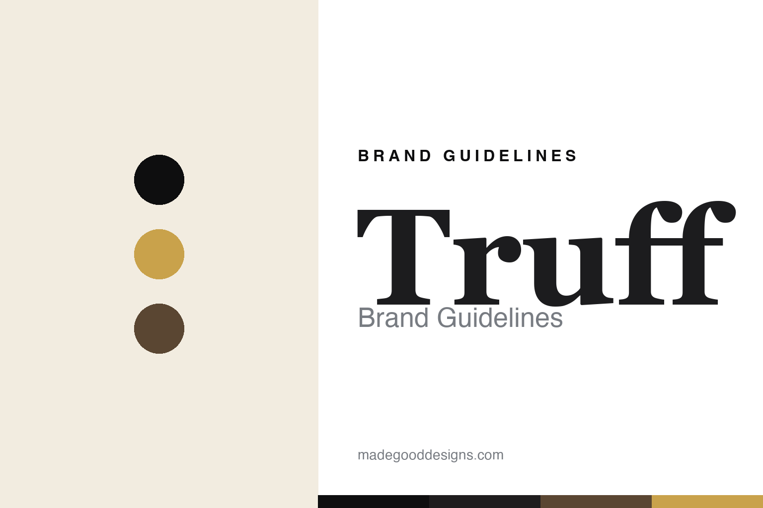
Truff Brand Guidelines
Luxury truffle hot sauce — black, gold and Instagram-born.
Aa
Two constants: a black-and-gold palette and a luxe serif. Abstract homage — not the Truff wordmark or logo.
Hot sauce as luxury object
Truff turned hot sauce into a design object.
Truff is a lesson in an audience-first, design-led launch. Founded in 2017 by Nick Guillen and Nick Ajluni (the “two Nicks”) in the Los Angeles / Southern California area, it began not with a product but with an Instagram account — the @sauce handle Guillen built into a large foodie following before deciding what to sell. They chose a premium, black-truffle-infused hot sauce.
The flagship TRUFF hot sauce (ripe chili, real black truffle, agave and a hint of spice) is positioned as an affordable-luxury, gourmet condiment, and the line grew into Hotter, White Truffle, truffle pasta sauces, mayo, oil and salt. But the brand’s real signature is its packaging: a matte-black bottle topped with a marbled, truffle-shaped cap, finished in black and gold so it looks more like a luxury fragrance than a hot sauce. It landed on Oprah’s Favorite Things (first in 2018) and collaborated with Taco Bell.
(Honest notes: Truff is best located in the LA / Southern California area rather than a single precise HQ; an oft-cited $25M valuation is a 2019 figure, not current; and Kim Kardashian’s SKKY Partners is a 2023 investor (its first-ever deal, a minority stake), not a founder — the two Nicks still run it. No official brand hex is published.)
Colour
Truff lives in a black-and-gold palette. Click a swatch to copy the hex.
Truff’s identity is dark, gilded and luxe — a truffle black, a charcoal marble, a luxe gold, a champagne gold, and a chili red. The palette reads like its bottle: deep black and gold with a marbled truffle cap, warmed by a single chili red. It signals affordable luxury and gifting rather than a utilitarian condiment. The honest caveat: with no published brand hex, these tones are an original, unofficial interpretation, not first-party values.
The lesson is a black-and-gold palette signals affordable-luxury food. Truff’s world reads as premium and gift-worthy. For designers, it is a reminder that deep black with gold and a marbled accent conveys luxury, matching a brand that made hot sauce look like a fragrance. The takeaways: use black and gold to lift an everyday product into a luxury object; add a marbled or metallic texture as the signature; and treat any single hex as unofficial — using the black or dark gold for small text so it stays legible.
Typography
The wordmark spirit is a luxe serif — premium and refined.
Truff’s identity carries a premium, refined, luxe spirit — a “TRUFF” wordmark whose polished forms match a luxury-styled condiment. A luxe serif captures the mood: it is elegant and gift-worthy, the register of fragrance and spirits packaging rather than a diner hot sauce. Set against a black-and-gold palette, the luxe serif feels premium and refined — exactly the truffle-cap, affordable-luxury personality Truff carries. It is elevated rather than utilitarian, mirroring a hot sauce dressed as a luxury object. (Truff’s real wordmark is a trademark we describe but do not reproduce, and the exact typeface is not something we assert.) Because the specific mark is not ours to use, the honest description is “a luxe serif spirit,” not the Truff logo. The type behaves like the brand: premium, refined and luxe.
Aa
A luxe serif spirit — premium and refined. (Specimen set in Frank Ruhl Libre, a refined serif; NOT the Truff logo, which is a trademark.)
Premium packaging as the difference
Truff stands for hot sauce as a luxury object.
Truff is a lesson in packaging a commodity into a luxury. Hot sauce is a cheap, utilitarian category; Truff reframed it as an affordable-luxury, giftable design object — a matte-black bottle with a marbled truffle cap that begs to be photographed and displayed. Paired with an Instagram-first audience it already owned, that premium packaging turned a condiment into a covetable brand. The differentiator is design and positioning: the same sauce in a plain bottle would be just another hot sauce.
For designers and brand-builders, Truff offers a clear takeaway: elevated packaging can move a product up a category. The lessons: build (or acquire) the audience before the product, as Truff did with @sauce; make the packaging the brand’s signature (the black-and-gold truffle bottle); and lean into giftability and shareability. It is also a reminder to stay accurate: Truff is LA/Southern-California-based, the $25M valuation is a 2019 figure, and Kim Kardashian’s SKKY is a 2023 investor, not a founder — with the palette here an unofficial interpretation. Truff dressed hot sauce as luxury — proof that premium packaging can be the difference.
Explore & save
Keep Truff’s identity on hand — save it to a board in the Made Good inspiration library.
Truff identity set
Pin the black-and-gold palette and the luxe-serif spirit to your own board.


