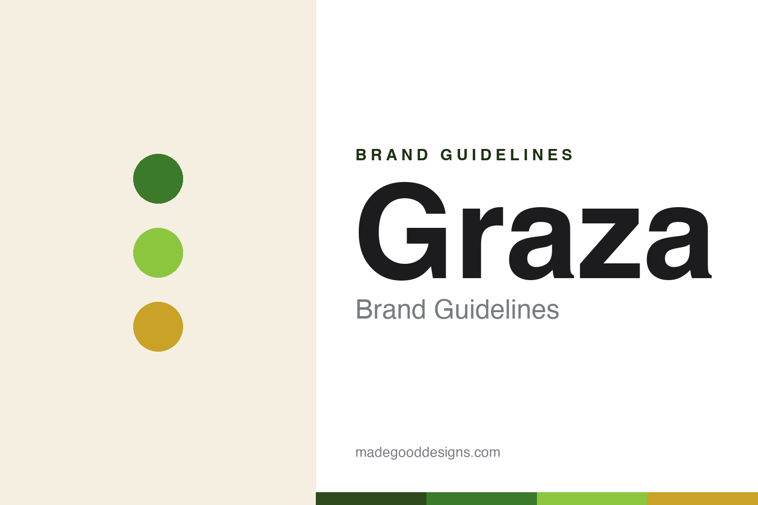
Graza Brand Guidelines
The squeeze-bottle olive oil that made EVOO fun.
Aa
Two constants: a vivid-green palette and a playful sans. Abstract homage — not the Graza wordmark or logo.
Drizzle and sizzle
Graza made olive oil fun and functional.
Graza is a lesson in rethinking a product’s format, not just its label. Founded by Andrew Benin (CEO) and Allen Dushi (COO) and launched in 2022 from Brooklyn, it sells single-origin Spanish extra-virgin olive oil (from Jaén, mostly Picual olives) in bright-green squeeze bottles. Its whole idea is behaviour-based: Drizzle, an early-harvest finishing oil, and Sizzle, an everyday cooking oil.
That split — plus the squeeze bottle borrowed from professional kitchens — demystified a category buried in jargon about acidity and region. Graza made olive oil fun, approachable and “made to be used,” encouraging people to pour more freely. Its vivid-green, playful identity (developed with the agency Gander) stood out on shelves full of rustic gold-and-green bottles, and it grew fast into Whole Foods, Target and beyond.
(Honest notes: Graza launched in 2022 (some records list a 2021 formation); the squeeze bottle is functional — it limits air and light exposure and pours one-handed — not a gimmick; it is genuine single-origin Spanish EVOO, not a cheap blend; it raised comparatively little capital (widely reported as under ~$3M); and the Drizzle/Sizzle duo is the origin — the line later added formats like a high-heat “Frizzle.” No official brand hex is published.)
Colour
Graza lives in a vivid-green palette. Click a swatch to copy the hex.
Graza’s identity is bright, fresh and playful — a signature vivid green, a bright lime, a deep olive, a warm cream, and a golden oil. The palette reads like fresh olive oil itself: green, grassy and alive, with a golden pour. It signals fun and everyday use rather than fussy gourmet luxury. The honest caveat: with no published brand hex, these tones are an original, unofficial interpretation, not first-party values.
The lesson is a vivid-green palette signals fresh, everyday olive oil. Graza’s world reads as bright and inviting. For designers, it is a reminder that fresh greens and a golden pour convey a young, approachable take on olive oil, matching a brand built to be used daily. The takeaways: use bright, fresh greens to modernise a heritage category; let the ingredient’s real colour lead; and treat any single hex as unofficial — using a deep olive for small text so the bright greens stay in the palette.
Typography
The wordmark spirit is a playful sans — bold and fresh.
Graza’s identity carries a bold, fresh, playful spirit — a “GRAZA” wordmark whose confident forms match a fun, everyday olive-oil brand. A playful sans captures the mood: it is bold and friendly, the register of an approachable modern kitchen staple rather than a rustic import. Set against a vivid-green palette, the playful sans feels bold and fresh — exactly the squeeze-bottle, use-more-oil personality Graza carries. It is approachable rather than precious, mirroring a product made to be used. (Graza’s real wordmark is a trademark we describe but do not reproduce, and the exact typeface is not something we assert.) Because the specific mark is not ours to use, the honest description is “a playful sans spirit,” not the Graza logo. The type behaves like the brand: bold, fresh and playful.
Aa
A playful sans spirit — bold and fresh. (Specimen set in Bricolage Grotesque, a characterful sans; NOT the Graza logo, which is a trademark.)
Reformatting a staple as the difference
Graza stands for fun, everyday olive oil.
Graza is a lesson in changing how a product is used, not just how it looks. Olive oil was a jargon-heavy, intimidating category; Graza reframed it around behaviour — Drizzle for finishing, Sizzle for cooking — in a squeeze bottle that invites generous, everyday use. That functional rethink, wrapped in a bright, playful identity, made good single-origin EVOO feel accessible and fun. The differentiator is the format and framing: the same quality oil in a rustic bottle would not have travelled the same way.
For designers and brand-builders, Graza offers a clear takeaway: rethinking format and language can revive a staple. The lessons: reduce a category’s jargon to intuitive behaviour (drizzle vs sizzle); make the packaging itself the innovation (the squeeze bottle); and let a bright, playful identity signal “use me.” It is also a reminder to stay accurate: Graza launched in 2022, its squeeze bottle is functional, and it grew on comparatively little capital — with the palette here an unofficial interpretation. Graza reformatted olive oil — proof that rethinking the format can be the difference.
Explore & save
Keep Graza’s identity on hand — save it to a board in the Made Good inspiration library.
Graza identity set
Pin the vivid-green palette and the playful-sans spirit to your own board.


