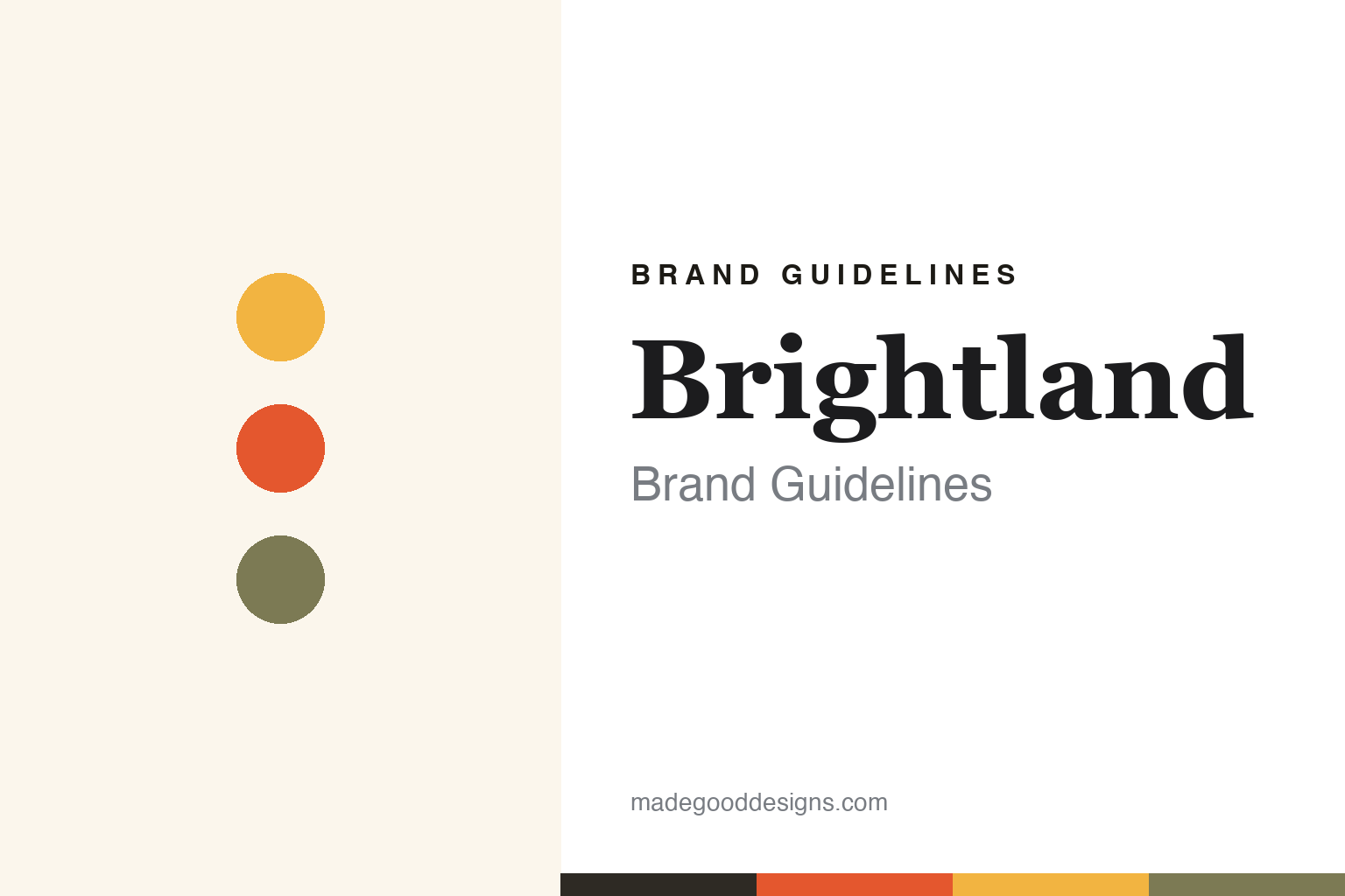
Brightland Brand Guidelines
Design-led California olive oil in art-covered bottles.
Aa
Two constants: a cream-and-gold palette and an editorial serif. Abstract homage — not the Brightland wordmark or logo.
Olive oil as a design object
Brightland made olive oil beautiful and fresh.
Brightland is a lesson in elevating a pantry staple into a design object. Founded in 2018 by Aishwarya Iyer in Los Angeles, it began from a discovery that much supermarket olive oil is rancid or adulterated. Brightland makes 100% California extra-virgin olive oil — its two flagships, robust AWAKE and mild ALIVE — and later expanded into raw vinegars (Rapture and Parasol) and honey.
Its signature is the bottle: tall, elegant, matte cream-white and covered in distinctive artwork, designed (with studio Stitch Design Co.) to sit on the counter like a design object. Crucially, the opacity is functional — a UV coating protects the oil from light — proving good design and good preservation can be the same choice. Brightland sells direct and through Whole Foods, Erewhon and Bloomingdale’s, positioned as “everyday luxury.”
(Honest notes: the opaque bottle is functional, not just pretty — it blocks light that would oxidise the oil; the brand’s vinegars use clear glass deliberately, since light does not degrade vinegar, so “opaque” applies to the oils; it is genuine single-source California EVOO; and the widely repeated “rancid supermarket oil” statistic is the founder’s advocacy point. No official brand hex is published.)
Colour
Brightland lives in a cream-and-gold palette. Click a swatch to copy the hex.
Brightland’s identity is elegant, sunny and artful — a warm cream, a soft ivory, a sunny gold, a coral art accent, and an olive sage. The palette reads like its bottles: a warm cream canvas, sunny California gold, and a bright artwork accent. It signals everyday luxury and design rather than a utilitarian kitchen product. The honest caveat: with no published brand hex, these tones are an original, unofficial interpretation, not first-party values.
The lesson is a cream-and-gold palette signals design-led, sunny olive oil. Brightland’s world reads as elegant and warm. For designers, it is a reminder that a cream canvas with sunny gold and a bright art accent conveys everyday luxury, matching a brand whose bottles are countertop art. The takeaways: build on a warm neutral canvas; add a sunny gold and one bright artwork accent; and treat any single hex as unofficial — using a dark ink for small text so the gold and coral stay in the palette.
Typography
The wordmark spirit is an editorial serif — elegant and warm.
Brightland’s identity carries an elegant, warm, editorial spirit — a “BRIGHTLAND” wordmark whose refined forms match a design-led olive-oil brand. An editorial serif captures the mood: it is graceful and considered, the register of a design object and an “everyday luxury” rather than a utilitarian bottle. Set against a cream-and-gold palette, the editorial serif feels elegant and warm — exactly the art-bottle, California personality Brightland carries. It is considered rather than plain, mirroring a beautiful, functional object. (Brightland’s real wordmark is a trademark we describe but do not reproduce, and the exact typeface is not something we assert.) Because the specific mark is not ours to use, the honest description is “an editorial serif spirit,” not the Brightland logo. The type behaves like the brand: elegant, warm and editorial.
Aa
An editorial serif spirit — elegant and warm. (Specimen set in Newsreader, an editorial serif; NOT the Brightland logo, which is a trademark.)
Design-as-function as the difference
Brightland stands for beautiful, fresh olive oil.
Brightland is a lesson in making beauty and function the same decision. Its art-covered cream bottles are countertop objects people are proud to display — but that opacity also protects the oil from light, keeping fresh California EVOO fresh. The brand married a real quality argument (freshness versus rancid supermarket oil) to a genuinely beautiful, ownable design, so the packaging is both marketing and preservation. The differentiator is design that does a job: it looks like art and works like a shield.
For designers and brand-builders, Brightland offers a clear takeaway: the best design solves a real problem while it looks good. The lessons: tie the aesthetic to a functional truth (opaque bottle protects the oil); make the product beautiful enough to display; and back it with a credible quality story (single-source, fresh California EVOO). It is also a reminder to stay accurate: the opacity is functional, the vinegars are clear glass by design, and the brand is single-source California — with the palette here an unofficial interpretation. Brightland made design do a job — proof that design-as-function can be the difference.
Explore & save
Keep Brightland’s identity on hand — save it to a board in the Made Good inspiration library.
Brightland identity set
Pin the cream-and-gold palette and the editorial-serif spirit to your own board.


