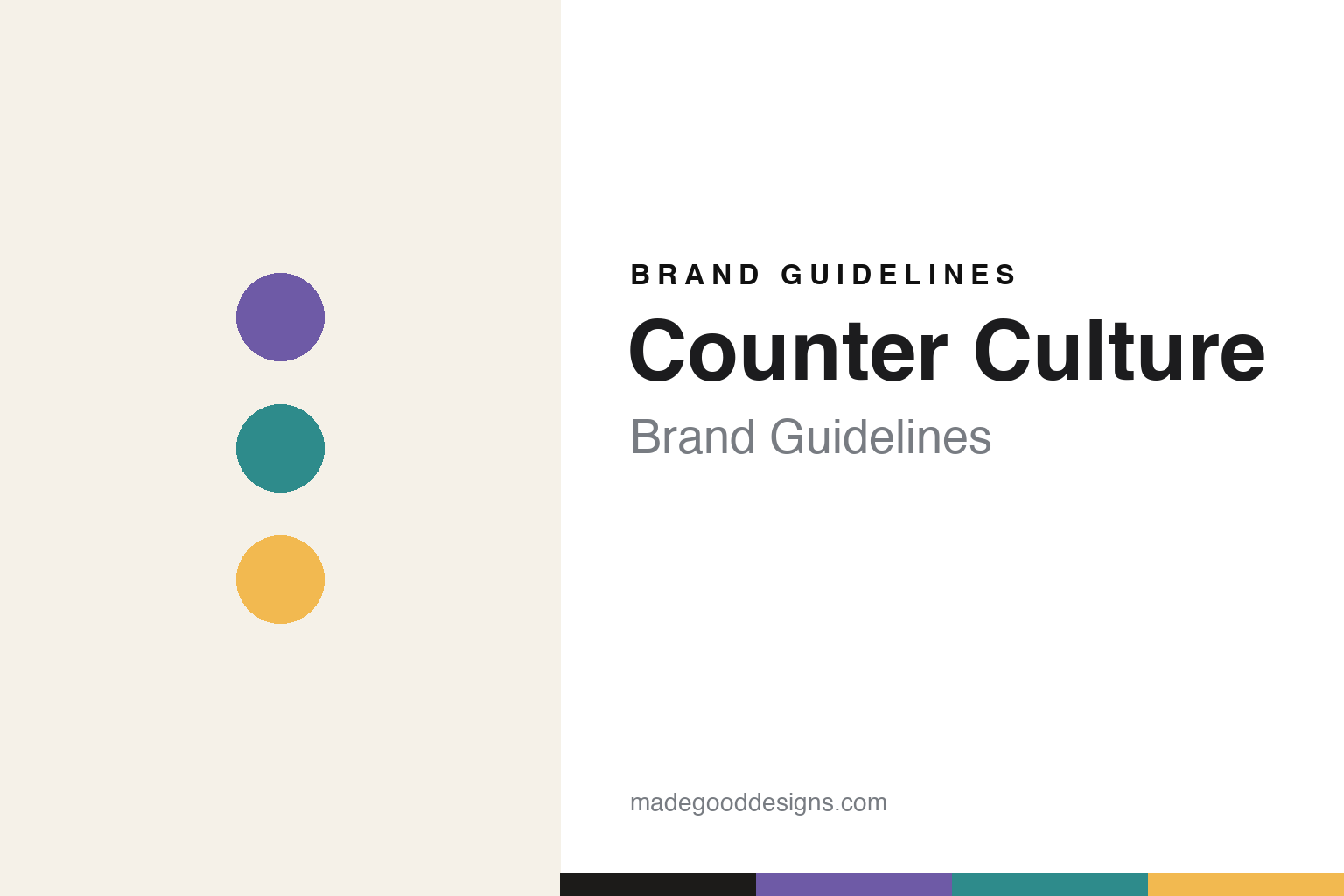
Counter Culture Brand Guidelines
Independent, transparency-first third-wave coffee.
Aa
Two constants: a clean, color-coded palette and a clean sans. Abstract homage — not the Counter Culture wordmark or logo.
Transparency and education
Counter Culture is the independent of the big three.
Counter Culture is a lesson in building a brand on values, not cafés. Founded in 1995 in Durham, North Carolina by Brett Smith and Fred Houk, it is one of the “big three” American third-wave roasters — but unlike its peers, it is a wholesale, B2B-focused roaster that sells to cafés and runs a network of Training Centers rather than its own coffeeshop chain.
Its defining pillars are transparency and education: it was a pioneer of the annual Transparency Report, publishing the prices it pays producers, and it runs free tastings and professional courses across a dozen training centres. Its color-coded blends — Hologram, Big Trouble, Apollo, Forty-Six — and its acclaimed flavour-wheel posters make it genuinely design-forward, and it was among the first organic-certified roasters in its state.
(Honest notes: Counter Culture is a wholesale roaster and education network, not a café chain; its Transparency Report is a real, verifiable practice, not a slogan; and, crucially, it is independent — not owned by Peet’s/JAB like Intelligentsia and Stumptown, nor by a food conglomerate like Blue Bottle, making it the independent holdout of the big three. No official brand hex is published.)
Colour
Counter Culture lives in a clean, color-coded palette. Click a swatch to copy the hex.
Counter Culture’s identity is clean, modern and systematic — an off-white paper, an ink near-black, a Hologram violet, a Forty-Six teal, and an Apollo yellow. The palette reads like its packaging: a clean paper ground with a distinct hue keyed to each blend. It signals clarity, transparency and education rather than rustic café warmth. The honest caveat: with no published brand hex, these tones are an original, unofficial interpretation, not first-party values.
The lesson is a clean, color-coded palette signals a transparent, education-first roaster. Counter Culture’s world reads as clear and organised. For designers, it is a reminder that a clean ground with per-product accent hues conveys systematic clarity, matching a brand built on transparency and teaching. The takeaways: use a clean neutral ground with a color-coded accent system; let clarity lead over decoration; and treat any single hex as unofficial — using the ink for small text so the accents stay in the palette.
Typography
The wordmark spirit is a clean sans — clear and systematic.
Counter Culture’s identity carries a clear, systematic, modern spirit — a “COUNTER CULTURE” wordmark whose clean forms match a transparency-first roaster. A clean sans captures the mood: it is legible and organised, the register of education and data rather than rustic craft. Set against a clean, color-coded palette, the clean sans feels clear and systematic — exactly the transparency-and-education personality Counter Culture carries. It is organised rather than decorative, mirroring a clear, teaching-led brand. (Counter Culture’s real wordmark is a trademark we describe but do not reproduce, and the exact typeface is not something we assert.) Because the specific mark is not ours to use, the honest description is “a clean sans spirit,” not the Counter Culture logo. The type behaves like the brand: clear, systematic and modern.
Aa
A clean sans spirit — clear and systematic. (Specimen set in IBM Plex Sans, a clean sans; NOT the Counter Culture logo, which is a trademark.)
Values and independence as the difference
Counter Culture stands for transparent, independent coffee.
Counter Culture is a lesson in competing on values and staying independent. While its “big three” peers were absorbed by Peet’s/JAB, Counter Culture kept its independence and doubled down on transparency and education — publishing producer prices, teaching the trade, and letting a clean, systematic design carry that seriousness. That combination of ethics, education and independence is its whole positioning. The differentiator is credibility: it can claim what conglomerate-owned rivals cannot.
For designers and brand-builders, Counter Culture offers a clear takeaway: values plus independence can be a durable position. The lessons: make ethics concrete and verifiable (a transparency report with real numbers); build education into the brand (training centres); and let a clean, systematic identity signal rigour. It is also a reminder to stay accurate: Counter Culture is a wholesale/education roaster (not a café chain) and is independent, unlike Intelligentsia and Stumptown — with the palette here an unofficial interpretation. Counter Culture stayed independent — proof that values can be the difference.
Explore & save
Keep Counter Culture’s identity on hand — save it to a board in the Made Good inspiration library.
Counter Culture identity set
Pin the color-coded palette and the clean-sans spirit to your own board.


