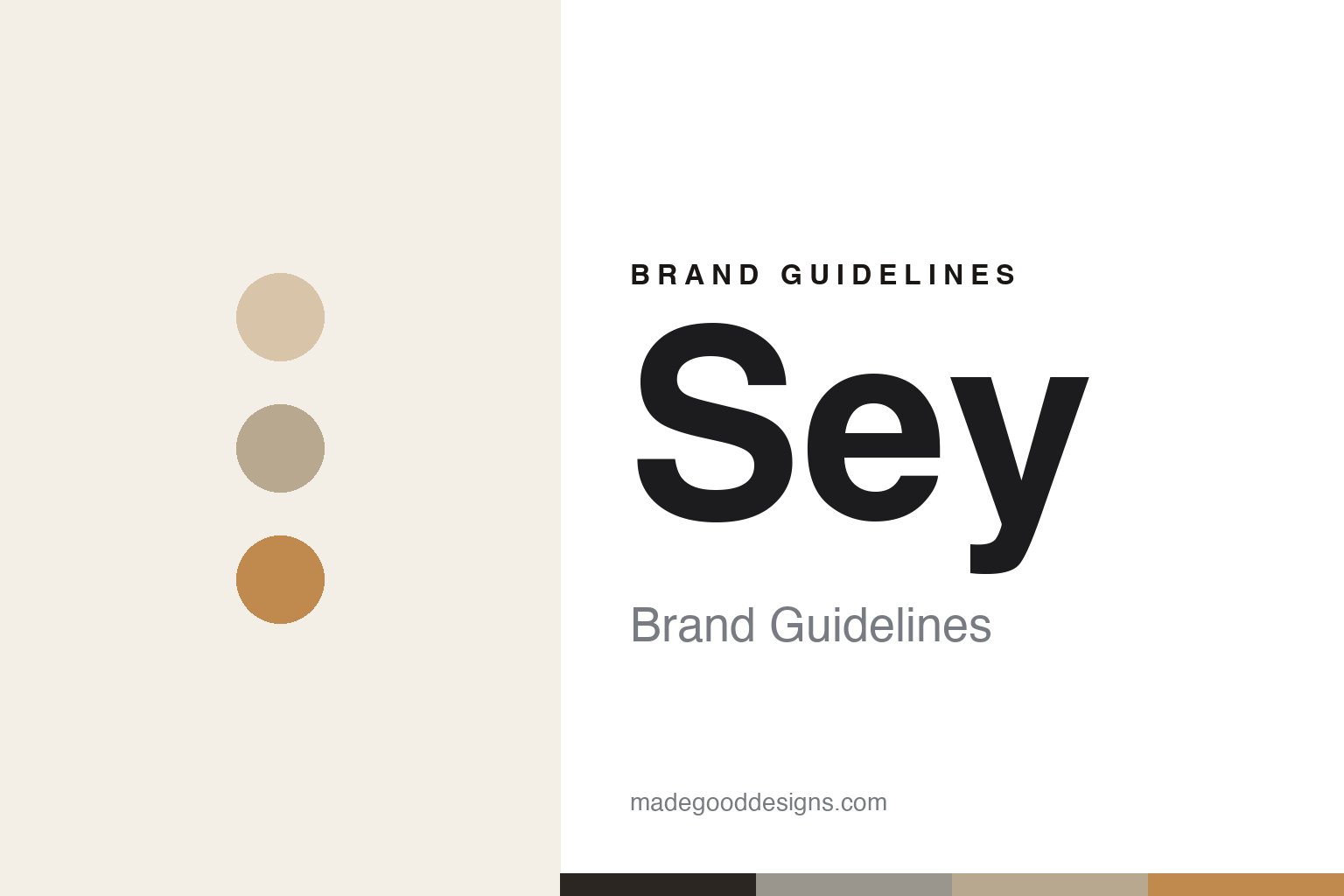
Sey Coffee Brand Guidelines
Minimalist, ultra-light Brooklyn coffee.
Aa
Two constants: a soft-neutral palette and a minimal sans. Abstract homage — not the Sey wordmark or logo.
Roasting as restraint
Sey is Brooklyn’s minimalist light-roast purist.
Sey is a lesson in restraint as an identity. Founded by Lance Schnorenberg and Tobin Polk — who first roasted as Lofted Coffee in the early 2010s before rebranding to Sey (“yes” backwards) after a trademark dispute — it opened its Bushwick, Brooklyn café in 2017. Sey is renowned for ultra-light, Nordic-style roasting, described as “roasting as an act of restraint,” designed to preserve the clarity and terroir of the green coffee.
It focuses on single-origin coffees and close, transparent sourcing, earning a cult following — Food & Wine named it the “Best Coffee Shop in America” in 2019, and it won a Good Food Award. Its café and identity are celebrated for serene minimalism: a light-filled, gallery-calm space of wood, concrete and plants, and refined, restrained packaging. It is independent, with a values-forward, gratuity-free model.
(Honest notes: Sey is a light-roast purist, not a dark-roast house; its identity is deliberately minimalist, not rustic or cluttered; it opened its Bushwick café in 2017 (after roasting earlier as Lofted Coffee); and it is a small, independent, cult roaster, not a big chain. No official brand hex is published.)
Colour
Sey lives in a soft-neutral palette. Click a swatch to copy the hex.
Sey’s identity is serene, minimal and restrained — a warm cream, a kraft neutral, a warm greige, a concrete grey, and a light-roast amber. The palette reads like its café: soft naturals, kraft and concrete tones, calm and pared-back, with a single restrained warm accent. It signals clarity and restraint rather than bold branding. The honest caveat: with no published brand hex, these tones are an original, unofficial interpretation, not first-party values.
The lesson is a soft-neutral palette signals minimalist, light-roast coffee. Sey’s world reads as calm and refined. For designers, it is a reminder that soft naturals, kraft and concrete tones convey restraint and clarity, matching a roaster whose whole ethos is understatement. The takeaways: build from soft naturals with a single warm accent; let restraint lead; and treat any single hex as unofficial — using the soft charcoal for small text so the palette stays calm.
Typography
The wordmark spirit is a minimal sans — calm and refined.
Sey’s identity carries a calm, refined, minimal spirit — a “SEY” wordmark whose pared-back forms match a serene, light-roast roaster. A minimal sans captures the mood: it is quiet and precise, the register of a gallery-calm café rather than a loud brand. Set against a soft-neutral palette, the minimal sans feels calm and refined — exactly the restraint-as-identity, Nordic-light personality Sey carries. It is understated rather than expressive, mirroring a pared-back, clarity-first brand. (Sey’s real wordmark is a trademark we describe but do not reproduce, and the exact typeface is not something we assert.) Because the specific mark is not ours to use, the honest description is “a minimal sans spirit,” not the Sey logo. The type behaves like the brand: calm, refined and minimal.
Aa
A minimal sans spirit — calm and refined. (Specimen set in Jost, a geometric sans; NOT the Sey logo, which is a trademark.)
Restraint as the difference
Sey stands for clarity and restraint.
Sey is a lesson in making restraint the whole brand. In roasting, it holds back — ultra-light profiles that let the coffee’s clarity and origin speak; in design, it holds back too — a serene, minimalist café and pared-back packaging with nothing extra. That consistency between the product philosophy and the visual identity is rare and powerful: everything says the same quiet, confident thing. The differentiator is disciplined restraint, applied end to end.
For designers and brand-builders, Sey offers a clear takeaway: restraint, applied consistently, can be a strong identity. The lessons: let the product philosophy set the design (light, clear roasting → minimal, calm design); remove everything non-essential; and trust that quiet confidence reads as quality. It is also a reminder to stay accurate: Sey is a light-roast purist, its Bushwick café opened in 2017 (after Lofted Coffee), and it is a small independent roaster — with the palette here an unofficial interpretation. Sey made restraint the point — proof that discipline can be the difference.
Explore & save
Keep Sey Coffee’s identity on hand — save it to a board in the Made Good inspiration library.
Sey Coffee identity set
Pin the soft-neutral palette and the minimal-sans spirit to your own board.


