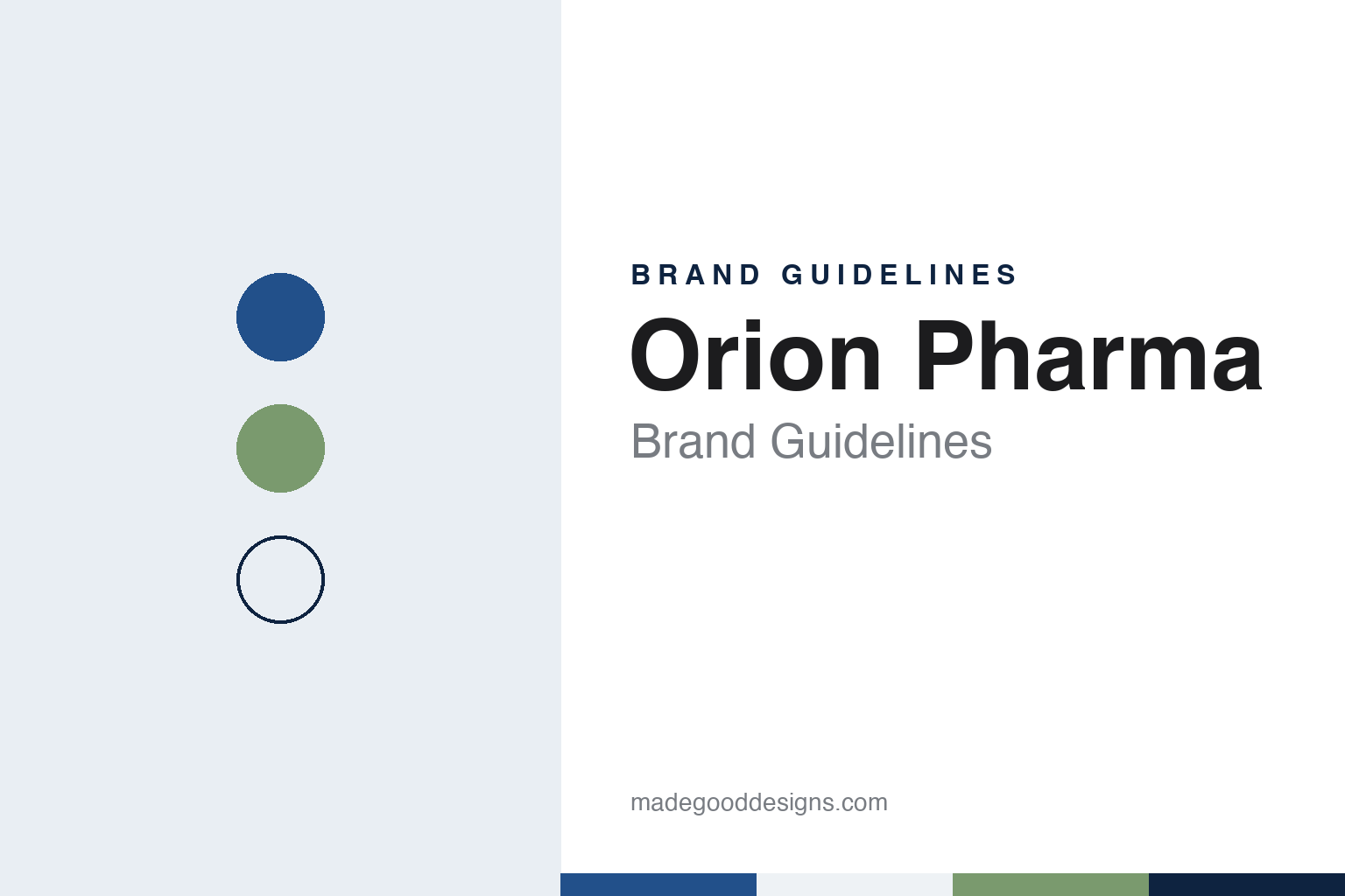
Orion Pharma Brand Guidelines
A Helsinki drug workshop of 1917 with an O drawn from a retort.
Aa
Two constants: a lake blue, birch white and lichen green palette and a geometric Nordic sans register. Abstract homage — not an Orion Pharma product or mark; no pack, logo or nameplate is reproduced.
Kruununhaka, 1917
Three pharmacists and a courtyard workshop.
Orion was founded in Helsinki on 21 September 1917 by three pharmacists, Onni Turpeinen, Eemil Tuurala and Wikki Walkama, the company says; Finnish and English Wikipedia spell the last name Valkama. All three had worked at Medica, a pharmaceutical and chemical factory in the city. A history of the company published on the website devoted to the paediatrician Arvo Ylppö describes their motive as the wish to build a Finnish-language drug factory, and records the first shareholders’ meeting in November 1917.
The first premises were in a courtyard building in Kruununhaka, Helsinki; the company says the space had been a factory for a vegetarian butter substitute. Its first product was Bellistol gun oil, and its first hit, the company says, was dulcine, an artificial sweetener.
The early years were hard. The Ylppö history says the business struggled once wartime conditions ended, and that closing it was discussed in 1928. Ylppö, who had bought shares in a 1922 issue and joined the board in 1925, became chairman in 1929 and persuaded Finnish doctors to buy new shares, so that physicians rather than pharmacists became the largest group of owners. In 1933 the board hired the medical researcher Erkki Leikola as managing director.
A new factory followed. In 1934 Orion moved to a building on Nilsiänkatu in Vallila, designed by the architect Kaarlo Borg, the Ylppö history says; it was extended in 1937 and 1938. The company says it began preparing vaccines in 1937 and that by 1938, with about a hundred employees, it was the largest pharmaceutical plant in Finland.
The Ylppö history says Orion did very well during the war years of the 1940s, and the company says its plant made its first batches of penicillin in 1944, an experiment that was then halted because of the war. The extensions in Vallila were finished in 1945.
Colour
From Vallila to Mankkaa, and into the world.
In 1945 Orion bought the Ylä-Mankkaa estate in Espoo, close to a hundred hectares, the Ylppö history says; the land had been due to be divided for families evacuated from Karelia, and was kept on the grounds that medicinal plants would be grown there and serum horses kept. It became the company’s home. After a difficult end to the decade the board was reorganised in 1949, and in 1952, the company says, it hired the German scientist Joachim Alberty to build up modern drug research.
A new pharmaceutical plant opened at Mankkaa in 1962, with a chemical plant for raw materials beside it four years later. Exports began in the early 1970s with Uricult, a urinary test the company developed; it says the test reached nearly 40 countries by 1973. In 1970 Orion set up Fermion, a maker of active ingredients, as a joint venture with Rikkihappo, now Kemira, and took it over fully in 1981, Finnish Wikipedia says. The head office moved to Mankkaa in 1984, at the address Orionintie 1.
The 1990s brought scale. In 1993 Orion merged with its former rival Farmos, which the company says brought heart and cancer medicines and animal sedatives to sit beside its own work on Parkinson’s disease; in 1995 it was listed on the Helsinki stock exchange. Stalevo, a Parkinson’s medicine Orion developed and patented, was authorised for marketing in 2003, the company says.
In July 2006, Finnish Wikipedia says, the group split in two: the new Orion kept the pharmaceutical and diagnostics businesses, while wholesale and distribution went to Oriola-KD. In April 2018 Talouselämä reported that Orion was selling its diagnostics unit to a fund managed by Axcel Management so it could concentrate wholly on medicines; the unit, Orion Diagnostica, was renamed Aidian in November 2019.
Today Orion Corporation is based in Espoo, and its A and B shares trade on Nasdaq Helsinki. English Wikipedia, citing the company, says all of its manufacturing sites and most of its research units are in Finland; Finnish Wikipedia lists sites in Espoo, Kuopio, Oulu, Hanko, Salo and Turku. It makes human and veterinary medicines and active ingredients, including the Easyhaler inhaler range, the Burana painkiller and Aqualan creams. Its research covers oncology, neurology and respiratory medicine, and darolutamide, a prostate-cancer medicine, was developed with Bayer.
Typography
Design and documentation.
Europe’s mid-sized drug makers tend to present themselves through their origins. Many began as a single pharmacist, doctor or industrialist with a laboratory, and their corporate histories still open with a founder, a town and a first product. Family holding companies and foundations often remain in the background as long-term shareholders, and the companies’ own timelines give as much space to new factories and research centres as to the medicines that came out of them.
The visual language that follows is restrained. Corporate sites and annual reports favour photographs of scientists at the bench, production lines seen through glass, and patients in ordinary settings — at home, at work, outdoors — rather than in hospital. Long-serving research campuses, some in use for half a century or more, appear again and again as proof of continuity, alongside newer laboratories in biotech districts abroad.
Identity systems are usually simple: a short word mark or set of initials, a single deep blue or green as the lead colour, and a clean sans for running text. Because prescription medicines cannot be advertised to the general public in the European Union, much of the visible branding lives at medical congresses rather than in shop windows: the dermatology meeting of the EADV, the multiple sclerosis congress of ECTRIMS and the reproductive-medicine meeting of ESHRE are among the places where these companies set up stands, posters and symposia for specialists.
This guide sets out what can be checked about each company — who founded it, who owns it, where it makes and researches its medicines, and how its history is told — and marks plainly what rests only on the company’s own word. The palettes and typefaces shown here are our own interpretations, not official brand assets.
Aa
A geometric Nordic sans — the company names Eina 03 as its brand font. (Specimen set in Outfit, a sans STAND-IN; NOT the Orion Pharma logo or brand font.)
Orion Pharma
An O drawn from a laboratory retort.
The company now presents itself under one corporate brand, Orion Pharma, and publishes an open brand portal that sets out how the identity works. Its stated purpose is “building well-being”, and its story leans on the Nordic setting: a country, it says, where care and equality are part of everyday life.
The logo is the centre of that system. The portal says its blue reflects the brand’s Nordic heritage as well as reliability and responsibility, and that the capital O is a visual interpretation of a retort, the glass vessel used for distillation in chemistry laboratories. A protective field, sized from the letter O, must be left clear around the logo, and the logo should not be reproduced narrower than 30 millimetres.
Type is specified just as plainly. The brand font is Eina 03, used in all materials including online; in office documents Segoe UI stands in; and a secondary face, Lumios Marker, is kept for headings, highlights and callouts. The graphic elements are drawn from a real microscopic image: a library of three shapes, each in three colour themes, meant to be composed into layouts with a three-dimensional feel.
Colour follows the same idea. The portal names an Orion Pharma blue and a dark blue as primary colours, which it links to clear skies and clean lakes, supported by six secondary colours and two special colours for richer visuals. Brand photographs are reserved for permanent materials and advertising rather than daily social posts, and in official materials the name is pronounced the Finnish way, while in speech anyone may say it naturally in their own language.
For a design guide, Orion Pharma shows how a century-old maker can tie a whole system back to one letter, with a laboratory object hidden in the O and the palette explained by landscape rather than chemistry. Compare the Danish approach in our Novo Nordisk brand guidelines and Lundbeck brand guidelines. For this guide we use lake blue, polar ink, birch white and lichen green with a geometric sans, an unofficial interpretation; no product or logo is reproduced.
Explore & save
Keep Orion Pharma’s identity on hand — save it to a board in the Made Good inspiration library.
Orion Pharma identity set
Pin the lake blue, birch white and lichen green palette and the geometric Nordic sans register to your own board.