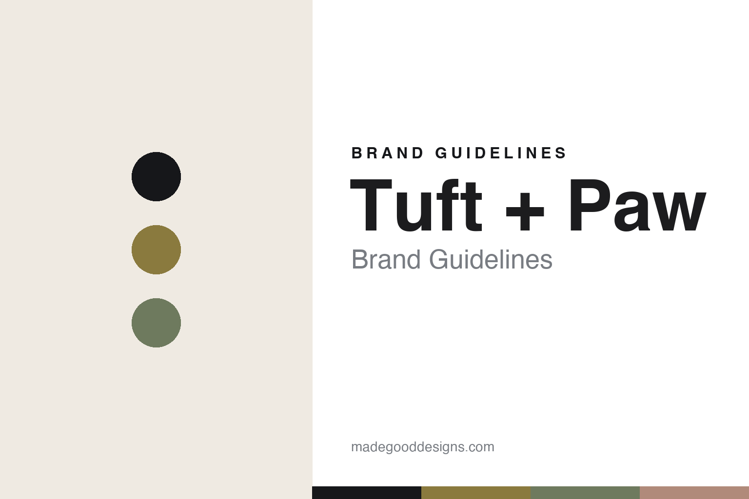
Tuft + Paw Brand Guidelines
The cat furniture.
Aa
Two constants: a mid-century-muted palette and a mid-century sans register. Abstract homage — not the Tuft + Paw products or wordmark.
The cat furniture
Tuft + Paw wants to be the West Elm of cats.
Tuft + Paw is a lesson in furniture-grade cat design as the identity. A Canadian brand founded in 2016 in Vancouver, it set out to make cat gear that reads as modern furniture — its own goal, “the West Elm of cat furniture.”
Its identity is the cat furniture. Tuft + Paw makes cat trees, scratchers, beds, bowls and its “Cove” modern litter box — designed to look like considered furniture rather than carpeted cat gear. Cat products for a designed home. A litter box you don’t have to hide.
(Honest notes: Tuft + Paw is a Canadian design cat brand founded in 2016 in Vancouver (an important correction: it is Canadian, not US/LA as sometimes listed) by Jackson Cunningham (with a partner, Vanessa). Its signature is design-forward cat furniture — cat trees, scratchers, beds and the “Cove” modern litter box (note: “Cove” is the litter box, its first manufactured product from a Kickstarter, not a bed), plus plant-based tofu litter — positioned as “the West Elm of cat furniture.” On production, it is contract-manufactured with overseas factories, so we don’t claim it’s made in the USA or Canada. On ownership, it is founder-led but raised outside investment (around $2M in 2022), so it is not purely independent. It is distinct from Karimoku Cat and Meyou, the other design cat-furniture brands. There’s no official brand hex, and we reproduce no product or logo — these tones are an unofficial interpretation. This is design commentary and does not promote any product.)
Colour
Tuft + Paw lives in a mid-century-muted palette. Click a swatch to copy the hex.
Tuft + Paw’s identity is modern, muted and mid-century — a mustard, an ink, a sage, a clay, and a cream. The palette leans mid-century muted — the register of furniture-grade, home-friendly design. It signals modernity and calm rather than novelty. The honest caveat: with no published brand hex, these tones are an original, unofficial interpretation, not first-party values.
The lesson is a mid-century-muted palette signals furniture-grade cat design. Tuft + Paw’s world is a modern, furniture-like object. For designers, it is a reminder that even the least glamorous category — the litter box — can be redesigned as furniture, and that a muted, mid-century palette signals that ambition. Because a mustard can fail as small text, keep type dark and let the colour live in the accents, palette and band. The takeaways: redesign the unglamorous; make it furniture; keep it muted; and treat any single hex as unofficial.
Typography
The register is a mid-century sans — clean, modern, warm.
Tuft + Paw’s identity carries a clean, modern, warm spirit — a furniture-grade, mid-century object. A friendly modern sans captures the mood: it is approachable and current, the register of a design-homewares brand. Set in a mid-century-muted palette, the mid-century sans feels clean and modern — exactly the personality Tuft + Paw carries. It is warm rather than clinical, mirroring furniture-grade cat gear. (Tuft + Paw’s real products and wordmark are works we describe but do not reproduce, and the exact typeface is not ours to use.) Because it is not ours to use, the honest description is “a mid-century sans spirit,” shown here in a stand-in. The type behaves like the brand: clean, modern and warm.
Aa
A mid-century sans spirit — clean and modern. (Specimen set in Instrument Sans, a friendly modern sans STAND-IN; NOT the Tuft + Paw wordmark.)
Furniture-grade cat design as identity
Tuft + Paw stands for the cat furniture.
Tuft + Paw is a lesson in redesigning the unglamorous as furniture. A mid-century-muted palette, a mid-century sans and a modern litter box make furniture-grade cat design the whole brand — modern, muted, warm. The ambition is the differentiator. The differentiator is taking cat gear — even the litter box — and making it look like something you’d choose for the room.
Put to work, the identity is a category elevated by design. A designer building in this spirit would take the parts of pet life people hide — the litter box, the cat tree — and make them furniture-grade, so they earn a place in a designed home. The lesson Tuft + Paw teaches is that ambition can define a brand: aiming to be “the West Elm of cat furniture” sets a clear, furniture-grade standard, and a muted, mid-century design language keeps that standard legible across the range.
For designers and brand-builders, Tuft + Paw offers a clear takeaway: make the hidden things beautiful. The lessons: redesign the unglamorous; make it furniture; keep it muted; and be honest about the story. It is also a reminder to stay accurate — and to correct assumptions: Tuft + Paw is Canadian, based in Vancouver, not US/LA as some databases list, and its “Cove” is a litter box, not a bed — the palette here is an unofficial interpretation. And it is a reminder that made-where honesty means admitting the unknown: because it is contract-manufactured overseas, we don’t claim a made-in country. It is a reminder, too, that ownership framing must be accurate: it is founder-led but venture-backed, not purely independent, and saying so keeps the story trustworthy. Tuft + Paw made the cat furniture the brand — proof that furniture-grade design can be the difference.
Explore & save
Keep Tuft + Paw’s identity on hand — save it to a board in the Made Good inspiration library.
Tuft + Paw identity set
Pin the mid-century-muted palette and the mid-century-sans register to your own board.

