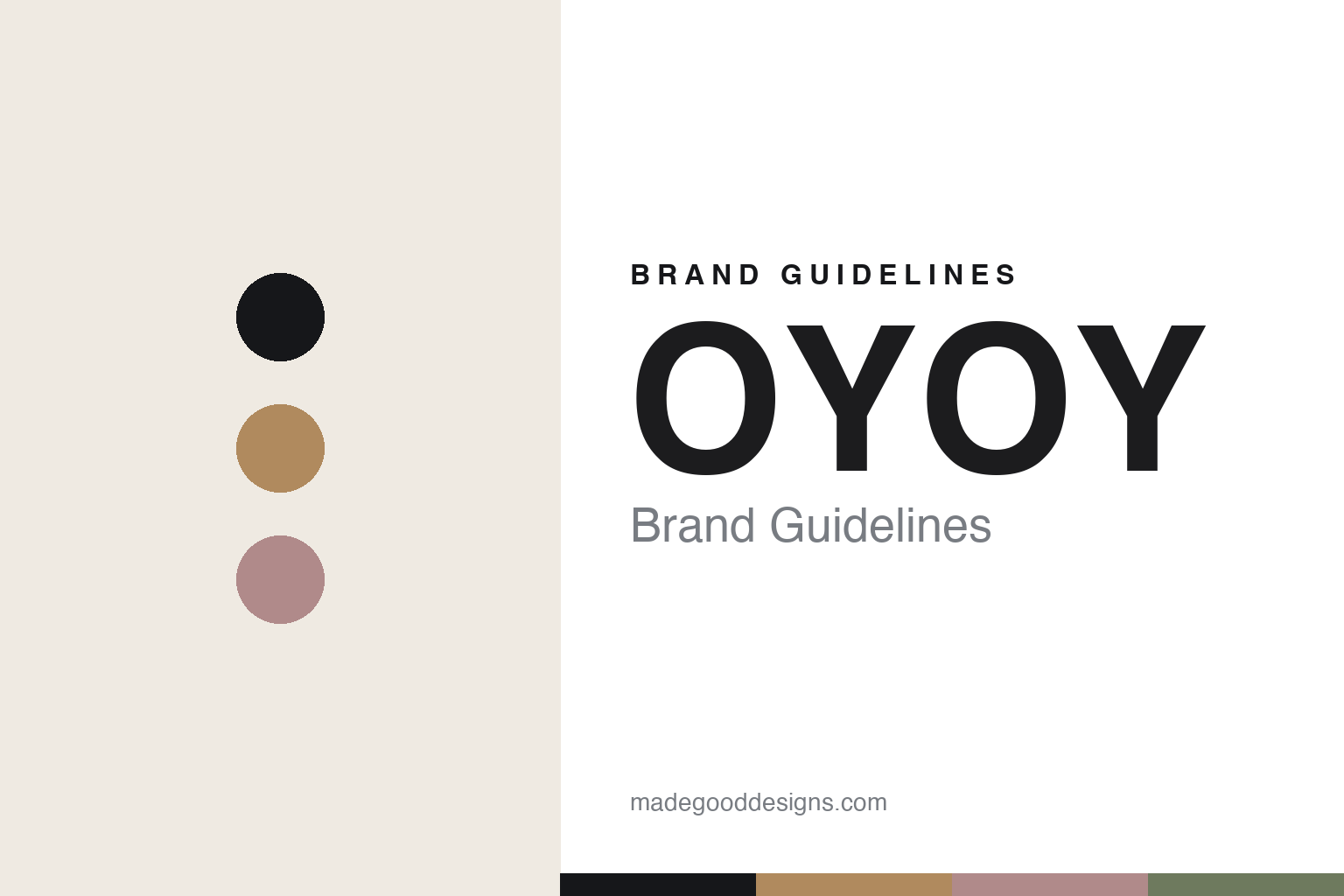
OYOY Brand Guidelines
The homeware pet line.
Aa
Two constants: a muted-Nordic palette and a Nordic sans register. Abstract homage — not the OYOY Zoo products or wordmark.
The homeware pet line
OYOY brings its homeware eye to pet gear.
OYOY is a lesson in a homeware eye applied to pets. A Danish design homeware brand founded in 2012, it extended its muted, playful Nordic language into a pet collection — “OYOY Zoo.”
Its identity is the homeware pet line. OYOY Zoo’s design dog beds (like the “Milo”), ceramic bowls and toys are the objects it is known for in pets — the same restrained, playful Nordic aesthetic as its cushions and ceramics. Pet gear from a homeware brand. Dog products that match the rest of the room.
(Honest notes: OYOY is a Danish design homeware brand — OYOY Living Design — founded in 2012 by the Danish designer Lotte Fynboe (a single founder, not “Lotta and Nicholas” as sometimes stated), based in Herning, Denmark (not Copenhagen); the name derives from “OY,” the registration on Danish aircraft since 1929. It is a broad Scandinavian homeware brand (furniture, lighting, rugs, ceramics, a kids’ line), and within it the pet collection “OYOY Zoo” is real and current — design dog beds (like the Milo), ceramic bowls, placemats, leashes, collars and toys — in the same muted, playful Nordic language. On production, it is designed in Denmark with no manufacturing country stated, so we don’t assert one. On ownership, it operates as OYOY Living Design A/S and is believed independent (a distributor, DDI Group, is an agent, not an owner). There’s no official brand hex, and we reproduce no product or pattern — these tones are an unofficial interpretation. This is design commentary and does not promote any product.)
Colour
OYOY lives in a muted-Nordic palette. Click a swatch to copy the hex.
OYOY’s identity is muted, playful and Nordic — an ochre, an ink, a dusty rose, an olive, and an off-white. The palette leans muted Nordic — the register of Scandinavian homeware in soft, playful tones. It signals warmth and design coherence rather than novelty. The honest caveat: with no published brand hex, these tones are an original, unofficial interpretation, not first-party values.
The lesson is a muted-Nordic palette signals homeware-grade pet design. OYOY’s world is a muted, playful, coherent object. For designers, it is a reminder that a homeware brand can extend its design language into pets — so a dog bed matches the cushions — and that a muted, playful Nordic palette signals that coherence. Because an ochre can fail as small text, keep type dark and let the colour live in the accents, palette and band. The takeaways: extend the design language; match the home; keep it muted; and treat any single hex as unofficial.
Typography
The register is a Nordic sans — clean, warm, coherent.
OYOY’s identity carries a clean, warm, coherent spirit — a muted, playful object. A friendly geometric sans captures the mood: it is warm and modern, the register of Scandinavian homeware. Set in a muted-Nordic palette, the Nordic sans feels clean and warm — exactly the personality OYOY carries. It is coherent rather than loud, mirroring pet gear that matches the home. (OYOY’s real products and wordmark are works we describe but do not reproduce, and the exact typeface is not ours to use.) Because it is not ours to use, the honest description is “a Nordic sans spirit,” shown here in a stand-in. The type behaves like the brand: clean, warm and coherent.
Aa
A Nordic sans spirit — clean and warm. (Specimen set in Manrope, a friendly geometric sans STAND-IN; NOT the OYOY wordmark.)
A homeware eye applied to pets as identity
OYOY stands for the homeware pet line.
OYOY is a lesson in extending a design language into pets. A muted-Nordic palette, a Nordic sans and a homeware pet line make design coherence the whole brand — muted, playful, coherent. The coherence is the differentiator. The differentiator is a homeware brand applying its exact design language to pet gear, so a dog bed belongs with the rest of the room.
Put to work, the identity is one language, extended. A designer building in this spirit would take an established homeware aesthetic and apply it faithfully to pet products, so a dog bed and a ceramic bowl read as part of the same collection as the cushions and vases. The lesson OYOY teaches is that a coherent design language travels across categories: a homeware brand’s muted, playful Nordic look makes its pet line feel considered and on-brand, and that consistency is what makes the pet products credible as design.
For designers and brand-builders, OYOY offers a clear takeaway: extend one design language everywhere. The lessons: extend the design language; match the home; keep it muted; and be honest about the story. It is also a reminder to stay accurate — and to correct assumptions: OYOY was founded in 2012 by Lotte Fynboe alone (not “Lotta and Nicholas”) in Herning, not Copenhagen — the palette here is an unofficial interpretation. And it is a reminder that a pet line’s existence should be confirmed, not assumed: “OYOY Zoo” is a real, current collection, so we can write about it honestly. It is a reminder, too, that made-where honesty means admitting the unknown: OYOY names no manufacturing country, so we don’t assert one. OYOY made the homeware pet line the brand — proof that a coherent design language can be the difference.
Explore & save
Keep OYOY’s identity on hand — save it to a board in the Made Good inspiration library.
OYOY identity set
Pin the muted-Nordic palette and the Nordic-sans register to your own board.