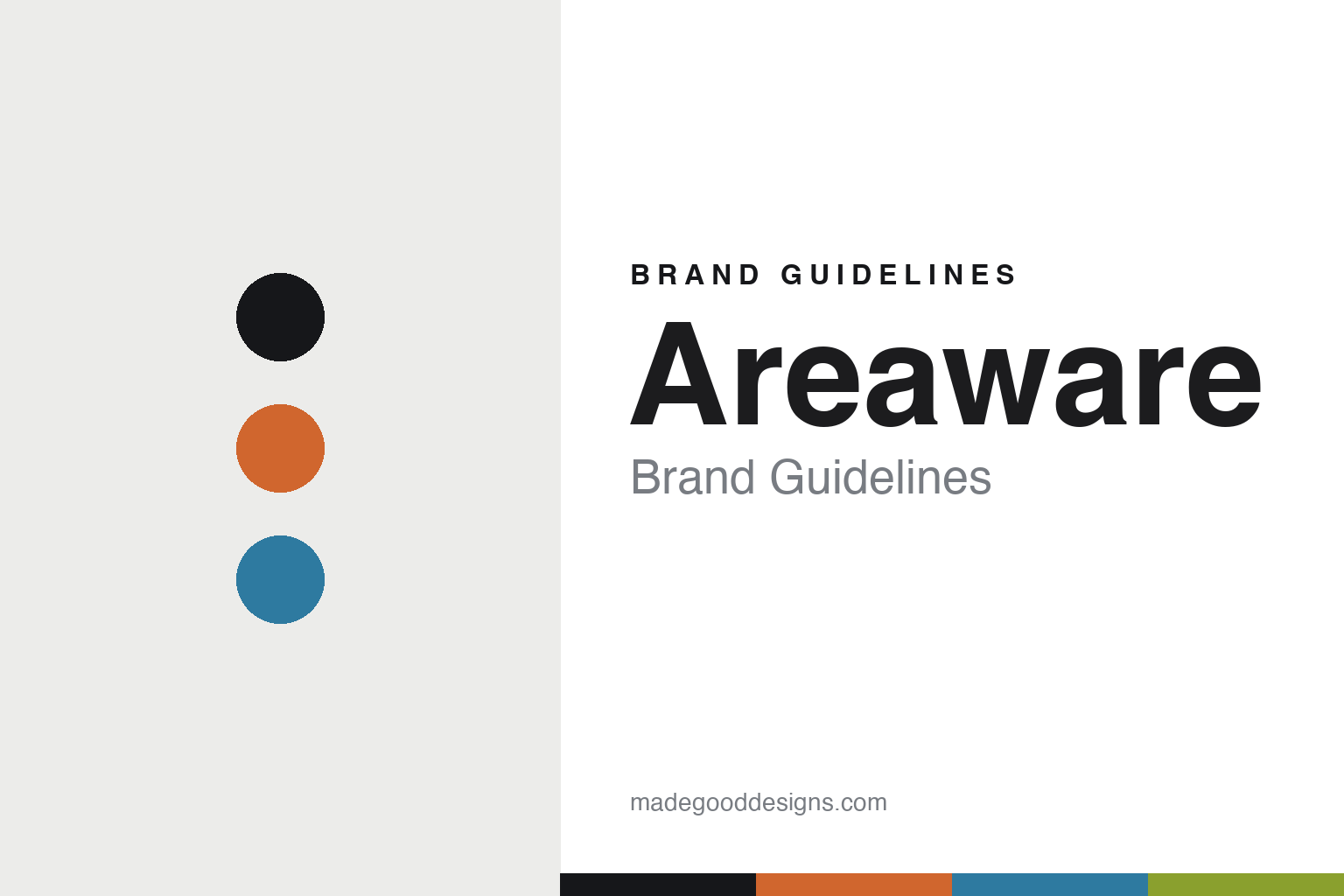
Areaware Brand Guidelines
The design-publisher object.
Aa
Two constants: a playful palette and a rounded sans register. Abstract homage — not the Areaware objects or wordmark.
The design-publisher object
Areaware publishes other designers’ objects.
Areaware is a lesson in the design-publisher model as the identity. An American brand founded in 2005 in Brooklyn, it produces and sells objects designed by independent designers rather than an in-house line.
Its identity is the published object. Areaware’s Cubebot by David Weeks, Balancing Blocks by Fort Standard and Reference Bookend are the objects it is known for — playful, colourful desk pieces, each carrying a named designer. A catalogue of other people’s good ideas. Design, published.
(Honest notes: Areaware is an American design publisher founded in 2005 in Brooklyn, New York, by Lisa Yashon and Noel Wiggins. Its model is to collaborate with independent designers and produce their objects — a design publisher, not an in-house studio. Its signature desk objects include the Cubebot by David Weeks Studio, Balancing Blocks by Fort Standard, Blockitecture, the steel-and-rubber Reference Bookend and cast-iron trays by Josh Owen (we drop the unverified “Gravity tray” and “Reddish” attributions and use these instead). On ownership, be accurate: Areaware was independent from 2005 to 2026, when it was acquired by Piecework, a puzzle company, and now continues under new ownership. On production, it is unconfirmed — contract manufacturing, likely offshore, but no source states a country, so we don’t assert one. One caution: “Cubebot” is trademarked and the designer-attributed pieces carry the designers’ rights, so we describe them but reproduce no forms or logo. There’s no official brand hex — these tones are an unofficial interpretation. This is design commentary and does not promote any product.)
Colour
Areaware lives in a playful palette. Click a swatch to copy the hex.
Areaware’s identity is playful, colourful and joyful — an orange, an ink, a sky, a chartreuse, and a chalk. The palette leans playful — the register of joyful, designer-led everyday objects. It signals fun and optimism rather than novelty. The honest caveat: with no published brand hex, these tones are an original, unofficial interpretation, not first-party values.
The lesson is a playful palette signals joyful design. Areaware’s world is a bright, joyful, designer-led object. For designers, it is a reminder that everyday objects can be as fun as they are functional — and that a bright, playful palette signals that optimism. Because an orange can fail as small text, keep type dark and let the colour live in the accents, palette and band. The takeaways: publish designers; make it joyful; keep it playful; and treat any single hex as unofficial.
Typography
The register is a rounded sans — friendly, playful, warm.
Areaware’s identity carries a friendly, playful, warm spirit — a joyful, designer-led object. A rounded geometric sans captures the mood: it is cheerful and approachable, the register of joyful design. Set in a playful palette, the rounded sans feels friendly and playful — exactly the personality Areaware carries. It is warm rather than serious, mirroring joyful objects. (Areaware’s real objects and wordmark are works we describe but do not reproduce, and the exact typeface is not ours to use.) Because it is not ours to use, the honest description is “a rounded sans spirit,” shown here in a stand-in. The type behaves like the brand: friendly, playful and warm.
Aa
A rounded sans spirit — friendly and playful. (Specimen set in Quicksand, a rounded geometric sans STAND-IN; NOT the Areaware wordmark.)
The design-publisher model as identity
Areaware stands for the published object.
Areaware is a lesson in publishing design rather than making it. A playful palette, a rounded sans and a designer-led object make the publisher model the whole brand — friendly, joyful, colourful. The model is the differentiator. The differentiator is being a platform for independent designers, each object carrying a named maker.
Put to work, the identity is a curatorial platform. A designer building in this spirit would act as an editor and producer of other designers’ ideas, so the catalogue reads as a rotating collection of authored objects rather than one house voice. The lesson Areaware teaches is that a publisher model can be a durable identity: producing work by David Weeks, Fort Standard and others gives the brand constant freshness and credibility, and a joyful, playful design language keeps that variety coherent.
For designers and brand-builders, Areaware offers a clear takeaway: be a platform for designers. The lessons: publish designers; make it joyful; keep it playful; and be honest about the story. It is also a reminder to stay accurate: it was founded in 2005 in Brooklyn by Lisa Yashon and Noel Wiggins, and its objects are authored by named designers — the palette here is an unofficial interpretation. And it is a reminder that ownership can change: Areaware was independent until 2026, when Piecework acquired it, and saying so keeps the story current. It is a reminder, too, that published work carries rights: the Cubebot and the designer collaborations are protected, so we describe them but reproduce none of the forms. And it is a reminder that crediting matters: because each object carries a named designer, the honest way to write about Areaware is to name David Weeks, Fort Standard and Josh Owen alongside the brand, not to fold their authorship into a house voice. Areaware made the published object the brand — proof that a publisher model can be the difference.
Explore & save
Keep Areaware’s identity on hand — save it to a board in the Made Good inspiration library.
Areaware identity set
Pin the playful palette and the rounded-sans register to your own board.