Cartoon Network Brand Guidelines
A kids’ channel that made its logo out of the two least playful colours imaginable — and it worked.
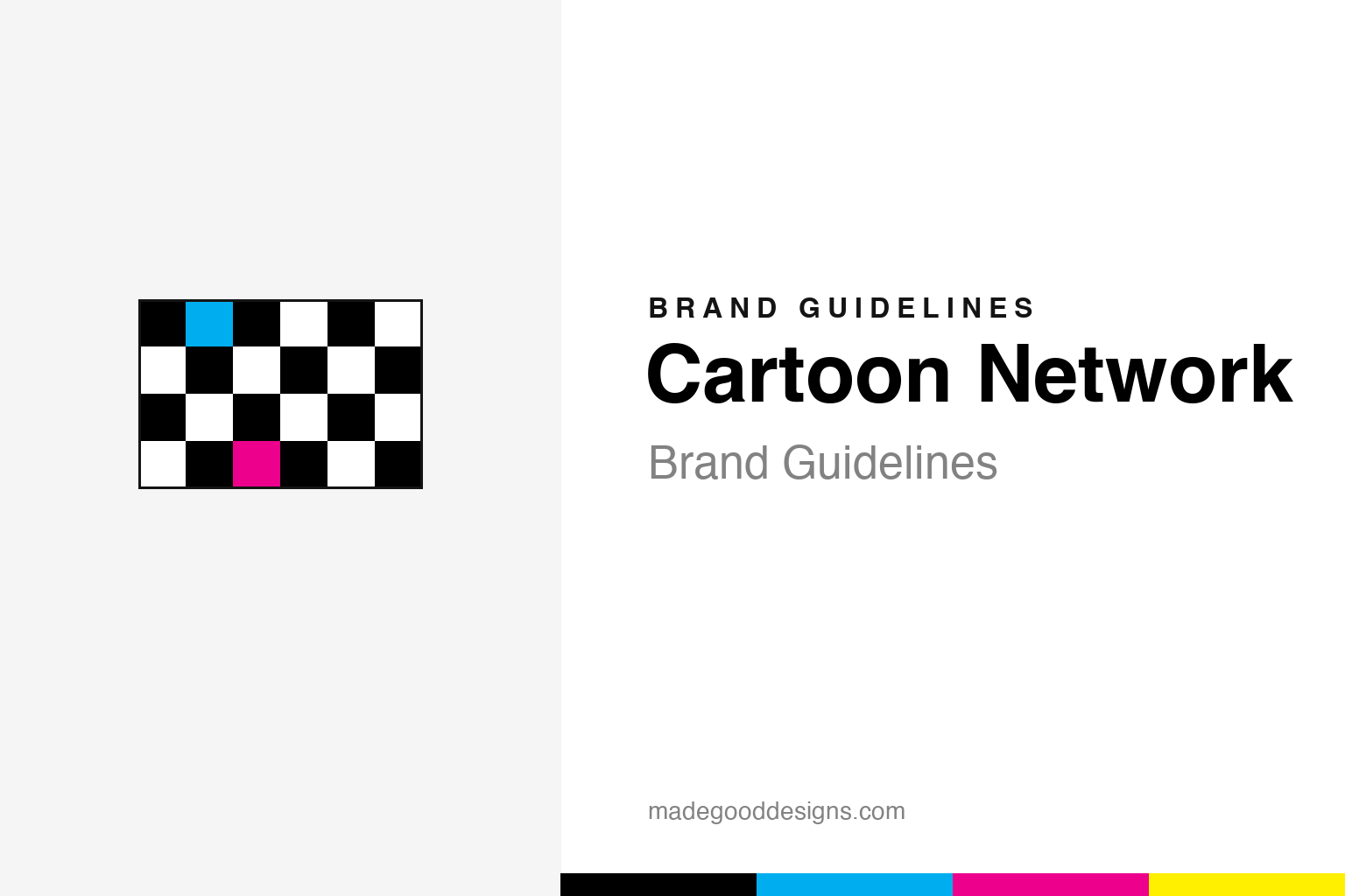
An abstract black-and-white checkerboard block with a few colour cells — the pattern, not the mark. Deliberately not the checkerboard wordmark or the ‘CN’ monogram.
A logo in two colours
The whole idea was to disappear into the cartoons.
Cartoon Network launched on 1 October 1992, and its identity was a black-and-white checkerboard holding the channel name — designed by studio Hatmaker. The brief was clever: a mark that would read cleanly against any bright cartoon background, without needing a drop shadow. Making it monochrome let the shows supply all the colour. It became one of the most flexible broadcast identities ever — ‘any content in the boxes.’ Because the checkerboard wordmark and the ‘CN’ monogram are protected, our homage is just an abstract checker block.
Built on a cartoon vault
Cartoon Network existed because Ted Turner had bought the cartoons.
The channel was created by Turner Broadcasting as the first 24-hour animation network, built on an enormous library: Hanna-Barbera (which Turner acquired in 1991), classic MGM cartoons (from his 1986 MGM deal), and pre-1948 Looney Tunes and Popeye shorts. It later grew its own originals (the ‘Cartoon Cartoons’) and the late-night Adult Swim block. The neutral checkerboard was the perfect container for a network that would hold decades of wildly different animation.
Many looks, one grid
The identity has been rebooted repeatedly — but keeps returning home.
Cartoon Network has cycled through eras: the playful early checkerboard, the ‘Noods’ line-based system (2008–2010), and a dimensional checkerboard revival that debuted on-air in the US on 29 May 2010 (reaching other regions in 2011). Through every reboot it returns to the black-and-white checkerboard, because that grid is the brand. It’s a textbook flexible-identity system: fix the structure, vary everything inside it.
Type: Eagle Bold
A 1930s poster face, reborn for Saturday mornings.
The checkerboard wordmark is set in Eagle Bold — genuinely a 1934 Morris Fuller Benton / ATF typeface originally drawn for New Deal NRA posters, digitally revived by Font Bureau in 1989. Its geometric, all-caps confidence suits the grid perfectly. Post-2010 wordmarks moved to a heavier Gotham-based custom cut. The specimen below is set in a geometric sans in that bold, blocky spirit.
It’s a fun place
Geometric, all-caps, unmissable — letterforms with the punch of a vintage poster. (Specimen set in Archivo, standing in for Eagle Bold.)
Step back and the same principle emerges once more: a brand is strongest when every element pulls in one direction. Cartoon Network shows how a symbol, a palette, a name and a tone of voice can reinforce a single idea until the whole becomes far greater than any part. Coherence like that is never an accident; it is the result of countless small decisions to stay on-message rather than chase novelty. Get that alignment right, protect it patiently over time, and an identity stops being something a company merely owns and becomes something people recognise instinctively.
Black & white first
The core is two colours; everything else is an accent. Click a swatch to copy the hex.
Cartoon Network’s documented core is simply black #000000 and white #FFFFFF — the checkerboard. The bright accents (a cyan #00AEEF, magenta #ED008C, yellow #FFF000) come from third-party brand-colour aggregators, not an official guideline, so we mark them as reconstructions. The whole point of the monochrome mark is that the shows bring the colour. Copy the working values below.
Why the grid still wins
Three decades on, the checkerboard is a rare thing in broadcast design — a logo that got more useful as television fragmented.
When Cartoon Network launched, a channel identity mostly meant a fixed logo tucked in the corner of the screen. The checkerboard was built for something more demanding: an era of bumpers, idents, apps and thumbnails where the brand has to appear thousands of times a day in wildly different contexts. Because the system is a structure rather than a picture — boxes you can fill — it absorbed all of that without strain. Designers could drop characters, colour or motion into the cells and the mark still read instantly as Cartoon Network. That is the textbook payoff of a flexible identity: endless variety on the surface, unwavering consistency underneath.
It also gave the network room to grow up without starting over. The same monochrome logic stretched to the late-night Adult Swim block, whose stark black cards and plain white type are practically the checkerboard’s serious sibling. And through every reboot — the playful early years, the line-based ‘Noods’ era, the dimensional revival — the two-colour core kept the brand legible to new generations of kids while staying nostalgic for the ones who grew up with it. For a media company that now spans channels, streaming and merchandise, an identity anyone can rebuild with a grid and two colours is worth more than any single illustration ever could be.
Explore & save
Keep the checkerboard idea and the black-and-white system on hand — save it to a board.
Cartoon Network identity set
Pin the checkerboard idea, the black-and-white core and the poster type to your own board.


