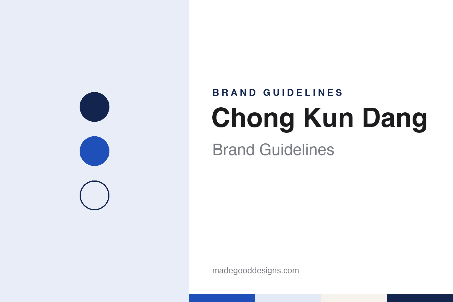
Chong Kun Dang Brand Guidelines
A 1941 Seoul pharmacy, a bell drawn from a dawn church bell, and a 2025 CKD mark.
Aa
Two constants: a bright blue and navy palette and a rising sans register. Abstract homage — not a Chong Kun Dang product or mark; no bell symbol, logo or package is reproduced.
Goongbon Pharmacy
A small Seoul pharmacy in 1941.
Chong Kun Dang began in May 1941 as a small pharmacy in Ahyeon-dong, in central Seoul, founded by Lee Jong-kun. Korea was then under Japanese colonial rule, and the shop traded as Goongbon in Korean and Miyamoto in Japanese, the Korea JoongAng Daily reported in August 2010. Korean Wikipedia, which gives the founding date as 7 May 1941, says the founder had worked as a travelling medicine salesman, cycling between pharmacies in Seoul, Hwanghae and Chungcheong, before opening a shop of about four pyeong, roughly 13 square metres. After the colonial era ended, he renamed it Chong Kun Dang Pharmacy in 1946, the newspaper said.
The business grew quickly after liberation. In 1949 it set up its first research lab, which developed what the JoongAng Daily describes as Korea’s first tube-type thiadiazole ointment. By 1951 it had become more a wholesaler than a pharmacy, with separate production and sales units, the paper reported. The Korean War hit it hard: Korean Wikipedia says its factory and pharmacy were destroyed in 1950 and the business moved temporarily to Busan, where a temporary plant was built in 1953.
Back in Seoul, it was making 30 different drugs by 1956 and registered as a corporation that year, the JoongAng Daily said. Korean Wikipedia records the 1956 name as Chong Kun Dang Pharmaceutical Co. and the change to Chong Kun Dang Co. in 1969.
Colour
Antibiotics, licences and Penzal.
Chong Kun Dang’s growth came through raw materials and partnerships. The JoongAng Daily reported a 1957 alliance with a Danish maker of antibiotics, which Korean Wikipedia names as Leo; a plant for antibiotic raw materials in 1965 that the paper called the largest in Asia; and, three years later, US Food and Drug Administration approval for a drug, which it called a first for a Korean firm. Korean Wikipedia dates the Sindorim plant in Seoul to 1962–65 and lists technology tie-ups with Hoffmann-La Roche and Boehringer Ingelheim in 1967, and with Santen, Syntex, Rhône-Poulenc and Glaxo in the early 1970s.
Joint ventures followed. The company set up Korea Rhône-Poulenc Rorer in 1980 and Roche Korea with the Swiss group in 1983, the paper reported, and Korean Wikipedia adds Korea Glaxo, a joint venture with the British company, in 1986. The JoongAng Daily called Penzal a popular headache remedy at neighbourhood pharmacies; Korean Wikipedia says it was launched in 1984, after a ten-year tie-up with Roche ended, and renewed as Penzal Q in 2008. Sokcheon, a liquid digestive and the company’s first, arrived in 1989. Korean Wikipedia also lists a central research institute from 1972, a stock-exchange listing in 1976 and a finished-drug plant at Cheonan, begun in 1994 and completed in 1998.
In 2013 the group split into a holding company, Chong Kun Dang Holdings, and a newly formed operating company that kept the Chong Kun Dang name, Korean Wikipedia says. Research has since reached licensing abroad: on 6 November 2023 the company agreed to grant Novartis global rights to CKD-510, a histone deacetylase inhibitor in development, English Wikipedia says, citing BioSpace.
Typography
How drug makers present themselves.
Korean and Chinese drug makers tend to introduce themselves through places as much as products. Their annual reports and websites lead with research campuses: new buildings in Shanghai and Suzhou, and the technology district of Pangyo, south of Seoul. Chia Tai Tianqing, for example, says it moved its global research headquarters to Shanghai in 2023, and Hengrui says it opened research offices in Princeton and Basel in 2020.
The pictures inside those reports follow a familiar pattern. White-coated scientists work at screens and fume hoods; long packaging lines carry tablets and vials; and the older companies keep a place for their beginnings, with founders and first factories shown in archive photographs. Several of the businesses in this group began as municipal or state factories decades before they became listed research companies.
Trade fairs are the other stage. The companies take booths at the BIO International Convention in the United States and at the large pharmaceutical fairs in China, where licensing talks with international partners are now a regular part of the business. Hengrui’s July 2025 licensing agreement with GSK is one recent example. In this guide, such deals are named without sums, and any deal not confirmed as completed is described as pending.
The visual identities themselves are mostly corporate and restrained: usually a wordmark in red, blue or green, with photography doing most of the work. Few of these companies publish brand guidelines or official colour values, so the palettes in this guide are our own unofficial interpretations, chosen to sit alongside the companies’ public materials without copying them.
Aa
A sans with rising strokes — after a mark redrawn in 2025. (Specimen set in Inter Tight, a sans STAND-IN; NOT the Chong Kun Dang logo or its in-house typeface.)
Chong Kun Dang
A bell drawn from a dawn church bell.
Chong Kun Dang’s mark has a well-recorded history. Its first symbol, in the 1950s, was a hexagon standing for a chemical compound with a cross inside it, NewDaily reported on 7 May 2025. The bell came from a 1960 design competition, won by a Seoul National University art student who took inspiration from a church bell ringing at dawn and joined the Hangul syllable “jong” with the cross-section of a bell in simple lines. A circle was added in the late 1960s; in the early 1970s the ring around the symbol carried the English line “Serving Human Health Everywhere,” replaced in the mid-1970s by “Better Life Through Better Medicine.” The Korean wordmark was set in the Iljung style of the calligrapher Kim Chung-hyun. The JoongAng Daily noted in 2010 that a big bronze bell rang at the end of the company’s television commercials and that the bell in the logo symbolised morning prayers.
On 7 May 2025, at its 84th anniversary ceremony, the company unveiled its first new corporate identity in about 50 years, NewDaily reported. The symbol kept its form, but the bell was enlarged, the surrounding circle widened and the slogan in the ring set larger. The calligraphic wordmark gave way to an in-house typeface, Chong Kun Dang Mirae, which the company describes as blending the dotum and gulim styles of Korean type, with strokes that rise to the upper right; the square frame around the old lettering was removed. The English mark was shortened from ChongKunDang to CKD. The signature blue, which the company links with birth, life and hope, was kept but made brighter. The new identity went onto signs at the Seoul head office, branches, plants and overseas offices, and onto business cards, staff passes and product packaging, the paper said.
For a design guide, Chong Kun Dang shows how a symbol can be redrawn across six decades without losing its first idea. Compare GC Biopharma, another Korean drug maker that shortened its English name to initials, and Yuhan, another Seoul pharmaceutical company. For this guide we use a bright blue, a deep navy and a warm off-white with a sans, an unofficial interpretation; no product or logo is reproduced.
Explore & save
Keep Chong Kun Dang’s identity on hand — save it to a board in the Made Good inspiration library.
Chong Kun Dang identity set
Pin the Chong Kun Dang bright blue and navy palette and the rising sans register to your own board.