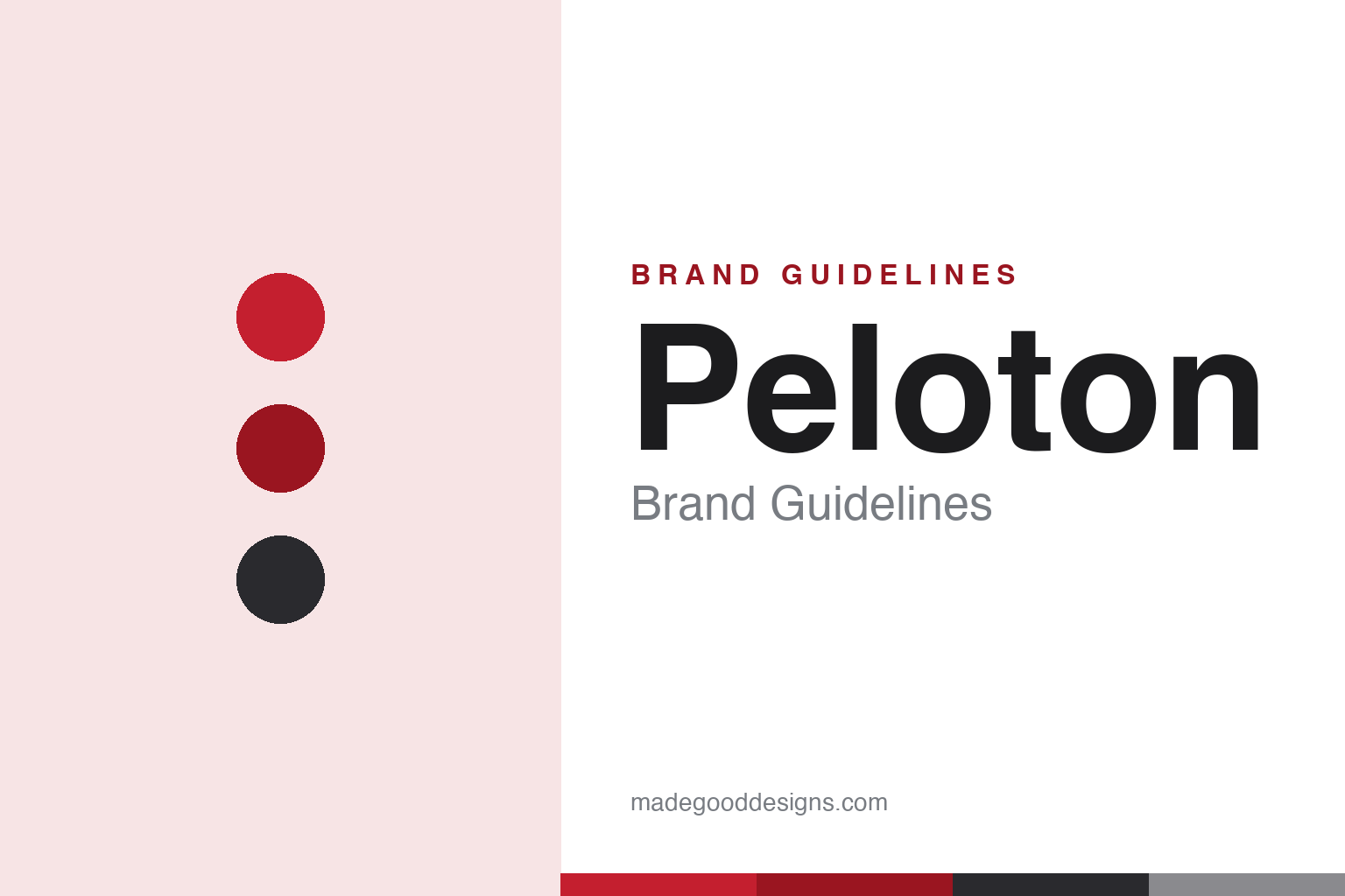
Peloton Brand Guidelines
A bike, a big screen and a cult of instructors — the connected-fitness brand that boomed, then crashed.
Aa
Two constants: a red-and-black palette and a geometric sans. Abstract homage — not the Peloton wordmark or ‘P’.
Connected fitness
Peloton fused hardware, subscription and community.
Peloton is a lesson in a brilliant model — and the perils of a boom. Peloton Interactive was founded in 2012 (in New York) by John Foley and co-founders Tom Cortese, Yony Feng, Hisao Kushi and Graham Stanton. It ran a Kickstarter in 2013 and shipped its first connected Bike in 2014. The idea was sharp: premium at-home fitness hardware with a large touchscreen, paired with a recurring subscription to live and on-demand studio classes led by charismatic instructors — hardware plus recurring revenue plus a cult-like community. (Honest caveats: no official public brand hex is confirmed, so the colours below are observed/approximate, and the wordmark typeface is undocumented.)
The model was genuinely clever, and it boomed during COVID-19: with gyms closed in 2020–2021, demand for at-home fitness exploded, Peloton’s revenue roughly doubled and its stock soared. For a moment, Peloton looked like the future of fitness — a beloved, high-status brand with devoted riders and celebrity-status instructors.
Then came the bust. As gyms reopened, demand collapsed, leaving Peloton with a huge oversupply glut, deep losses and layoffs. It faced a serious safety crisis — the Tread+ treadmill recall in 2021 after a child’s death and dozens of injuries — and reputational hits like the 2019 “Peloton Wife” holiday-ad backlash. Founder John Foley stepped down as CEO in 2022. The identity — a sleek, premium, boutique-fitness look in red and black with a distinctive “P” mark — remained strong throughout, but Peloton became a cautionary tale about scaling to a pandemic spike. A great model, tested by a brutal cycle.
Colour
Peloton lives in red and black. Click a swatch to copy the hex.
Peloton’s palette pairs a bold red with black/charcoal and greys. The red reads as energetic, intense and motivating — the adrenaline of a hard workout — while the black gives it a premium, sleek, boutique-fitness feel, like a high-end spin studio. Together they’re a confident, high-energy scheme that signals effort, aspiration and quality, matching Peloton’s pitch as a premium at-home fitness experience. It’s a strong, ownable combination that looks the part in a living room and on a big touchscreen. The honest caveat: Peloton publishes no confirmed official brand hex — the red here is an observed approximation, not a first-party value.
The lesson is red-and-black for premium intensity. Peloton’s palette signals both energy (red) and premium quality (black), fitting a boutique-fitness brand. For designers, it’s a reminder that a two-colour pairing can carry both emotion and positioning. The takeaways: use an energetic accent to convey the feeling (red for effort/intensity); pair it with black for a premium, sleek tone; and treat specific hexes as approximate when no official spec is published.
Typography
The wordmark is a sleek geometric sans — premium and energetic.
Peloton’s sleek geometric sans wordmark — with its distinctive “P” mark — is premium and energetic. The clean, modern letterforms read as aspirational, high-end and confident, matching a boutique-fitness brand that sells a premium at-home experience, and the ownable “P” gives it a recognisable icon for the app and hardware. In red and black, the type feels intense yet refined — the adrenaline of a workout wrapped in a premium studio aesthetic. It’s stylish and motivating rather than utilitarian, exactly the elevated, sweat-with-status personality Peloton cultivates. (Because the exact face is custom and undocumented, the honest description is “a sleek geometric sans,” not a named font.) The type behaves like the brand: premium, energetic and aspirational.
Aa
A sleek geometric sans — premium and energetic. (Specimen set in Sora, a geometric sans in the spirit of the Peloton wordmark; the real face is undocumented.)
The peril of a spike
Peloton scaled to a moment that passed.
Peloton is a lesson in the danger of mistaking a spike for a new baseline. Its connected-fitness model — premium hardware, recurring subscriptions, charismatic instructors and a devoted community — was genuinely excellent, and the brand identity was strong and aspirational. But the pandemic surge tempted Peloton to scale as if the boom would last, and when demand snapped back to normal it was left with oversupply, losses and a safety crisis. The brand didn’t fail because the design or the model was bad; it stumbled because the business over-extrapolated a temporary spike. It’s a sober reminder that even a great brand and a smart model must be matched by disciplined judgement about demand.
For designers and brand-builders, Peloton offers a clear takeaway: a strong brand and model still depend on sober business judgement — don’t scale a temporary spike as if it’s permanent. The lessons: a great identity (the sleek red-and-black look) can’t offset over-expansion; recurring-revenue models and community are powerful assets worth protecting; and honest storytelling includes the hard chapters (the recall, the layoffs). It’s also a reminder to keep the facts precise — Peloton was founded in 2012 by John Foley and four co-founders, shipped its first Bike in 2014, pairs premium hardware with a live-class subscription and a cult community, boomed during COVID-19 and busted as gyms reopened (with the 2021 Tread+ recall and Foley’s 2022 departure), and uses a sleek red-and-black identity with a distinctive “P.” Peloton scaled to a moment that passed — proof that brand and model still need disciplined judgement.
Explore & save
Keep Peloton’s identity on hand — save it to a board in the Made Good inspiration library.
Peloton identity set
Pin the red-and-black palette and the geometric-sans spirit to your own board.